
Banner
The In-App Banner is designed to display an image to users within the app. This banner template can effectively communicate key messages or promotions, offering high visibility.
Creating a Banner
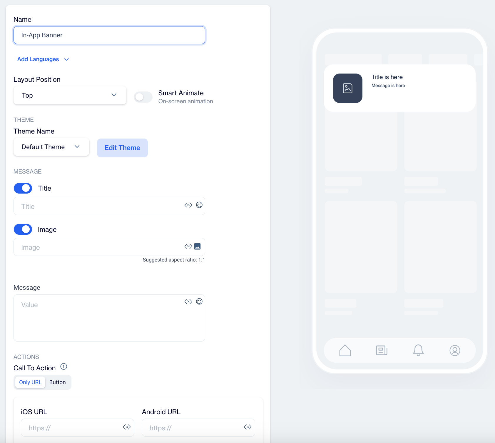
Name: Input a name for your In-App Banner to ensure it is easily identifiable and organized.
Preview on Mobile: Once you select the In-App Banner template, you’ll see a mobile preview on the right side of the screen, displaying how the banner will appear to users.
Add Languages: Add multiple language versions to your In-App Banner to reach a broader audience. When adding a new language, choose from two options:
- Copy from Content: Duplicate existing content to maintain consistency across languages.
- Create Blank Content: Start with a blank template for custom content in the selected language.
THEME
Edit Theme: In the Edit Theme section, you can customize the appearance of your In-App Banner by adjusting the following parameters:
General
- Font Family: Choose from options like Helvetica, or Roboto.
- Background Color: Set the background color.
- Card Radius: Adjust the radius of the survey card.
- Card Padding: Define the padding inside the card.
- Margin Top (px): Set the top margin.
- Margin Bottom (px): Set the bottom margin.
- Margin Right (%): Specify the right margin.
- Margin Left (%): Specify the left margin.
Message
- Message Color: Choose the text color for the message.
- Font Size: Set the font size for the message text.
- Text Align: Align the text (options include Left, Center, Right).
- Weight: Adjust the font weight (options include Normal, Bold).
Title
- Title Color: Set the color for the title text.
- Font Size: Define the font size for the title.
- Text Align: Align the title text (options include Left, Center, Right).
- Weight: Adjust the font weight for the title (options include Normal, Bold).
Buttons
- Font Family: Choose a font for the buttons (options include Helvetica, Arial, sans-serif).
- Font Size: Set the font size for button text.
- Button Radius: Adjust the button’s border radius.
- Weight: Choose the font weight for button text (options include Normal, Bold).
- Fit Content: Option to set the button width to fit the text.
Primary&Secondary&Tetriary Button
- Background Color: Define the button's background color.
- Text Color: Set the text color for the button.
- Border Color: Choose the border color for the button.
- Border: Define the border thickness.
Close Button
- Icon Color: Set the color for the close button icon.
- Icon Size: Specify the size of the close button icon.
After clicking Save as New, a pop-up window will appear prompting you to name your new theme. Enter a unique name in the provided text field to identify your theme easily in the future. Once you’ve chosen a name, click OK to finalize your custom theme.
MESSAGE
Title: Enter your title text, with options to add Customization and Emojis to enhance engagement.
Image: Add an image by using Image Selector, with option to Add Customization.
Message: Input your banner message with options to add Customization and Emojis to personalize the content.
ACTIONS
Call to Action Options
- Only URL
- With this option, users are directed to a specified URL as soon as they click on the In-App Banner. This setup is ideal for quick navigation without any buttons.
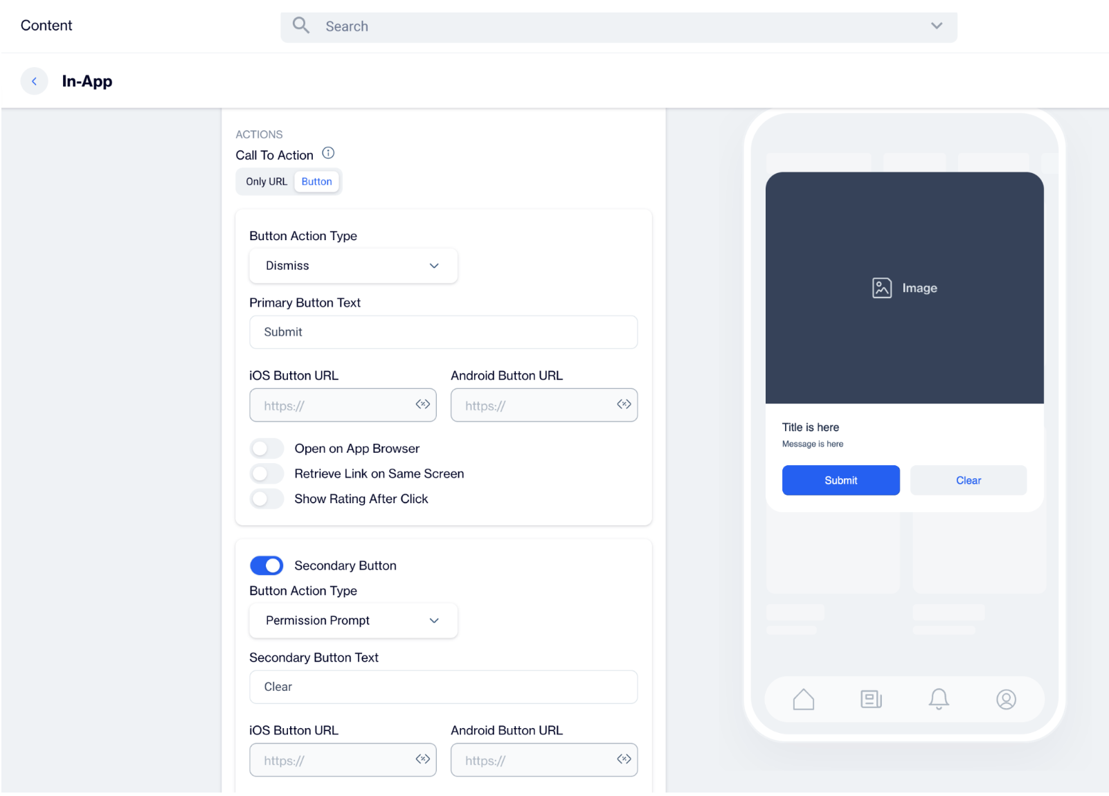
- Button
- With this option, users are only directed to a URL when they click a designated button within the Banner.
Button Action Type: Choose the action that occurs when users interact with the banner button:
- Open URL: Directs users to a specified URL. Use this option if you want the banner to send users to a website or landing page, such as a product page.
- Dismiss: Closes the banner. Choose this option if the banner is only for informational purposes and does not require further action.
- Permission Prompt: Triggers request permission prompt for push notifications. This prompt can be blocked by the operating system. So this action should be triggered once.
Permission Prompt
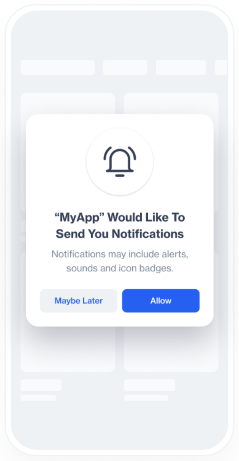
The Permission Prompt feature is designed to help companies secure push notification permissions from users who have downloaded their app but have not yet enabled notifications. By assigning the Permission Prompt button action in this template, you can present an in-app message that prompts users to grant permission for push notifications.
This two-step approach increases the chances of gaining notification permission by first showing an in-app request, followed by the system's native prompt. This method helps engage users before the system prompt, reducing the risk of losing future opportunities if they initially decline.
Building Your Message
In the message body, highlight the reasons why users should enable push notifications. Be clear and specific about the types of notifications you plan to send and the value they can offer.
- Example for a shopping app: "Stay updated with exclusive deals and product launches! Enable push notifications to never miss out on special offers."
- Example for a travel app: "Get real-time updates on your trips! Enable push notifications to receive flight alerts and travel tips directly to your device."
Configuring the Button Action
Add Button Text: Label the buttons with clear, actionable text. Common choices are "Allow Notifications" for the primary button and "Dismiss" for the secondary button.
Define Button Actions:
- Primary Button: Under the Button Action Type dropdown menu, select Permission Prompt. When users click this button, the SDK will check their current notification permission status.
- Secondary Button: Set the action to Dismiss. This option allows users to decline the prompt, closing the message without taking any further action.
Handling User Interaction:
- If the user clicks "Allow Notifications" and has not yet granted permission, the SDK will automatically guide them to their device's settings screen to enable push notifications for your app.
How Does the Permission Prompt Work?
Triggering the Prompt:
- When the Permission Prompt button is clicked, the SDK checks the user's current push notification permission status.
- If permission has already been granted, the SDK takes no further action.
- If permission has not been granted, the SDK will automatically navigate the user to the device's settings screen where they can enable push notifications.
Test Scenario:
- Within the Dengage Sample App, create an In-App message using this template and add a Permission Prompt (Allow Notifications) button.
- When the user clicks the Allow Notifications button, they are shown a message prompting them to enable push notifications. This action leads them to the Android or iOS notification settings screen.
- The user can then enable Show Notifications, granting the app permission to send push notifications.
Primary Text Button: Customize the text on the banner's button (e.g., "Submit", "Get Started") to clearly communicate its purpose.
iOS Button URL & Android Button URL: Provide specific URLs for iOS and Android platforms if you need users to be directed to different pages based on their device.
Toggles:
- Open on App Browser: Opens the link within the app’s browser, keeping users within the app while they view the content.
- Retrieve Link on Same Screen: Opens the URL on the same screen without navigating away, maintaining user focus on the current page.
- Show Rating After Click: Displays a rating option after the button is clicked, allowing users to provide feedback on the banner's content.
How to Configure Secondary and Tertiary Buttons:
- Select the Button Type: Choose whether you want to configure the secondary or tertiary button by selecting the appropriate button type in the editor.
- Set Button Action: Choose the Button Action Type that best fits the purpose of the secondary or tertiary button, such as "Dismiss" or "Tertiary Button Text" like "Remind me Later".
- Customize Button Text: Input the text for the button (e.g., "Remind me Later", "No Thanks", etc.) to reflect the action the button will perform.
- Add URLs: If necessary, provide separate URLs for iOS and Android users. This ensures a personalized experience based on the platform.
- Enable Toggles: Decide whether to enable toggles like Open on App Browser, Retrieve Link on Same Screen, or Show Rating After Click based on your specific needs.
Clickable Image Support
Clickable Image Support allows you to assign a click action directly to the image in this template. With this feature, images are no longer limited to being visual elements.
This capability gives you the flexibility to use both clickable images and buttons within the same In-App message, each with its own destination. As a result, you can design more engaging layouts, guide users through multiple actions, and create richer interaction experiences without changing your existing template structure.
Enable Clickable Image
While configuring your content, scroll to the Action section, the Clickable Image toggle is located within this section. When the toggle is turned on, the image in the template becomes clickable and can trigger its own action independently from buttons.
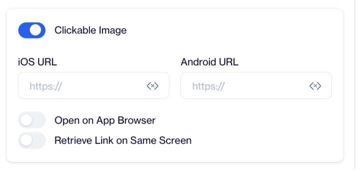
If the toggle remains off, the image will stay non-clickable, and only buttons will trigger user actions.
Configure Image Click Actions
After enabling the Clickable Image toggle, additional configuration fields become visible. You can enter separate destination URLs for iOS and Android platforms. You can also choose whether the link opens in the app browser and whether the link should be retrieved on the same screen.
These settings apply only to the image and do not affect any button configurations in the template.
Configure Buttons Independently
Buttons in the same template can be configured as usual and remain completely independent from the image. You can assign different destinations to buttons, or you can choose to send users to the same destination as the image.
Both images and buttons support Web URLs, Deep Links, and Custom Actions.
Use Cases
Clickable Image Support enables a wide range of design and interaction scenarios. For example, you can direct users to a product detail page by clicking the image, while using a button to add the product to the cart. This helps shorten the path to purchase while still offering clear call-to-action buttons.
You can also use the image to open content such as an article or campaign landing page, while buttons allow users to save, share, or take secondary actions. In cases where you want to increase the clickable area, both the image and buttons can lead to the same destination, making the experience more accessible.
Clickable Image Support allows images and buttons to work together in the same In-App message. This feature gives you greater control over user journeys, and enables more flexible design choices.
Close Button: Adds a close (X) button to the banner, allowing users to dismiss it if they do not wish to engage with it.
Dismiss on Touch Outside: Closes the banner when users tap outside its boundaries. This option is useful for banners that users might want to exit quickly if they are not interested.
Once your In-App Banner content is successfully generated, you can make any necessary changes and save it as a draft for future use. When you’re ready to launch the campaign, publish the content to prepare it for your in-app campaigns.
Updated 3 months ago