
Subscription Popup
The Subscription Popup is an on-site element designed to capture user information through a form, typically for email subscriptions or sign-ups. This popup is ideal for growing your mailing list or promoting special offers through a subscription-based model.
Creating a Subscription Popup
Subscription Popup
Preview on Desktop or Mobile:
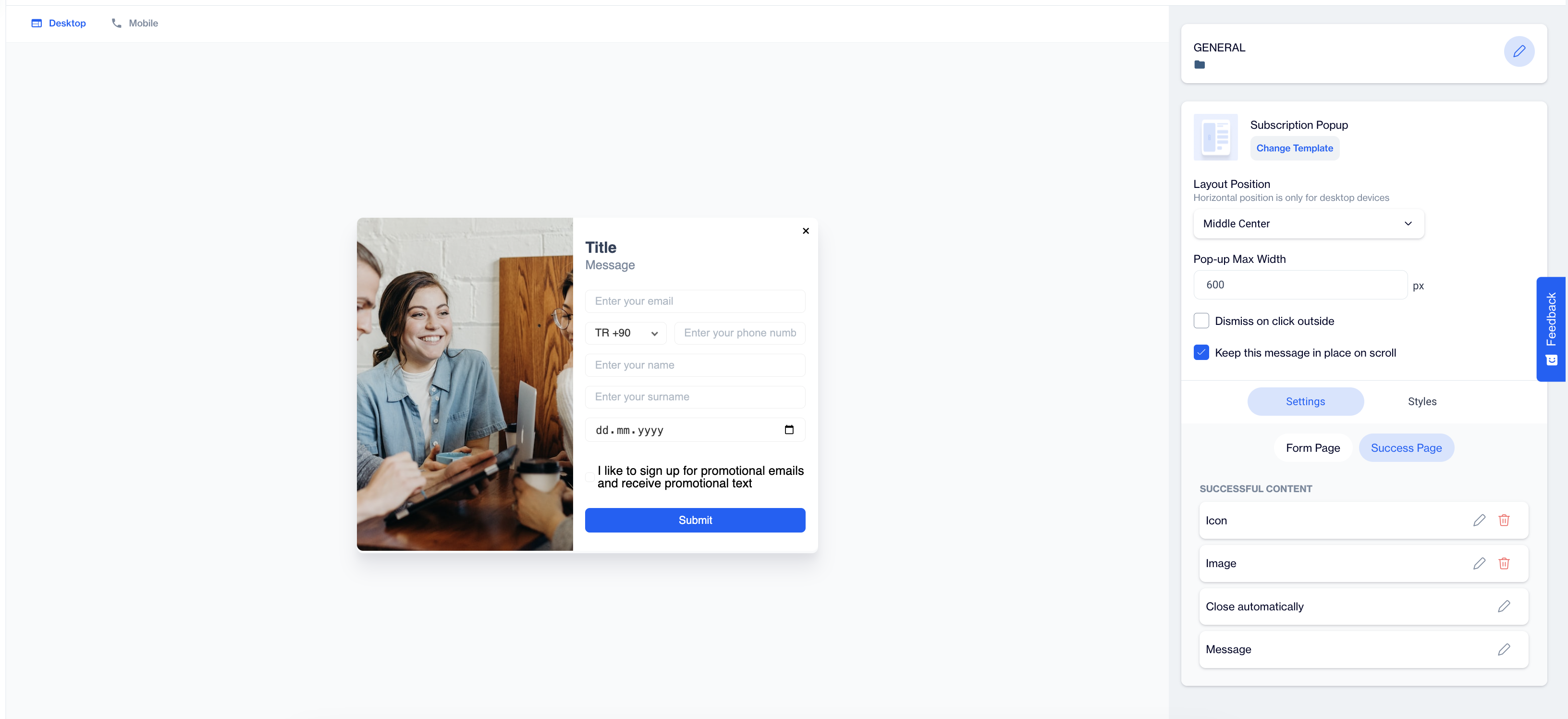
After selecting the Subscription Popup template, users will see a preview on the left side of the screen, showing how the popup will appear on both desktop and mobile devices.
General Section
As with other on-site elements, the General Section is where users input the Name and Folder details to ensure the subscription popup content is well-organized and easy to manage.
Content Section
- Change Template; Users can switch between different templates by clicking the Change Template button, allowing flexibility.
- Layout Position; In the Layout Position dropdown, users can choose from various placement options such as middle center, top right, and others, depending on the desired positioning on the page.
- Pop-up Max Width; Set the maximum width of the popup to ensure it fits seamlessly within the page’s design.
- Dismiss on Click Outside; Enable this option to allow users to close the popup by clicking anywhere outside of it.
- Keep This Message in Place on Scroll; Toggle this option on to ensure the subscription popup remains visible as users scroll down the page.
Settings:
Form Page
Media:
- Position: After clicking on the media icon in the opening screen, users can choose the position of the media (image or video). Options include positioning the media to the left, top, or right of the popup content.
- Media Type: Users can select the type of media to be displayed. The available options are image or video.
- Source: Below the media type selection, users need to provide the source for the media. For images, users can upload an image and apply customization using the Customization Selector.
Texts:
- For both the Title and Message, click on the pencil icon next to each to edit the text.
- Use the Customization Selector to add personalized content based on the user's flow or real-time targeting campaigns.
Fields:
- Email: This field is used to collect the subscriber's email address, which is typically the main point of contact.
- GSM: (Phone number) This optional field allows users to collect the subscriber’s mobile phone number.
- Name & Surname: These fields allow users to gather the subscriber’s first and last names, enabling more personalized interactions.
- Birthday: Collect the subscriber's birth date, which can be useful for personalized marketing campaigns like birthday promotions.
- Tags: When users click on the Tags field, they will see options to customize it further:
- Label: This is the description or title of the tag field. For example, the label could be "I'm interested in," indicating the subscriber's preferences.
- Tags: Users can select from predefined tags that categorize the subscribers based on their interests or behaviors. These tags can then be used for segmentation and future targeting.
Validation Language:
- In the Validation Language section, users can choose the language for validation messages that appear when subscribers interact with the form. The available language options are: Turkish or English
Checkbox Type:
- In the Checkbox Type section, users have the option to configure permission checkboxes for their subscription form. One of the key features here is the Has Merged Permission Checkbox toggle.
- Has Merged Permission Checkbox: When this option is enabled, if both the Email and GSM fields are selected, the system will merge the permission checkboxes into a single checkbox.
- Example: A single checkbox could display a message like, "I would like to sign up for promotional emails and receive promotional text" allowing users to grant permission for both communication methods at once.
Checkboxes:
If users choose not to enable the Has Merged Permission Checkbox option, separate permission checkboxes will be displayed for each communication method, allowing users to individually opt-in for email and SMS communications:
- Email Permission Checkbox: Users can opt-in to receive promotional emails by selecting this checkbox.
- SMS Permission Checkbox: Users can opt-in to receive promotional text messages by selecting this checkbox.
Button:
In the Button Section, users can customize the Submit Button by:
- Changing the Text: Edit the text displayed on the submit button to align with your message (e.g., "Sign Up Now," "Submit," or "Join Us").
- Adding Customization: Apply dynamic content to the button text using the Customization Selector.
Success Page
The Success Page is displayed after the form is successfully submitted. It includes the following options:
- Successful Content: Users can customize the message displayed on the success page, ensuring it aligns with the campaign's tone.
- Close Automatically: This toggle allows users to enable or disable automatic closure of the success message. If activated, users can specify the duration after which the success message will close automatically by adjusting the Close After X Seconds option.
- Message: The default message is “The form is submitted successfully.” Users can customize this message further, including the addition of emojis for enhanced engagement.
After clicking on the icon in the right corner, users need to click the Save & Back button to save their changes and return to the previous screen.
Styles
The Styles section allows users to customize the visual appearance of the Subscription Page.
- General: In this section, users can choose the font family or enter a custom font URL. They can adjust the card radius and padding to control the overall layout and spacing. Users can also select background colors, set the close button color, and size to ensure it fits well within the design.
- Title: Users can customize the title's color, font size and alignment. These options help create an eye-catching title that aligns with the overall design of the subscription popup.
- Message: In this section, users can select the message color, font size, alignment, and font weight. These styling options help ensure the message is clear and readable.
- Inputs: Users can customize the input fields with options for l horizontal and vertical padding, and background color. They can also adjust the font size for better readability, ensuring a smooth user experience.
- Checkboxes: This section enables users to customize checkboxes, including the tick mark, checked background, and font size. Proper styling of checkboxes enhances user interaction and clarity.
- Submit button: Users can change the submit button's text, alignment, font size, and background color. They can also adjust the border radius to create a modern appearance that encourages user interaction.
- Successful content: In this section, users can style the successful submission message by choosing the color, font size, text alignment, and padding. These options help create a visually appealing confirmation message that enhances user satisfaction.
After adding your content successfully, save it as a draft for future use or publish it to make it ready for your campaigns.