Product Box
The On-Site Product Box is a visually engaging notification displayed on specific areas of a website. It is designed to showcase products, campaigns, or promotions with a combination of visuals and text. Static Product Box can be used both in flow campaigns and in real-time. Dynamic Product Box, on the other hand, is only available for flow campaigns.
How It Works
- Static Product Box: Displays manually defined content (e.g., image, title, description) that is the same for all users. This format is ideal for campaigns where you want all users to see the same product details, discounts, and prices.
- Dynamic Product Box: Customizes the displayed content dynamically based on user behavior, past interactions, or specific data sources. This format is ideal for tailoring the user experience, showing products or offers relevant to each user's interests.
How to Access
- Navigate to Content > Onsite > New > Visual Editor > Product Box
- Choose between Static Carousel or Dynamic Carousel depending on your campaign needs.
- Follow the steps below to configure and customize the Carousel for your campaign.
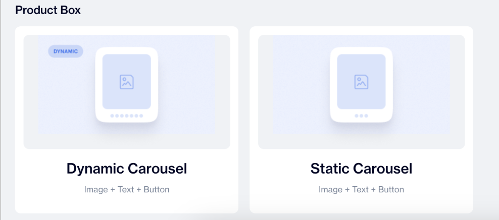
Product Box
In the General section:
- Name: Provide a name for the Carousel to identify it easily.
- Folder: Choose a folder to organize the carousel for better management.
- Once done, click the Next button or click the pencil icon in the Content section below to proceed.
The Content Section lets you set up the layout and customize how the Carousel works:
- Change Template: Users can switch between different templates by clicking the Change Template button, allowing flexibility.
- Layout Position: Select the desired position for the carousel from the dropdown menu. Options include Middle Center, Bottom Center, and others. Horizontal position settings are available for desktop devices only.
- Pop-up Max Width: Set the maximum width for the carousel to ensure it fits seamlessly into your page design.
- Dismiss on Click Outside: Enable this option to allow users to close the carousel by clicking outside its borders.
- Keep This Message in Place on Scroll: Toggle this on to keep the carousel visible even as users scroll down the page.
- Show Button: Display a call-to-action button, such as "Buy Now" or "Submit," for each product.
- Show Price: Enable this option to display the product's price in the carousel.
- Show Discount Price: Highlight discounted prices for promotional products.
- Price Direction: Choose how prices are displayed using the dropdown menu: Horizontal or Vertical.
- Close Button: Toggle this on to provide users with the ability to manually close the carousel.
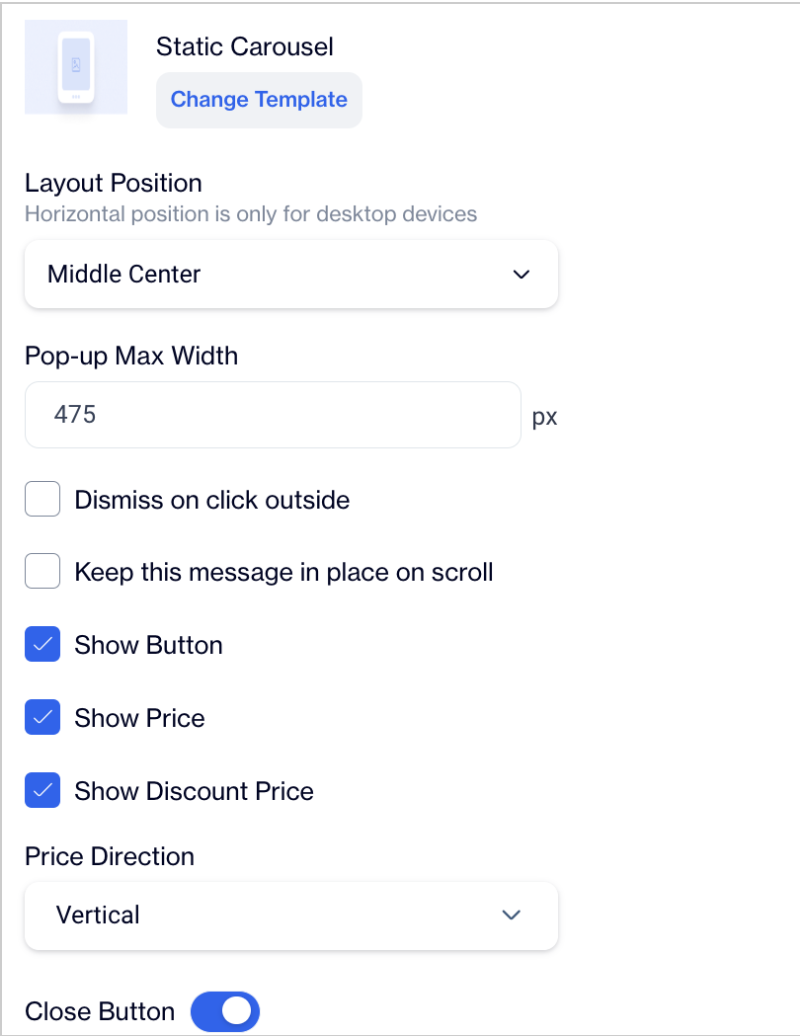
Static Carousel
Settings for Static Product Box
When setting up the Onsite Product Box, you can customize each product's details by clicking on the pencil icon next to a product (e.g., Product 1). The following fields can be configured:
Carousel Items
- Product Image: You can upload an image or provide a URL. Choose the option that best suits your workflow.
- Product ID: This ID is crucial if you plan to segment users based on their interactions with this product. For example, you can create a segment for users who click on this product using its Product ID.
- Product Name: Specify the name of the product to display on the carousel.
- Product Price: Define the price of the product to be shown to users.
- Product Discount Price: If the product has a discount, provide the discounted price here. This will be displayed alongside the original price if applicable.
- Product Button Text: Customize the text on the product's call-to-action button (e.g., "Buy Now" or "Learn More").
Different button names can be used for each product. - Product Target URL: Enter the URL where users will be directed when they click the button for this product.
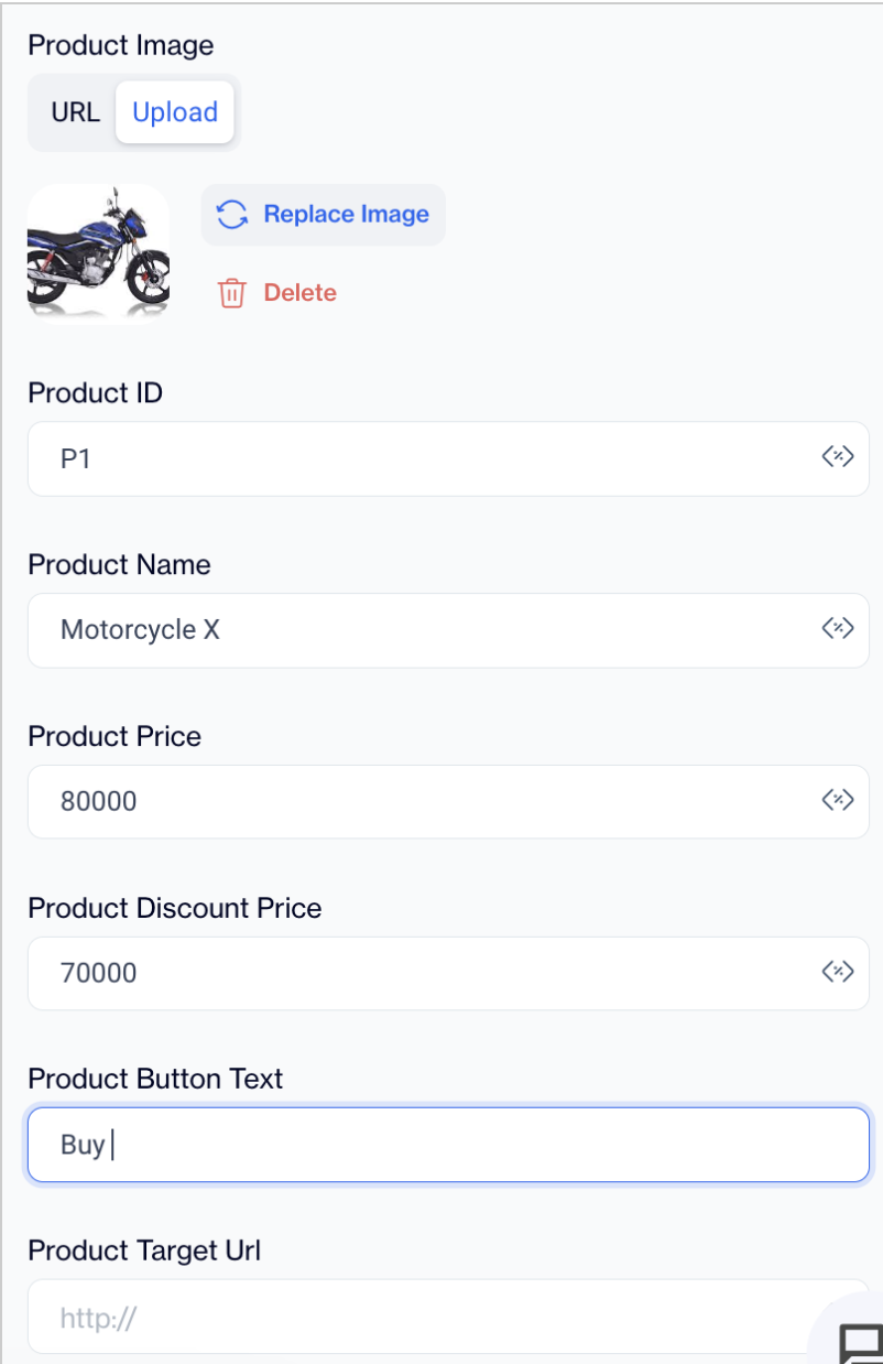
Settings for Static Product Box
You can add more products to the carousel by clicking the Add New Product button. Once added, click on the pencil icon for the new product and configure the same fields as described above for Product 1.
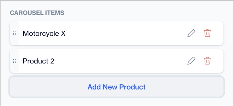
Add New Product
It is mandatory to click the Save&Back button after making changes to ensure they are reflected in the preview on the left side of the screen. Without saving, updates will not appear in the preview.
Settings for Dynamic Product Box
1. Product Source
This setting defines the origin of the products displayed in the Dynamic Product Box. Use the dropdown menu to select one of the following options:
- Recommendation Segmentify: Select this option to display products based on predefined recommendation segments.
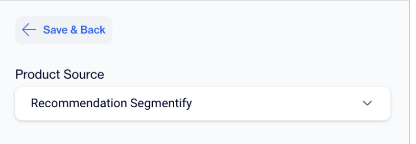
Recommendation Segmentify
- Recommendation WIS: Choose this option to provide product suggestions via Recommendation Widget. Once selected, an additional dropdown menu will appear, allowing you to choose from options such as: last_visited_products_cart
- Products From Segment: Select this option to display products sourced directly from a predefined segment. No additional widget selection is required, as the products are pulled from the specified segment.
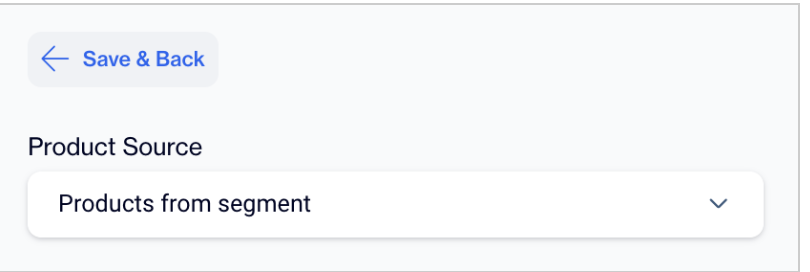
Products From Segment
2. Product Button Text
Define the text that will appear on the button within the Product Box. Examples include:
- "Submit"
- "Add to Cart"
This customization allows you to align the button text with your campaign or website's functionality and messaging.
Styles
General
- Font Family: Choose from a variety of options such as Helvetica, Arial, or Tahoma.
- Font URL: Add a custom font URL if needed.
- Card Radius: Adjusts the roundness of the product cards.
- Card Padding: Sets the internal spacing within the card.
- Background: Define the background color.
- Close Button: Customize the color and size of the close button.
Title
- Color: Sets the text color of the product title.
- Font Size: Adjusts the size of the title font.
- Font Weight: Specifies the weight of the title font.
Button
- Color: Sets the button text color.
- Font Size: Adjusts the font size for the button text.
- Font Weight: Controls the thickness of the button text.
- Text Align: Aligns the button text (default: Center).
- Background: Define the button background color.
- Border: Customize the button border with radius and width.
- Fit Content: Ensures the button resizes to fit its content.
- Padding: Set the internal spacing: horizontal, vertical.
Price
- Color: Sets the text color for the product price.
- Font Size: Adjusts the font size for the price text.
- Font Weight: Controls the thickness of the price font.
Discount Price
- Color: Sets the text color for the discounted price.
- Font Size: Adjusts the font size for the discounted price.
- Font Weight: Specifies the weight of the discounted price font.
Slide Button Position
- Configure the position of the carousel navigation buttons.
After adding your content successfully, save it as a draft for future use or publish it to make it ready for your campaigns.
Segment Creation for Static and Dynamic Carousels
Segment creation for Static and Dynamic Carousels enables precise targeting based on user interactions with the products displayed. Below are the steps to create segments for each carousel type:
Static Carousel Segment
- Navigate to the segmentation screen and select the On-Site field.
- Choose the Clicked filter to identify users who interacted with the products in this campaign.
- Refine the segment by adding the Action Button filter.
- Enter the Product ID (eg, P1) of the specific product defined during content creation.
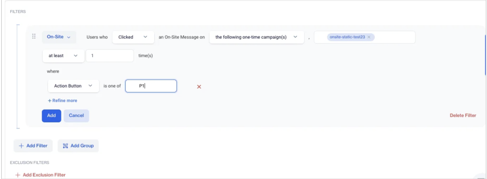
Static Carousel Segment
Dynamic Carousel Segment
- Navigate to the segmentation screen and select the On-Site field.
- Choose the Clicked filter to identify users who interacted with the products in this campaign.
- Refine the segment by adding Recommendation WIS or Recommendation Segmentify.
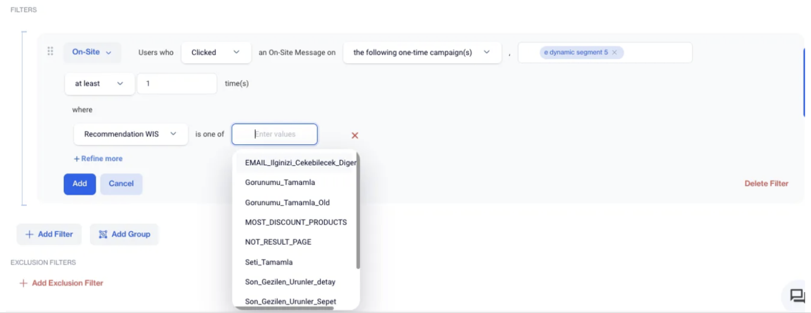
Dynamic Carousel Segment
Prerequisites
- Web in Stats Integration: Ensure that the Web in Stats (WIS) platform is integrated with your system.
- Algorithm Configuration on Web in Stats: The necessary algorithms must be configured and operational within the Web in Stats platform.
- Integration Between WIS and Dengage Recommendation Engine: Confirm that the integration between Web in Stats and the Dengage recommendation engine has been successfully completed.
Updated 15 days ago