
Horizontal Popup
The Horizontal Popup is designed to display an image, text, and two buttons (primary and secondary) in a horizontal layout. It offers flexibility for users to convey messages with both visual and textual elements, while providing multiple calls to action through the buttons.
Creating a Horizontal Popup
Horizontal Popup
Preview on Desktop or Mobile:
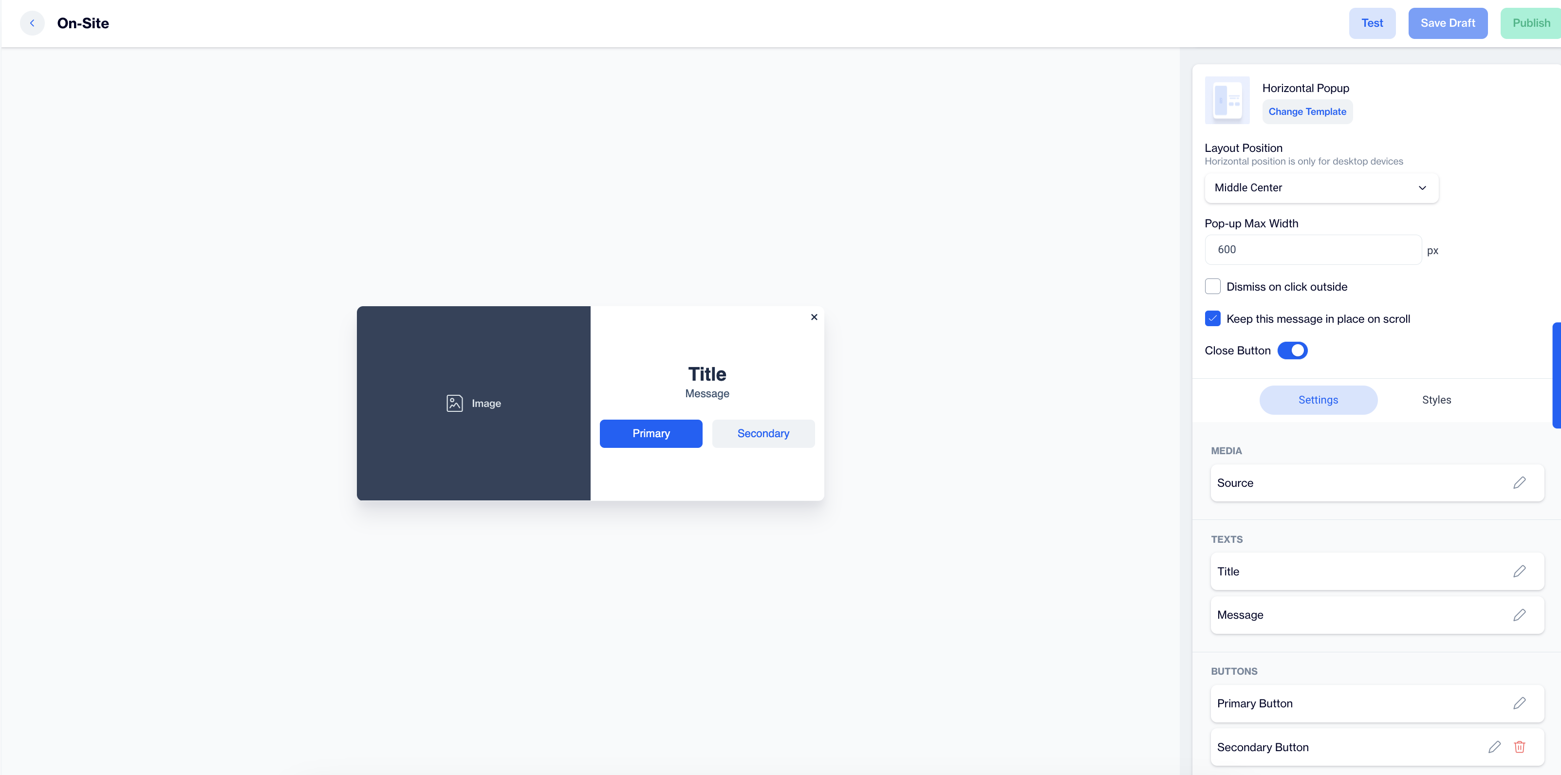
After selecting the Horizontal Popup template, users will see a preview on the left side of the screen showing how the popup will appear on desktop and mobile devices.
General Section
- As with other popup types, users need to fill out the Name and Folder details in the General section. This step ensures proper organization and management of popup content.
Content Section
Change Template:
- If needed, users can click the Change Template button to switch to a different layout.
Layout Position:
- Set the popup's position using the Layout Position dropdown, option includes various placements such as Bottom Center, Top Right.
- Remember, Horizontal position is only for desktop devices.
The Pop-up Max Width:
- This option allows users to specify the maximum width of the popup, ensuring it fits seamlessly within the design of the page. Users can set this width to achieve a balanced look and prevent the popup from being overly wide or distracting.
Additional Options:
- Enable the Dismiss on click outside option to allow users to close the popup simply by clicking anywhere outside of it, rather than needing to interact with the close button.
- Enable the Keep this message in place on scroll option if you want the popup to stay visible as users scroll.
- Toggle the Close Button option to allow users to close the popup.
Below these settings, users will find the Settings and Styles sections to further customize the popup.
Settings
In the Settings section, users can configure three key elements for the Horizontal Popup: Media, Text, and Buttons(Primary and Secondary).
Media:
- To add or change the image in the popup, click on the image area to open the Image Selector screen. From here, you can upload or choose an image to display.
- You can also add customization through the Customization Selector, allowing dynamic content adjustments based on flow or targeting campaigns.
Texts:
- For both the Title and Message, click on the pencil icon next to each to edit the text.
- Use the Customization Selector to add personalized content based on the user's flow or real-time targeting campaigns.
- Once you've completed your edits, click the Save & Back button. The updated text will appear on the left side of the screen, allowing you to preview how it looks within the popup.
Buttons (Primary and Secondary):
- Click on the pencil icon for each button to configure the Button URL and determine where each button leads.
- Optionally, toggle the Open in New Tab setting to have the link open in a separate browser tab when clicked.
- You can also apply customization to each button's behavior through the Customization Selector.
After clicking on the icon in the right corner, users need to click the Save & Back button to save their changes and return to the previous screen.
Styles
In the Styles section, users can customize the visual appearance of the Horizontal Popup to match their campaign’s design. Key customization options include:
- Fonts: Adjust the font size, alignment, and weight for both the title and message to ensure clarity and emphasis.
- Layout Customization: Modify the border radius and width, as well as card padding, for a tailored appearance.
- Colors: Customize the background, primary, and secondary button colors, along with the title and message colors, to create visual harmony with your campaign.
- Text Styling: Control the font size, alignment, and weight for both the primary and secondary buttons, ensuring that your call-to-action stands out.
These options allow users to design a fully customized Horizontal Popup, ensuring it works seamlessly across desktop and mobile devices.
After adding your content successfully, save it as a draft for future use or publish it to make it ready for your campaigns.