
Collect Leads with NPS
The Collect Leads with NPS is an on-site element designed to capture user feedback through a brief survey that measures user loyalty and satisfaction. This popup is ideal for collecting leads while engaging visitors with a quick NPS survey.
Creating Collect Leads with NPS
Collect Leads with NPS
Preview on Desktop or Mobile:
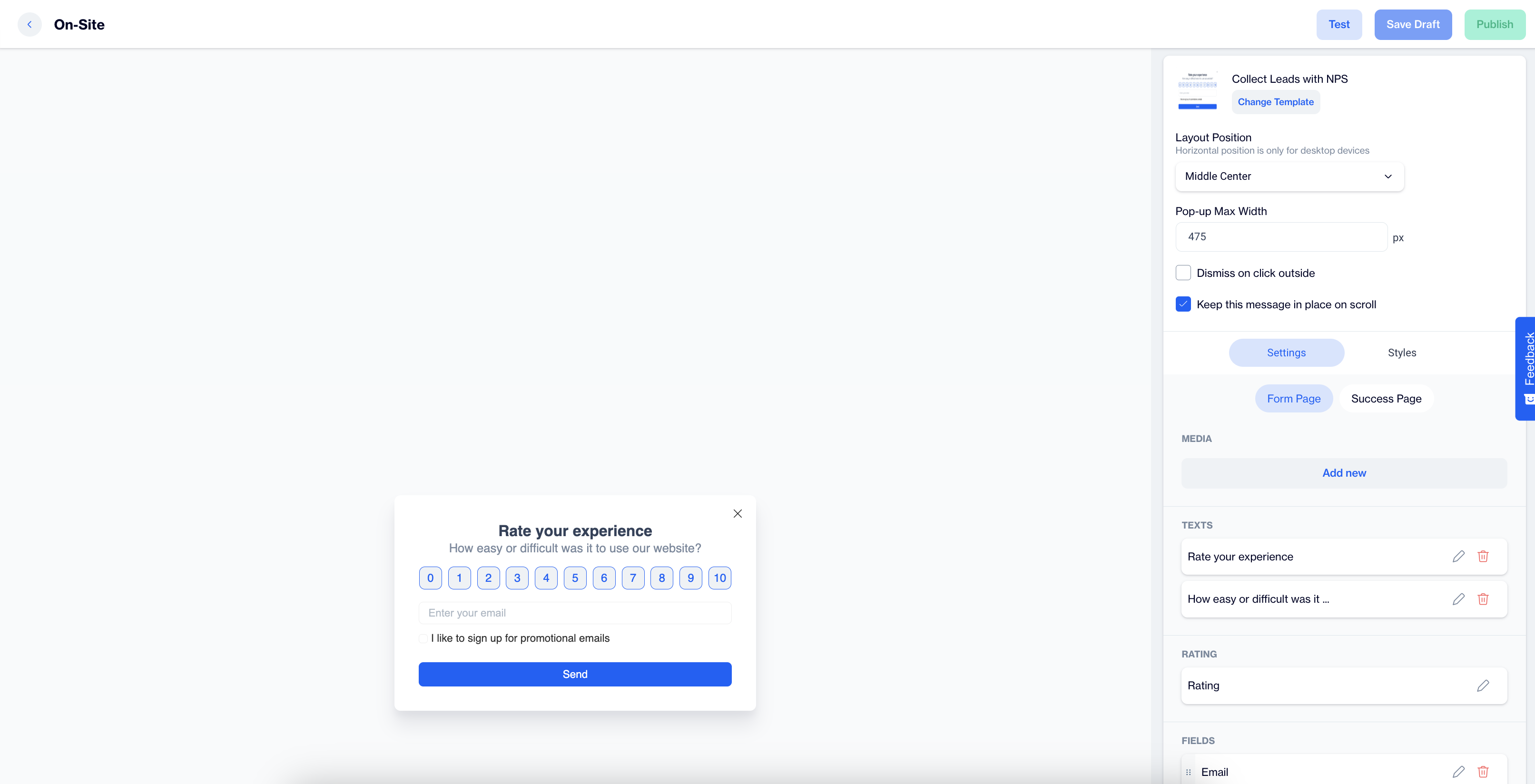
After selecting the Collect Leads with NPS template, users will see a preview on the left side of the screen, displaying how the popup will appear on both desktop and mobile devices.
General Section
As with other on-site elements, the General Section is where users input the Name and Folder details to ensure the Collect Leads with NPS content is well-organized and easy to manage.
Content Section
- Change Template:
Users can switch between different templates by clicking the Change Template button, allowing flexibility.
- Layout Position:
In the Layout Position dropdown, users can choose from various placement options, such as middle center, top right, and others, depending on the desired positioning on the page.
- Pop-up Max Width:
Set the desired width of the popup to ensure it fits seamlessly within the page’s design.
- Dismiss on Click Outside:
Enable this option to allow users to close the popup by clicking anywhere outside of it.
- Keep This Message in Place on Scroll:
Toggle this option on to ensure the Collect Leads with NPS remains visible as users scroll down the page.
Settings
Form Page
Media:
Once users click the Add New button, additional media customization options become available.
- Position: Users can choose the position of the media within the form, such as left, top, or right of the content.
- Media Type: Users can select the type of media to display, either an image or video.
- Source: Users need to provide the media source, with customization available using the Customization Selector for dynamic and personalized content.
Texts:
- Title: The title text, such as "Rate you experience" can be edited by clicking the pencil icon.
- Message: Users can edit the message, like "How easy or difficult was it to use our website?" The Customization Selector allows for personalized content.
Rating
- Size: Select the size of the rating element to fit your design preferences.
- Primary (Color): Choose the primary color for the rating element to align with your brand or design theme.
- Secondary (Color): Set the secondary color for the rating element for contrast and visual appeal.
- Tag: Select a tag to save the rating. Tags help categorize or identify users based on their rating behavior.
- Add Tag:
- Tag Name: Enter a name for the tag.
- Tag Type (Key Value): Define the tag type based on a key-value structure, where the tag identifies the key, and its value provides further details.
- Value Type: Choose the Value Type as either TEXT or INTEGER, depending on whether the value needs to be treated as a text or a numeric value.
- Description: Provide a description to clarify the tag's role or usage.
- Audience Type: Specify if the tag applies to Contact Specific (individual user profiles) or Device Specific (applied to a specific device).
- Add Tag:
Fields:
- Email; The primary field for collecting the respondent’s email address for future communication and follow-ups.
- GSM; (Phone number) Collect the respondent’s mobile phone number for SMS communication and personalized outreach.
- Name; Users can gather the respondent’s first name to personalize any follow-ups or future communications.
- Surname; This field captures the respondent’s last name, allowing for more personalized and professional communication.
Validation Language:
- In the Validation Language section, users can choose the language for validation messages that appear when subscribers interact with the form. The available language options are: Turkish or English
Checkbox Type:
- Merged Permission Checkbox; When both the Email and GSM (Phone number) fields are selected, this feature will merge the permission checkboxes into one. This single checkbox will allow users to opt-in for both email and SMS communications simultaneously.
Checkboxes:
- If the Merged Permission Checkbox is enabled, users will see a combined opt-in for both SMS and email messages. If it’s not enabled, separate checkboxes will be displayed for each communication method, allowing subscribers to opt in individually.
Button:
- Text; Users can edit the Send Button text to align with their campaign, such as "Send Feedback" or any other action-oriented text that fits the context of the survey or form.
- Customization; Apply dynamic content using the Customization Selector to personalize the button text.
Success Page:
Successful Content:
- Close Automatically: Users can enable or disable the option to automatically close the success message. If enabled, they can specify the time in seconds before the message closes.
- Message: The default success message, such as “The form is submitted successfully,” can be customized. Users can modify the text, add emojis, or use personalized content for enhanced engagement.
- Icon: An icon can be added to the success page to enhance visual appeal. If no custom icon is selected, a default one will be used.
- Image: The form image will automatically be displayed on the success page.
After making changes, users must click the Save & Back button to return to the previous screen.
Styles:
General:
Users can select a font family, input a Font URL, and adjust the card's radius and padding for optimal spacing. Background and close button color customization options are available to ensure a cohesive design.
Title:
Customize the title's color, font size, alignment, and font weight to make the text eye-catching and engaging.
Message:
Adjust the message's color, font size, alignment, and font weight to ensure clarity and readability.
Inputs:
Users can modify the input fields' padding, background color, and font size, ensuring the form fields are easily readable and aligned with the popup design.
Checkboxes:
Customization options for checkboxes include styling the tick mark, checked background, font size, and borders, enhancing user clarity.
Submit Button:
Users can modify the submit button's text, alignment, font size, background color, and border radius to create a modern and interactive design.
Successful Content:
Style the success message by adjusting its color, font size, text alignment, and padding to provide a visually appealing confirmation message for the user.
After adding your content successfully, save it as a draft for future use or publish it to make it ready for your campaigns.
Updated 8 months ago