
Banner
The In-App Banner is designed to display an image to users within the app. This banner template can effectively communicate key messages or promotions, offering high visibility.
Creating a Banner
Banner
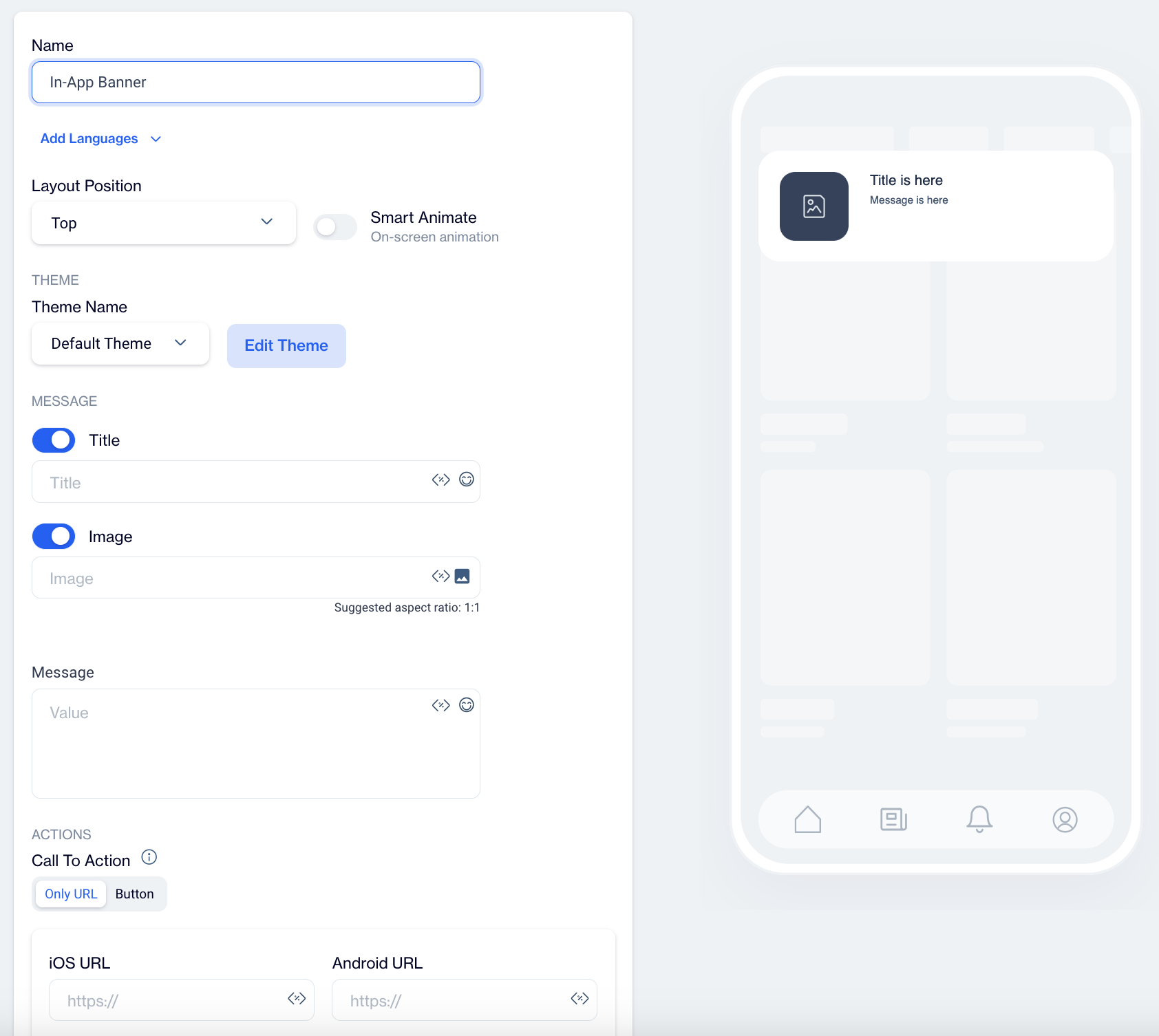
Name: Input a name for your In-App Banner to ensure it is easily identifiable and organized.
Preview on Mobile: Once you select the In-App Banner template, you’ll see a mobile preview on the right side of the screen, displaying how the banner will appear to users.
Add Languages: Add multiple language versions to your In-App Banner to reach a broader audience. When adding a new language, choose from two options:
- Copy from Content: Duplicate existing content to maintain consistency across languages.
- Create Blank Content: Start with a blank template for custom content in the selected language.
THEME
Edit Theme: In the Edit Theme section, you can customize the appearance of your In-App Banner by adjusting the following parameters:
General
- Font Family: Choose from options like Helvetica, or Roboto.
- Background Color: Set the background color.
- Card Radius: Adjust the radius of the survey card.
- Card Padding: Define the padding inside the card.
- Margin Top (px): Set the top margin.
- Margin Bottom (px): Set the bottom margin.
- Margin Right (%): Specify the right margin.
- Margin Left (%): Specify the left margin.
Message
- Message Color: Choose the text color for the message.
- Font Size: Set the font size for the message text.
- Text Align: Align the text (options include Left, Center, Right).
- Weight: Adjust the font weight (options include Normal, Bold).
Title
- Title Color: Set the color for the title text.
- Font Size: Define the font size for the title.
- Text Align: Align the title text (options include Left, Center, Right).
- Weight: Adjust the font weight for the title (options include Normal, Bold).
Buttons
- Font Family: Choose a font for the buttons (options include Helvetica, Arial, sans-serif).
- Font Size: Set the font size for button text.
- Button Radius: Adjust the button’s border radius.
- Weight: Choose the font weight for button text (options include Normal, Bold).
- Fit Content: Option to set the button width to fit the text.
Primary&Secondary&Tetriary Button
- Background Color: Define the button's background color.
- Text Color: Set the text color for the button.
- Border Color: Choose the border color for the button.
- Border: Define the border thickness.
Close Button
- Icon Color: Set the color for the close button icon.
- Icon Size: Specify the size of the close button icon.
After clicking Save as New, a pop-up window will appear prompting you to name your new theme. Enter a unique name in the provided text field to identify your theme easily in the future. Once you’ve chosen a name, click OK to finalize your custom theme.
MESSAGE
Title: Enter your title text, with options to add Customization and Emojis to enhance engagement.
Image: Add an image by using Image Selector, with option to Add Customization.
Message: Input your banner message with options to add Customization and Emojis to personalize the content.
ACTIONS
Call to Action Options
- Only URL
- With this option, users are directed to a specified URL as soon as they click on the In-App Banner. This setup is ideal for quick navigation without any buttons.
- Button
- With this option, users are only directed to a URL when they click a designated button within the Banner.
Button Action Type: Choose the action that occurs when users interact with the banner button:
- Open URL: Directs users to a specified URL. Use this option if you want the banner to send users to a website or landing page, such as a product page.
- Dismiss: Closes the banner. Choose this option if the banner is only for informational purposes and does not require further action.
- Permission Prompt: Triggers request permission prompt for push notifications. This prompt can be blocked by the operating system. So this action should be triggered once.
Primary Text Button: Customize the text on the banner's button (e.g., "Submit", "Get Started") to clearly communicate its purpose.
iOS Button URL & Android Button URL: Provide specific URLs for iOS and Android platforms if you need users to be directed to different pages based on their device.
Toggles:
- Open on App Browser: Opens the link within the app’s browser, keeping users within the app while they view the content.
- Retrieve Link on Same Screen: Opens the URL on the same screen without navigating away, maintaining user focus on the current page.
- Show Rating After Click: Displays a rating option after the button is clicked, allowing users to provide feedback on the banner's content.
How to Configure Secondary and Tertiary Buttons:
- Select the Button Type: Choose whether you want to configure the secondary or tertiary button by selecting the appropriate button type in the editor.
- Set Button Action: Choose the Button Action Type that best fits the purpose of the secondary or tertiary button, such as "Dismiss" or "Tertiary Button Text" like "Remind me Later".
- Customize Button Text: Input the text for the button (e.g., "Remind me Later", "No Thanks", etc.) to reflect the action the button will perform.
- Add URLs: If necessary, provide separate URLs for iOS and Android users. This ensures a personalized experience based on the platform.
- Enable Toggles: Decide whether to enable toggles like Open on App Browser, Retrieve Link on Same Screen, or Show Rating After Click based on your specific needs.
Close Button: Adds a close (X) button to the banner, allowing users to dismiss it if they do not wish to engage with it.
Dismiss on Touch Outside: Closes the banner when users tap outside its boundaries. This option is useful for banners that users might want to exit quickly if they are not interested.
Once your In-App Banner content is successfully generated, you can make any necessary changes and save it as a draft for future use. When you’re ready to launch the campaign, publish the content to prepare it for your in-app campaigns.