
Inline
The Inline Content template lets you embed content directly within the app, allowing you to tailor the experience to suit your visitors' preferences and needs.
Creating an Inline Content
Inline
- Name: Enter a name for your Inline Content to easily identify it among your templates.
- Preview on Mobile: Once selected, preview how the Inline Content will look on mobile devices on the right side of the screen.
- Add Languages: Increase your content's reach by adding multiple language versions. You can:
- Copy from Content: Duplicate existing content to keep language versions consistent.
- Create Blank Content: Start with a blank template, personalizing each language version.
THEME
Edit Theme: In the Edit Theme section, you can customize the appearance of your In-App Inline Content by adjusting the following parameters:
General
- Font Family: Choose from options like Helvetica, or Roboto.
- Background Color: Set the background color.
- Card Radius: Adjust the radius of the survey card.
- Card Padding: Define the padding inside the card.
- Margin Top (px): Set the top margin.
- Margin Bottom (px): Set the bottom margin.
- Margin Right (%): Specify the right margin.
- Margin Left (%): Specify the left margin.
Message
- Message Color: Choose the text color for the message.
- Font Size: Set the font size for the message text.
- Text Align: Align the text (options include Left, Center, Right).
- Weight: Adjust the font weight (options include Normal, Bold).
Buttons
- Font Family: Choose a font for the buttons (options include Helvetica, Arial, sans-serif).
- Font Size: Set the font size for button text.
- Button Radius: Adjust the button’s border radius.
- Weight: Choose the font weight for button text (options include Normal, Bold).
- Fit Content: Option to set the button width to fit the text.
Primary&Secondary&Tetriary Button
- Background Color: Define the button's background color.
- Text Color: Set the text color for the button.
- Border Color: Choose the border color for the button.
- Border: Define the border thickness.
Close Button
- Icon Color: Set the color for the close button icon.
- Icon Size: Specify the size of the close button icon.
After clicking Save as New, a pop-up window will appear prompting you to name your new theme. Enter a unique name in the provided text field to identify your theme easily in the future. Once you’ve chosen a name, click OK to finalize your custom theme.
MESSAGE
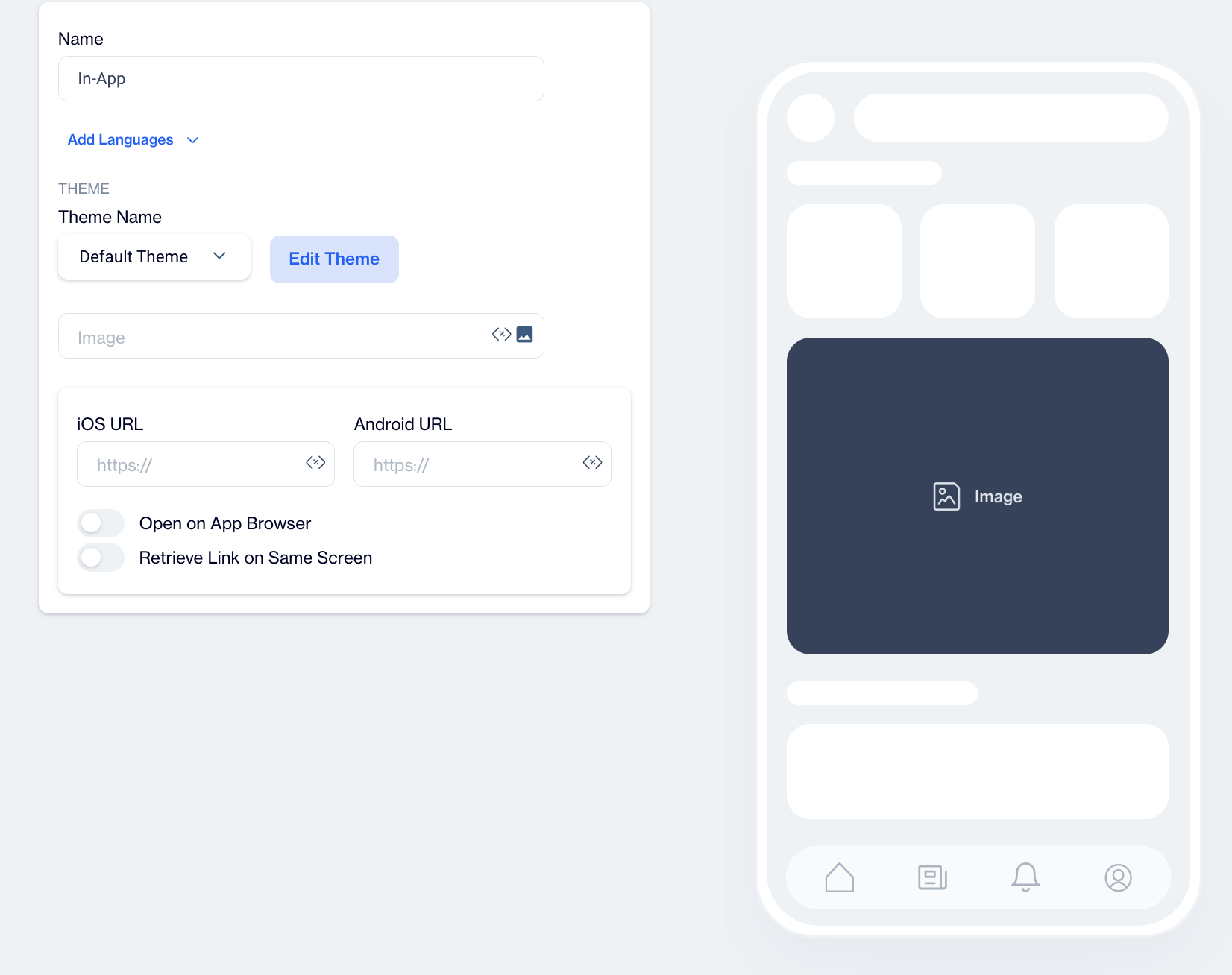
Image
Select the primary image using the Image Selector and add customization if needed.
iOS Button URL & Android Button URL
Provide platform-specific URLs if needed, directing iOS and Android users to different pages.
Toggles
- Open on App Browser: Opens the link within the app’s own browser, keeping users within the app to view the linked content.
- Retrieve Link on Same Screen: Opens the URL on the same screen, maintaining focus and minimizing screen transitions.
Story
The "Story" template allows you to create engaging, visually rich in-app messages designed to capture user attention and deliver content in a swipeable, story-style format.
Creating a Story
Name Your Story
At the top of the setup screen, enter the desired name for your story. This will help you identify it later.
Preview on Mobile: After selecting the Story template, you will see a preview on the right side of the screen. This preview shows how the story-style content will appear on mobile devices, allowing you to tailor the design and content for an optimal mobile experience.
Settings
Below the name field, you will see a section labeled Settings. This is where you will configure the main details of your story.
Stories Title:
In this field, input the title for your in-app story. This title will be displayed to users within the in-app message.
Story Set
Under the Stories Title, you'll find the Story Set section.
- Click on the pencil icon to edit the story set details.
- Story Stack Name: Enter the name of the story stack here.
- Story Stack Image: Use the Image Selector to choose an image for your story stack. This image will represent the entire stack of stories visually.
Story
This section is dedicated to the content of your individual story. You will configure various settings related to the media, background, and call-to-action (CTA).
- Story Name: This is where you provide a unique name for each individual story within the story set. This will help in organizing and managing multiple stories.
- Media Type: You can choose between two media options for each story:
- Image
 Upload an image that will serve as the visual for your story. Use high-quality visuals to capture the user's attention.
- Video
 If you want to include a video, select this option. You can then input a video URL in the next step.
- Media URL: For both image and video media types, you need to provide a media URL. This is the source from which the media will be pulled. Ensure the URL is correct and accessible.
- Story Background Color:Customize the background color of the story to match your brand or the theme of the content. Choose a color that complements your media and text for visual appeal.
- Call To Action (CTA): You can add a CTA to each story to engage users and direct them to a specific action. The following options are available:
- Label
Enter the text for the CTA button (e.g., "Learn More," "Shop Now").
- Android Link
Provide a dedicated Android URL link for the CTA. This can be a URL that directs users to a web page or product.
- iOS Link
Provide the corresponding iOS link to direct iPhone or iPad users to the relevant page.
- Background Color and Text Color
- Background Color
 Choose the background color for the CTA button to make it stand out.
- Text Color
 Customize the text color within the button to ensure readability and align with the design.
After creating your Story content, you can save it as a draft or publish it for your in-app campaigns when ready.