
Image Popup
The Image Popup is an on-site element designed to display a single image, providing an engaging and attention-grabbing experience.This feature is ideal for showcasing promotional visuals or announcements in a more prominent, popup-style format.
Creating an Image Popup
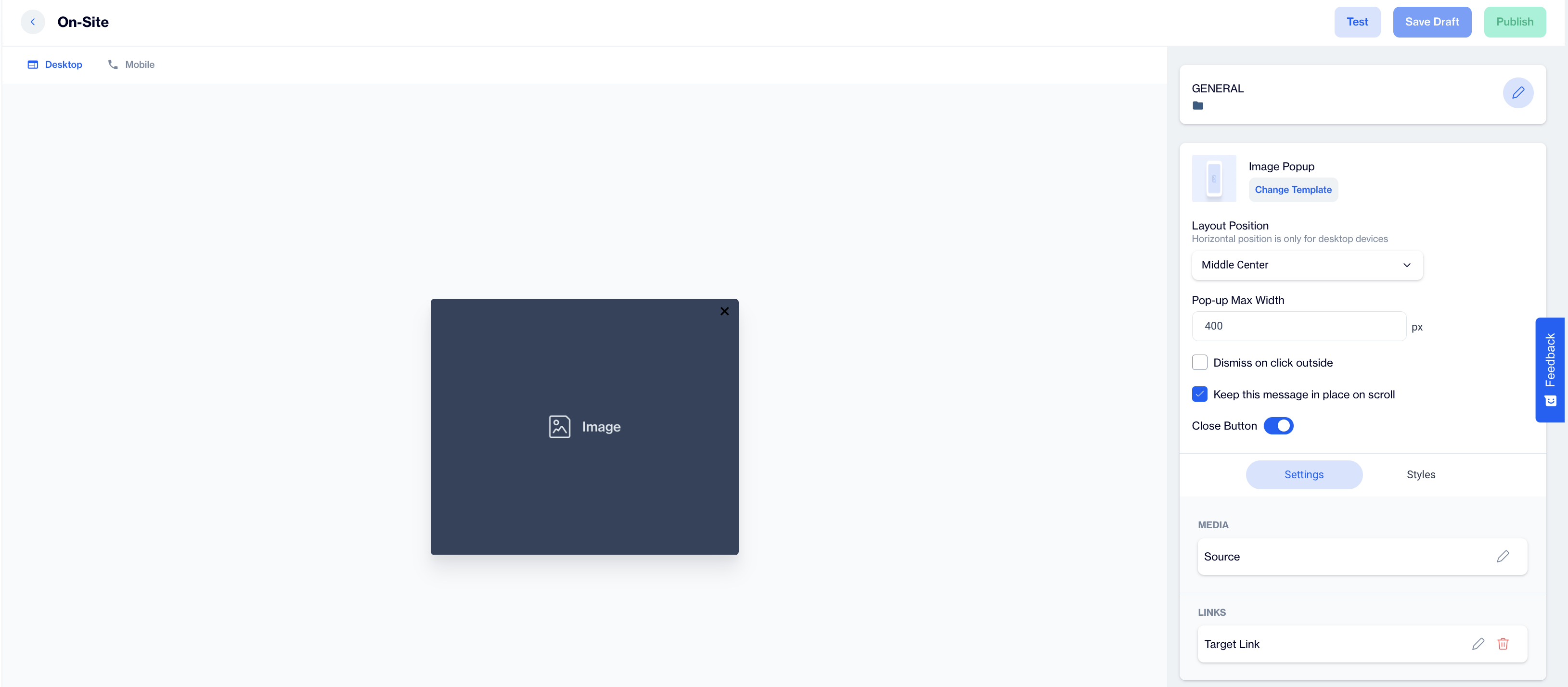
Image Popup
Preview on Desktop or Mobile:
After selecting the Image Popup template, users will see a preview on the left side of the screen showing how the popup will appear on desktop and mobile devices.
General Section
As with other popup types, users need to fill out the Name and Folder details in the General section. This step ensures proper organization and management of the Image Popup content.
Content Section
- Change Template; If needed, users can click the Change Template button to switch to a different layout.
- Layout Position; Set the popup’s position using the Layout Position dropdown. Options include various placements such as Bottom Center, Top Right, etc.
Note: Horizontal position is only available for desktop devices. - Pop-up Max Width; This option allows users to specify the maximum width of the popup, ensuring it fits seamlessly within the page design.
Additional Options:
- Dismiss on Clicked Outside; Enable this option to allow users to close the popup by clicking anywhere outside of it.
- Keep this message in place on scroll; If you want the popup to remain visible as users scroll, toggle this option on.
- Close Button; Toggle the Close Button option to allow users to manually close the popup.
Settings:
- Media; Users can click on the image to open the Image Selector, where they can choose or upload the desired image for the Image Popup.
Users can also utilize the Customization Selector to add dynamic content. - Links; In this section, users can enter the Target URL for the Image Popup.
You can also toggle the Open a New Tab option if you want the link to open in a separate browser tab.
Like the media section, users can apply the Customization Selector for dynamic button content.
After clicking on the icon in the right corner, users need to click the Save & Back button to save their changes and return to the previous screen.
Styles; In the Styles section, users can customize the visual appearance of the Image Popup to align with their design preferences. Key customization options include:
- Font Family & Font URL; Select the desired font family or provide a custom font URL to maintain brand consistency.
- Layout Customization; Adjust the Card Radius and Card Padding to modify the shape and spacing of the Image Popup for a polished look.
- Colors; Set the Background Color and customize the Close Button Color to align with your campaign’s aesthetic.
- Close Button Size; Control the size of the close button to ensure it’s easily noticeable and user-friendly.
After adding your content successfully, save it as a draft for future use or publish it to make it ready for your campaigns.
Updated 10 months ago