
Email Subscription Popup
The Email Subscription Popup is an on-site element designed to capture user’s email information through a form. This popup is ideal for growing your mailing list or promoting special offers through a subscription-based model.
Creating an Email Subscription Popup
Email Subscription Popup
Preview on Desktop or Mobile:
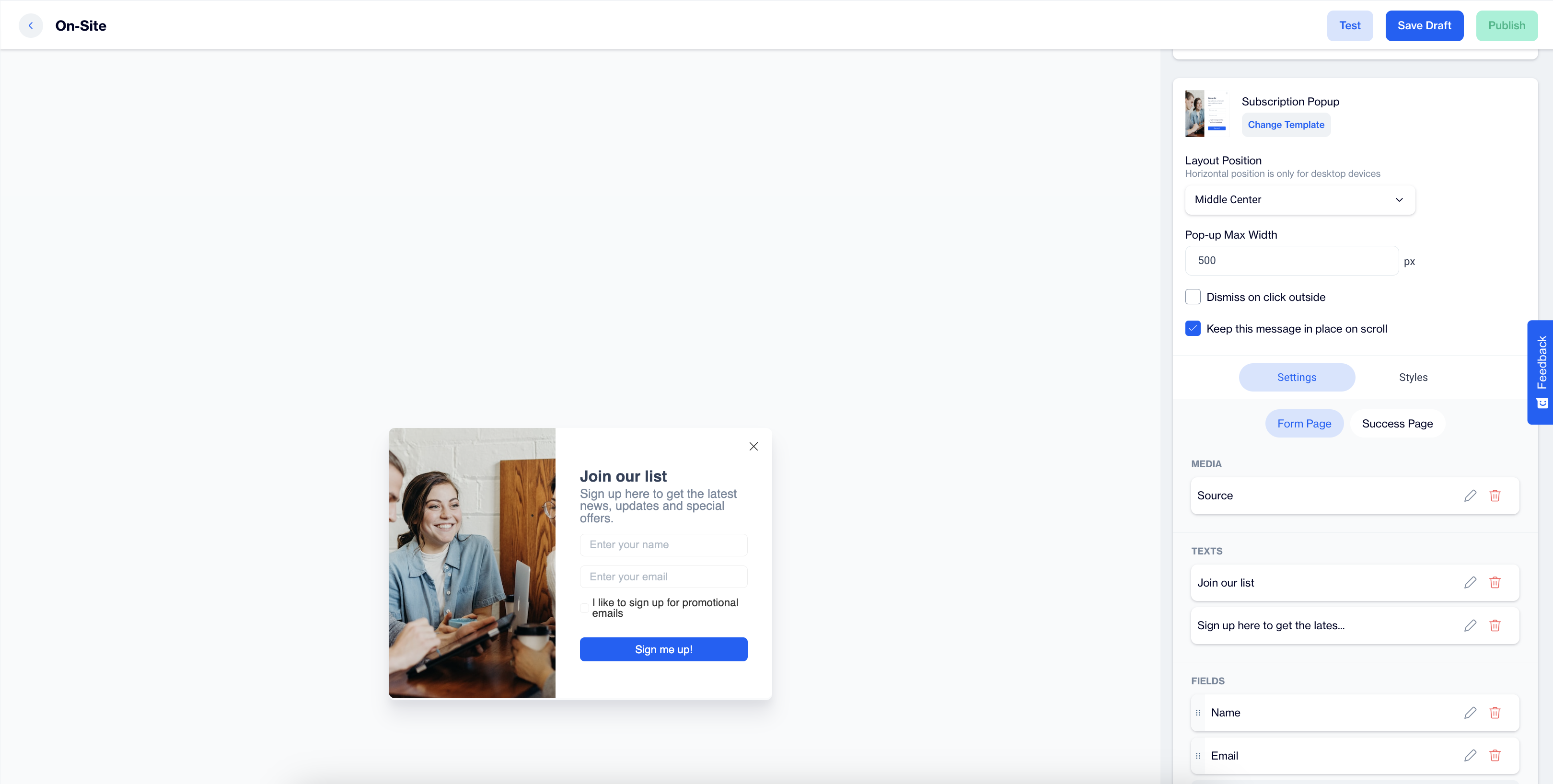
After selecting the Email Subscription Popup template, users will see a preview on the left side of the screen, showing how the popup will appear on both desktop and mobile devices.
General Section
As with other on-site elements, the General Section is where users input the Name and Folder details to ensure the subscription popup content is well-organized and easy to manage.
Content Section
- Change Template:
Users can switch between different templates by clicking the Change Template button, allowing flexibility. - Layout Position:
In the Layout Position dropdown, users can choose from various placement options such as middle center, top right, and others, depending on the desired positioning on the page. - Pop-up Max Width:
Set the desired width of the popup to ensure it fits seamlessly within the page’s design. - Dismiss on Click Outside:
Enable this option to allow users to close the popup by clicking anywhere outside of it. - Keep This Message in Place on Scroll:
Toggle this option on to ensure the subscription popup remains visible as users scroll down the page.
Settings
Form Page
Media:
- Position: Users can choose the position of the media within the form, such as left, top, or right of the content.
- Media Type: Users can select the type of media to display, either an image or video.
- Source: Users need to provide the media source, with customization available using the Customization Selector for dynamic and personalized content.
Texts:
- Title: The title text, such as Join our list, can be edited by clicking the pencil icon.
- Message: Users can edit the message, like Sign up here to get the latest news, updates and special offers. The Customization Selector allows for personalized content.
- Fields:
- Name: Users can gather the subscriber's first name.
- Surname: This field captures the subscriber's last name.
- Email: The primary field for collecting the subscriber's email address.
- Checkbox Type:
- Email Permission Checkbox: Users can enable this checkbox for email opt-ins.
- Button:
- Text: Users can edit the Submit Button text to align with their campaign, such as "Sign me up."
- Customization: Apply dynamic content using the Customization Selector to the button text.
Success Page:
- Icon:
Users can add an icon to be displayed on the success page, enhancing the visual appeal of the confirmation message. If no custom icon is selected, a default icon will be used on the success page. - Image:
The form image will automatically be used on the success page. - Close Automatically:
Enable or disable the option for the success message to close automatically. If enabled, users can specify how many seconds before it closes. - Message:
The default success message, “The form is submitted successfully,” can be customized with options to add emojis or modify the text for increased engagement and personalization.
After making changes, users must click the Save & Back button to return to the previous screen.
Styles:
- General:
Users can select a font family, input a Font URL, and adjust the Card Radius and Padding for spacing. Background and Close Button color customization options are available, ensuring a cohesive design. - Title:
Customize the Title color, font size, alignment, and font weight to ensure the text is eye-catching and engaging. - Message:
Adjust the Message color, font size, alignment, and weight for clarity and readability. - Inputs:
Users can modify the Input Fields' padding and background color, ensuring the form fields are easily readable and aligned with the popup design. - Checkboxes:
Customization options for checkboxes include styling the tick mark, checked background, and font size, enhancing clarity for the user. - Submit Button:
Users can modify the Submit Button's text, alignment, font size, background color, and border radius for a modern, interactive design. - Successful Content:
Style the Success Message by adjusting color, font size, text alignment, and padding to ensure a visually appealing confirmation message for the user.
After adding your content successfully, save it as a draft for future use or publish it to make it ready for your campaigns.