
Inline Personalization
The Inline element allows you to customize the website to suit your visitors' preferences and needs, offering a seamless user experience. Inline campaigns are placed directly on your website page. They are often used for displaying product recommendations within the page content.
How to Access and Create On-Site Inline Content
Access On-Site Inline Content:
- Go to Content > Marketing > Onsite.
Create New On-Site Inline Content:
- Click the New button in the top-right corner.
Select Content Type:
- After clicking New, choose Visual Editor.
- Then, find Inline Personalization and choose the Inline template to create inline content.
Creating an Onsite Inline Content
General Section:
As with other onsite elements, the General Section is where users input the Name and Folder details to organize the Inline element effectively.
Content Section:
- Change Template:
Users can switch between different templates by clicking the Change Template button, allowing flexibility.
Preview on Desktop or Mobile:
After selecting the Inline template and adding elements, users will see a preview on the left side of the screen, showing how the inline content will appear on both desktop and mobile devices.
Settings
- HTML:
Under the Settings tab, users can add the inline element by clicking on the Add New Element button. Three options are available when adding a new element:- Image
- Text
- Button
1.Image
When users select the Image option and click on the pencil button, a new page appears where they can configure various attributes and styles for the image.
Attributes:
-
Source:
Users can either select an image using the Image Selector or customize the source by clicking the Add Customization option. -
Alternate Text:
This field allows users to provide alternative text for the image. -
Link URL:
Users can add a URL (starting with https) to make the image clickable. The Add Customization option and emojis are also available. -
Open Link In:
Users can choose whether the link opens in a New Tab or the Current Tab when clicked. -
Width and Height:
Users can adjust the dimensions of the image by setting the Width and Height using units such as px or % .Style: -
Margin:
To adjust the margins around the image, users need to click the Add button to customize the spacing. -
Padding:
Similarly, for padding adjustments, users can click the Add button to make changes to the padding inside the image container.
Changes will appear in the preview once you click Save & Back.
2.Text
When users select the Text option and click on the pencil button, they can configure both the display text and attributes for the text element, along with customizing its style.
Display Text:
-
Display Text:
Users can edit the main display text, adding dynamic content using the Customization option or inserting emojis for a more personalized touch.Attributes: -
Link URL:
Users can add a clickable link to the text. The Add Customization option and emojis are also available for personalization. -
Open Link In:
Users can select whether the link opens in a New Tab or the Current Tab when clicked.Style: -
Select to Add Value:
Users can click the Select to Add Value button to reveal a list of style properties. After choosing the desired property, they can click Add to customize the appearance of the text. These properties include Cursor, Height, Width, Border Radius, Border Width, Border Color, Background Color, Color, Padding, Margin, Line Height, Text Align,Font Height, Font Size and Text Decoration. After selecting a property, they need to click the Add button to apply and modify the selected style.
Changes will appear in the preview once you click Save & Back.
3.Button
When users select the Button option and click on the pencil button, they can configure both the display text and attributes for the button element, along with customizing its style.
Display Text:
Users can edit the main button text, adding dynamic content through the Customization option or inserting emojis for a more engaging and personalized button label.
Attributes:
-
Link URL:
Users can add a clickable link to the button, with the Add Customization option and emojis available to personalize the link further. -
Open Link In:
Users can choose whether the link opens in a New Tab or the Current Tab when clicked.Style: -
In the Style section, users can click the Select to Add Value button to access a list of style properties. After selecting the desired property, they can click Add to apply customizations to the button’s appearance. The available style properties include Font Size, Font Weight, Text Align, Text Decoration, Color, Background Color, Border Color, Border Width, Border Radius, Padding, and Cursor. After selecting the property, users must click Add to modify the button’s style.
Changes will appear in the preview once you click Save & Back.
Styles
In the Styles section, users can adjust general design settings to align with the website's aesthetics.
Font Family:
Select a font family or apply the website's default font for consistency.
Card Radius:
Adjust the corner radius to create either sharp or rounded edges.
Card Padding:
Set the inner padding to control spacing.
Direction:
Align content horizontally along the X-axis and vertically along the Y-axis for precise layout control.
Justify Content:
Determine horizontal alignment of content, such as left, center, or right.
Align Items:
Vertically align elements, such as center or top alignment.
Background:
Select a background color that matches your website's design theme.
Creating an Onsite Inline Campaign
Once your Onsite Inline content is successfully created, you can make any necessary changes and save it as a draft for future use. When you’re ready to launch the campaign, publish the content to prepare it for your onsite campaigns.
To create a campaign directly from the content, click on the Create Campaign button located at the top right corner of the screen.
There are two ways to create an Onsite Inline campaign:
- Directly from the content, as described above.
- Navigate to Campaign > Targeting > Onsite. Then, click on New in the upper-right corner and select Inline Personalization as the campaign type.
Campaigns have various configurations divided into 4 steps: Settings, Content, Delivery Control and Summary.
Step 1: Settings
-
Campaign Name:
-
Start by providing a name for your campaign in the Campaign Name field.
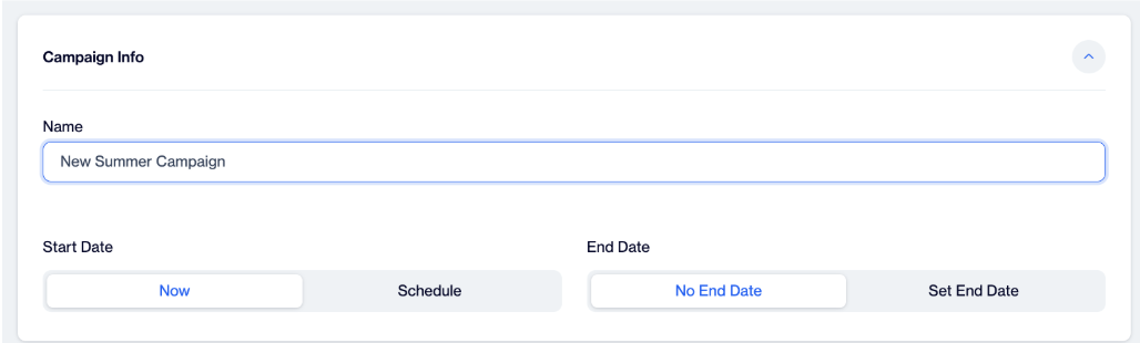
Campaign Info
-
-
Schedule:
- Start Date: You can either:
- Select Now to launch the campaign immediately.
- Or choose Scheduled to select a specific start date and time.
- End Date: You can either:
- Select Never if you don’t want the campaign to end.
- Or choose Scheduled to select an end date for the campaign.
- Start Date: You can either:
-
Website:
- Choose the app for which you want to create the campaign.
- Simply click on the app name(s) to select them.
- Within this section applications with On-Site Messaging Enabled are listed for selection. If you can’t see the Website(Application) that you want to deliver, please check that application’s On-Site Messaging Enabled configuration on the Settings / Applications Page.
-
Platform:
-
This section provides platform based show conditioning for the On-Site Campaign.
-
This conditioning is used to diverse end-users by detecting they have entered the website from a smartphone browser or a desktop browser. If the end-user’s browser type cannot be detected by D-engage Web SDK, detection is done by checking the screen width of the device they’re using.
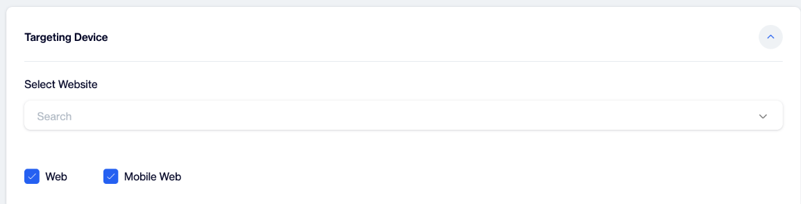
Targeting Device
-
-
Whom to Show?
- Choose the target audience for your campaign:
- All visitors: Show the campaign to all users.
- Visitor that satisfy the filters: Add specific filters to show the campaign to a targeted audience.
- Click Add Filter or Add Group to create or group conditions.
- Choose the target audience for your campaign:
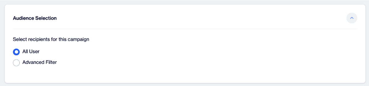
Audience Selection
-
When to Show?
- This section lets you set when the On-Site Campaign will display. Once all conditions (like "Whom to Show" and "When to Show") are met, the campaign will be triggered based on your chosen action:
- On Page Load: The campaign will display when the page loads.
- On Custom Event: The campaign will display when a specific Google Tag Manager (GTM) Data Layer event occurs. Enter the event name in the input field, such as ‘gtm.dom’ or ‘gtm.historyChange’.
- This section lets you set when the On-Site Campaign will display. Once all conditions (like "Whom to Show" and "When to Show") are met, the campaign will be triggered based on your chosen action:
-
Where to Show?
- This section allows you to configure where the On-Site Message will be displayed. There are two options for this section:
- All Pages
Selecting this option allows the On-Site Message to appear on any page of the website. - Specific Pages
This option lets you include or exclude specific pages. You can set URL path conditions to determine where the On-Site Message will be shown. To display the message, all specified path conditions must be met. You can also choose logical operators and enter text for these conditions.
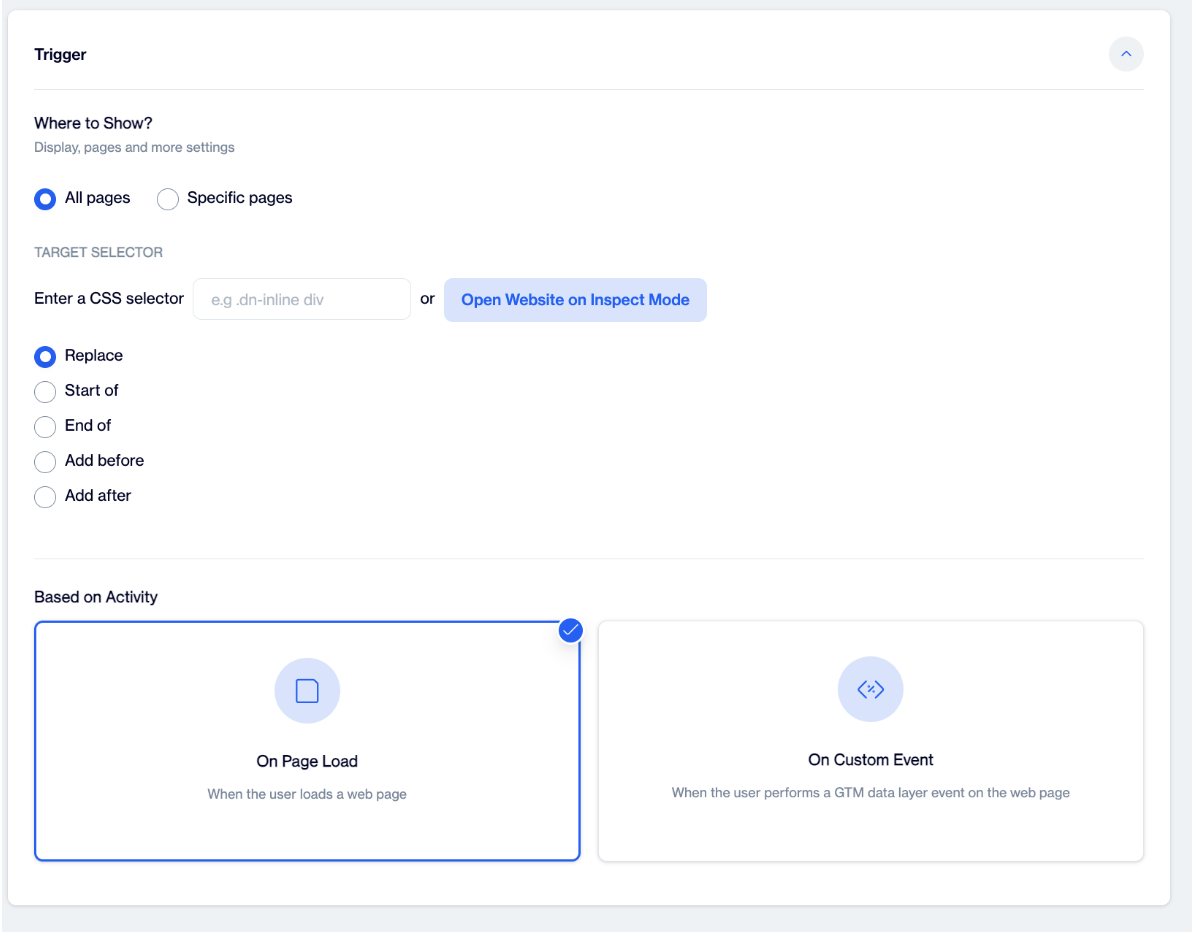
Trigger
Target Selector for On-Site Inline Campaign
The Target Selector allows you to specify where the inline campaign will be displayed on your website. Here’s how to use it:
Enter a CSS Selector:
- You can manually enter a CSS selector to target specific elements. For example, you can use .dn-inline div to select a div within an element with the class dn-inline.
- The relevant HTML on your page must include a div element. You can either use an existing div or have your front-end team define a new div.
Open Website in Inspect Mode:
- Alternatively, you can open your website in Inspect Mode (right-click on the page and select "Inspect" or press Ctrl+Shift+I on Windows or Command+Option+I on Mac). This will allow you to identify the specific elements you want to target.
Selector:
- The HTML injection feature takes a CSS/query selector string that specifies the HTML element. To ensure proper functionality, users are advised to use elements with the #dn-inline-target prefix for inline on-site campaigns. When selecting a target in the campaign screen, elements that contain this prefix will be highlighted and listed in the overlay.

CSS Selector Format
- If the query selects html, head, or body elements and the type is set to either before or after, no action will be taken.
Type:
- The Type specifies how the HTML injection will be performed and can take the following values: Replace, Start of, End of, Add Before, and Add After.

Selector Example

Example content to be injected
-
Replace: The Replace type option completely clears the content of the selected HTML element and fills it with the specified content.
Example:
Consider the following HTML element.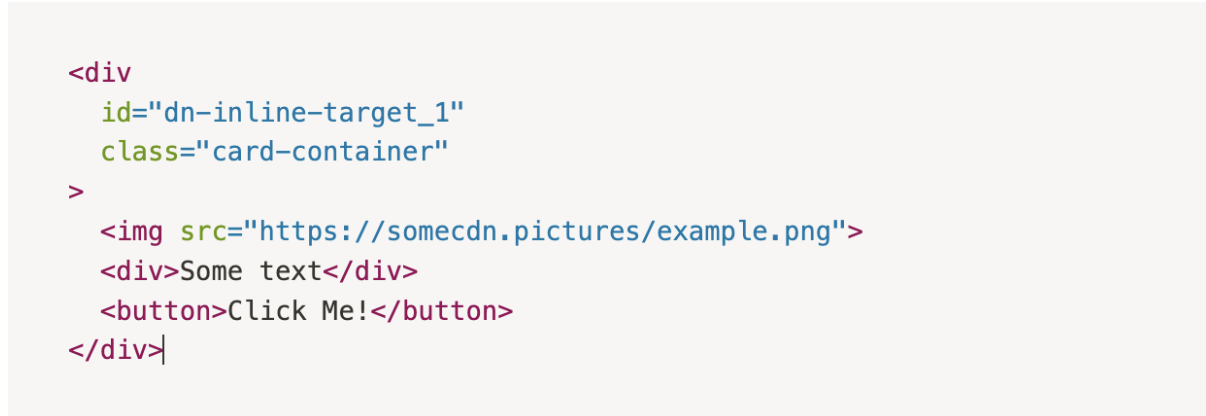
If you choose the Replace type with the provided selector and content, the element will be modified as follows: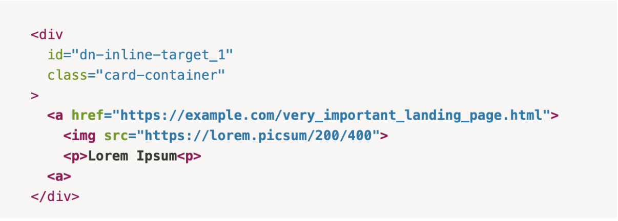
-
Start of: This option adds the injected content at the beginning of the selected element.
Example:
Consider the following HTML element.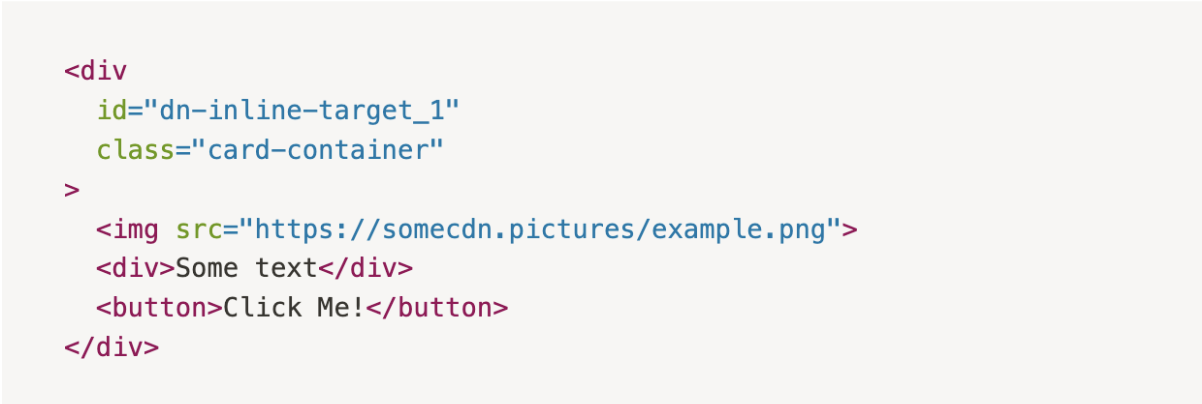
If you choose the Start of type with the provided selector and content, the element will be modified as follows: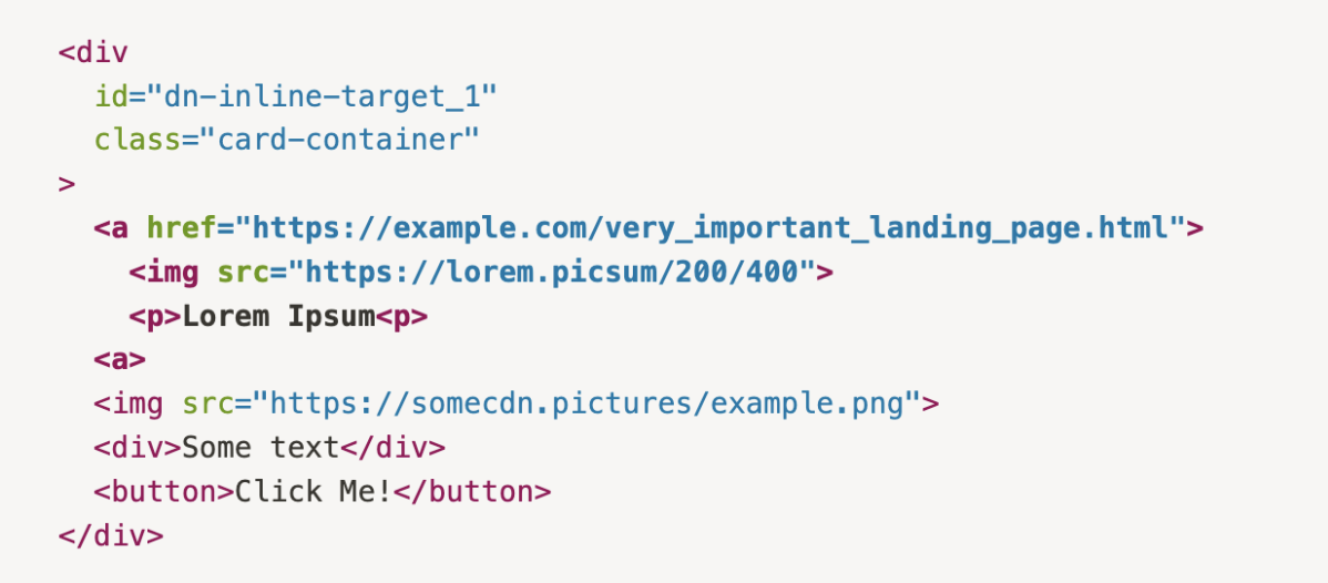
-
End of: This option adds the injected content at the end of the selected element.
Example:
Consider the following HTML element.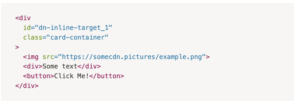
If you choose the End of type with the provided selector and content, the element will be modified as follows: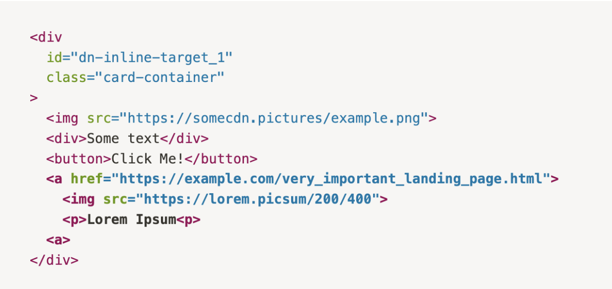
-
Add Before: This option inserts the injected content before the selected element.
Example:
Consider the following HTML element.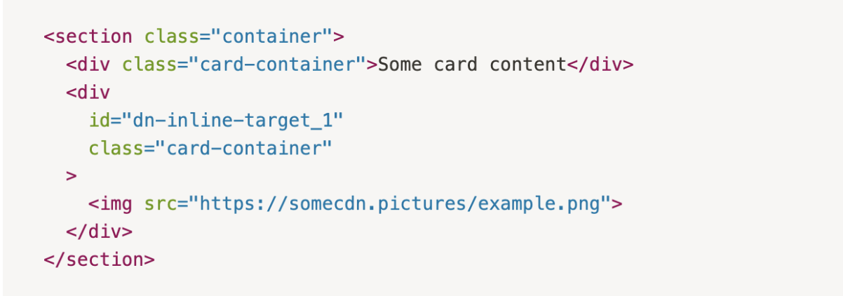
If you choose the Add Before type with the provided selector and content, the element will be modified as follows: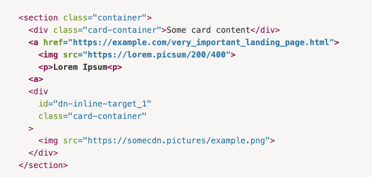
-
Add After: This option inserts the injected content after the selected element.
Example:
Consider the following HTML element.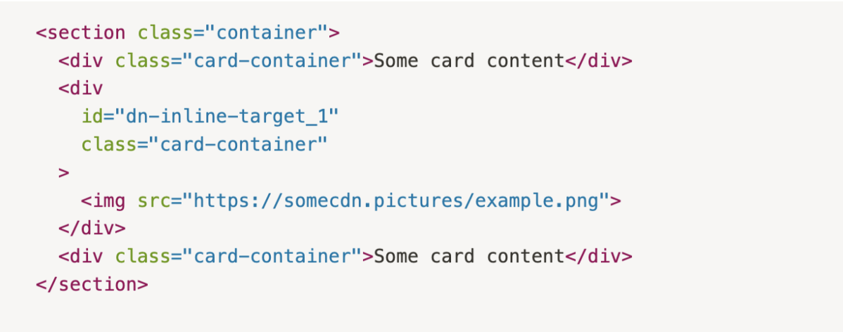
If you choose the Add After type with the provided selector and content, the element will be modified as follows: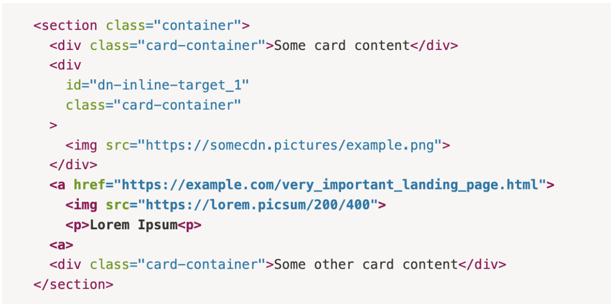
-
If the selected selector and type values target either the html or head elements, no action will be performed.
8. Testing
- In this section, a customer can enable A/B testing to offer the best content among all options for the audience. If the customer opts for A/B testing, you are supposed to select more than one content to essentially understand what is the best one for better customer engagement.
Step 2: Content
In the Campaign Settings under the Content section, users have two options:
- Choose from Existing Content: Select an existing on-site inline content from the list. When users select the content they want to add to the campaign, a preview will appear on the right side of the screen.
- Create New Content:
- Click on the New button.
- Choose Visual Editor.
- Select Inline to create new on-site inline content.
This allows users to either use pre-existing content or create fresh inline content as needed.
Step 3: Delivery Control
In this section, configure how and when your on-site inline content is displayed to users.
Campaign Priority
Set the campaign priority to control how prominently it is displayed:
- High: Shows the campaign with top priority.
- Medium: Default setting, showing the campaign with normal priority.
- Low: Shows the campaign with lower priority compared to other campaigns.
Show Frequency
- Show Without Limits: Allows the campaign to be shown an unlimited number of times for each visitor. This option is recommended to ensure the campaign displays consistently without restrictions.
- Show With Limits: If you prefer to set limits, make sure the targeted div is also supported by another image or content to prevent any potential issues or blank spaces in case the campaign doesn’t appear. Configure the following settings:
- Show to Each Visitor Up to X Times: Define the maximum number of times each visitor can see the content. For example, setting this to "5" will display the campaign up to five times per visitor.
- Show to Each Visitor Once in Every X Minutes: Set the interval between displays for each visitor. For example, setting this to "5" ensures the campaign is shown only once every five minutes per visitor.
- Do Not Show After Engagement: When enabled, the campaign will stop displaying to a visitor after they have engaged with it.
Step 4: Summary
In the Summary section, review your selected settings for the on-site inline campaign:
- Settings:
- Campaign Info: Name, Website, Duration.
- Details: Platform, Target Audience, Show Trigger, Show Location, Inline Target.
- Content: Displays the specific content selected for this campaign.
- Delivery: Shows the campaign's priority level and frequency settings (limits or unlimited views).
If any updates are needed, click Edit next to each section to adjust your choices.
This final overview helps confirm your campaign setup before publishing.
Save and Activate Your Campaign
- Save the Campaign:
After reviewing your campaign in the Summary step, click the Save button located at the upper right corner of the screen. - Activation Pop-Up: Once you click Save, a pop-up will appear saying:
- "Campaign successfully saved. Do you want to activate the campaign?"
- Activate the Campaign:
- To launch the campaign, select Yes in the pop-up.
- If you prefer to activate it later, select No to keep it saved as a draft.
By following this final step, your Onsite Inline campaign will be saved and activated if you choose to proceed.
Updated 3 months ago