
Recommendation Engine- Onsite
The Recommendation Engine for Onsite allows you to show personalised product recommendations directly on your website. It helps you present the most relevant products to each visitor based on behaviour, catalogue data and defined recommendation rules.
With this feature, you can increase product discovery, improve user experience and drive higher conversion by automatically showing products that match each user’s interests and actions. You can fully control which recommendation model is used, how many products are displayed and what should happen if no products are found.
Prerequisites
Before using Recommendations, ensure that:
- The SDK is integrated.
- Mobile SDK (iOS & Android): https://dev.dengage.com/reference/recommendation-ios-android-sdk
- Web SDK: https://dev.dengage.com/reference/recommendation-web-sdk
- Analytics Event Definition is enabled.
- Product integration is completed.
How to Access
- Go to Content > Marketing > Onsite.
- Click the New button.
- Select Visual Editor, HTML Editor.
- Enter the required information such as Name and Description, then click Next to open the Content section.
To add the recommendation component:
- Visual Editor: Go to the Recommendation section and select Recommendation Widget.
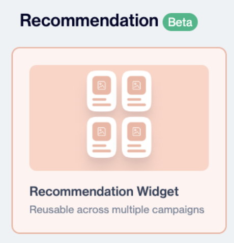
Recommendation Widget
- HTML Editor: Click Insert > Dynamic Content.Then, in the Dynamic Content panel, select Product Box from the first tab.
After selecting Product Box, you can configure the Recommendation Engine to display personalised product recommendations.
How to Use
Create the Widget
After selecting the Recommendation Widget template, you will first see the General screen. Enter a name for your widget and optionally add a description for internal reference. Select the folder where the content will be stored.
Click Next to continue.
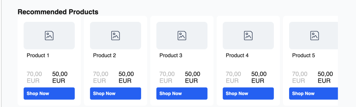
Recommended Products
Recommendation Rule Selection
In this section, select the recommendation rule that determines which products will be displayed in the widget. The selected rule defines the recommendation logic and product selection used to generate personalised recommendations.
Click Select to choose an existing recommendation rule.
For more information about creating and configuring recommendation rules, see the Recommendation Rules section.
Widget Layout & Structure
You can control how your recommendation widget looks and behaves using the layout and navigation settings below. These settings help you create a more engaging and user-friendly experience.
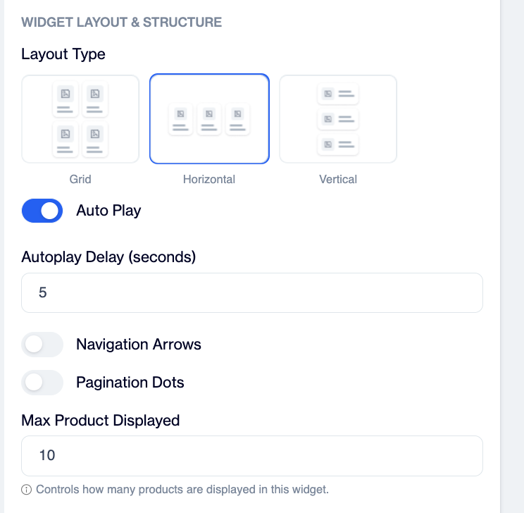
Widget Layout & Structure
Layout Type: Choose how products are displayed in the widget:
- Grid: Displays products in a multi-column layout.
- Horizontal: Shows products in a scrollable row.
- Vertical: Stacks products in a single column.
Auto Play: Enable this option to automatically scroll through products.
- Autoplay Delay (seconds): Define how often the products should slide (e.g. every 5 seconds).
Navigation Arrows: Enable arrows to allow users to manually navigate between products.
- You can upload a custom icon or provide a URL.
- Supported formats: JPEG, PNG, GIF (max 20 MB).
Pagination Dots
Display dots to indicate the number of product slides.
- Default Color: Set the color of inactive dots.
- Active Color: Set the color of the selected dot.
- All Dots: Shows a dot for each product group.
- Dynamic Dots: Adjusts the number of visible dots based on content.
Max Products Displayed
Define the maximum number of products shown in the widget (e.g. 10).
This helps control layout size and overall user experience.
Customize Style
You can customise the appearance of your recommendation widget separately for desktop and mobile. If you prefer a consistent design, you can apply desktop settings to mobile with a single option.The layout can be adjusted by defining the number of product rows to display.
Widget Title
You can also choose to show a widget title and enter a custom title such as “Recommended Products.”
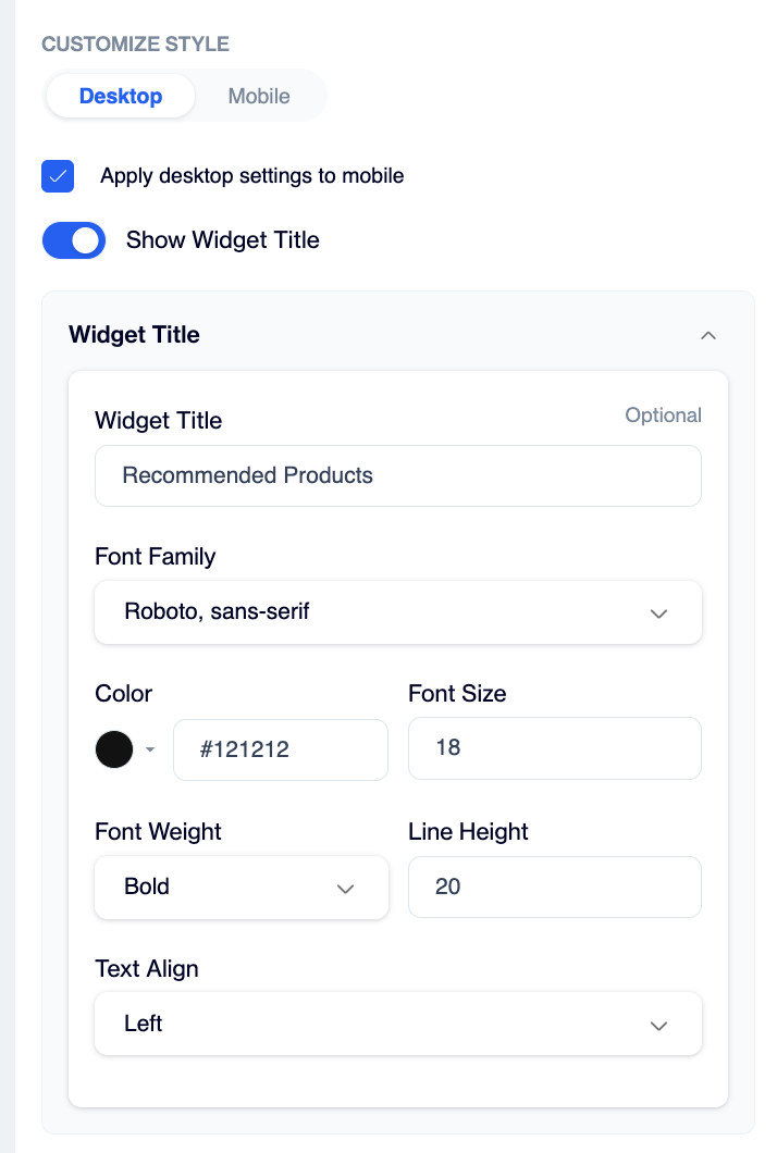
Widget Title
The title style can be further refined by selecting the font family, color, font size, font weight, line height, and text alignment to match your overall design.
Product Card
You can control the size and spacing of each product card to match your design. Define the card width and height, adjust the border radius for rounded corners, and set the border width and color if needed. You can also manage the spacing between cards using the gap setting and set a background color for the card area. For spacing, use the product box padding option.
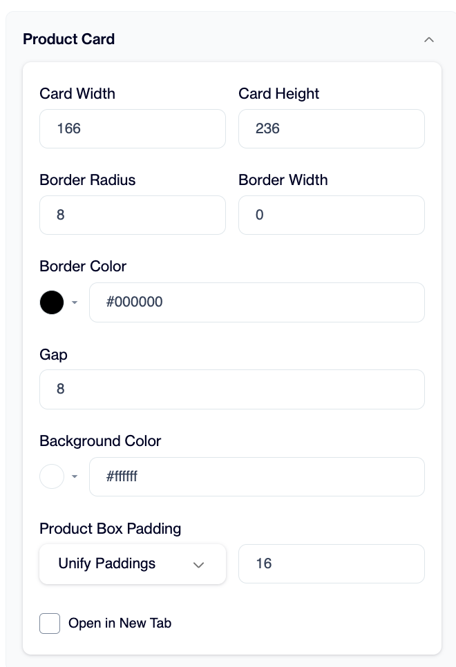
Product Card
Product Image
You can customise how product images are displayed within each card. Enable Fill Available Space to make the image automatically adjust to the container. You can also define a fixed image width and height, adjust the corner radius for rounded edges, and control the spacing using image padding.
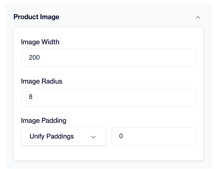
Product Image
Product Title
You can customise the appearance of the product title to match your design. Adjust the font family, color, font size, font weight, line height, and text alignment to control how the title is displayed. You can also manage the spacing around the title using padding.
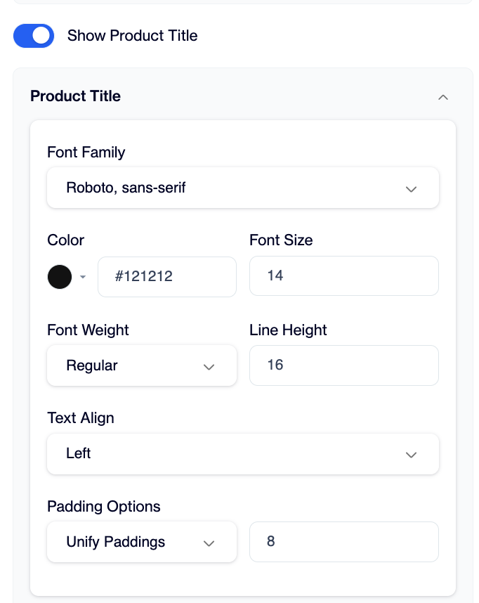
Product Title
Product Price
You can customise how the product price is displayed to match your design. Adjust the font family, color, font size, font weight, line height, and text alignment to control the look of the price. You can also define the currency (e.g. TL) and manage spacing using price padding.
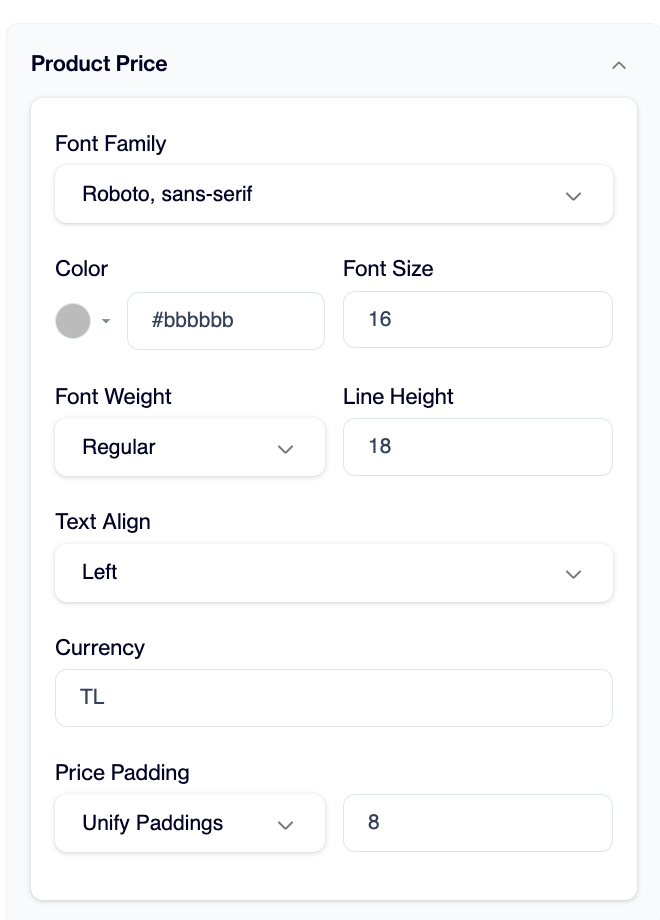
Product Price
Discounted Price
You can enable Show Discounted Price to display both the original and discounted prices. The price layout can be arranged horizontally to show them side by side, and you can choose to cross out the original price to clearly highlight the discount.
The discounted price style can be customised by adjusting the font family, color, font size, font weight, line height, and text alignment. You can also define the currency (e.g. TL) and control spacing using discount price padding.
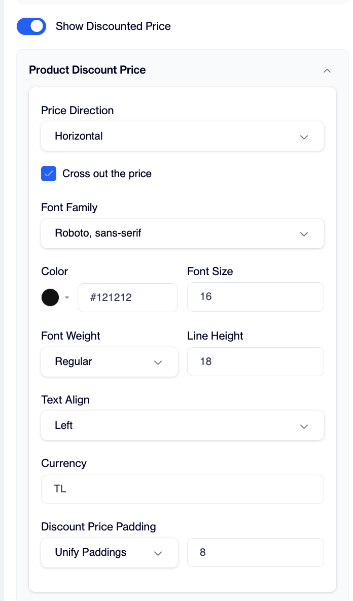
Discounted Product Price
CTA Button
You can customise the call-to-action button to match your design and messaging. Define the button text and adjust its appearance by setting the font family, color, font size, font weight, line height, and text alignment.
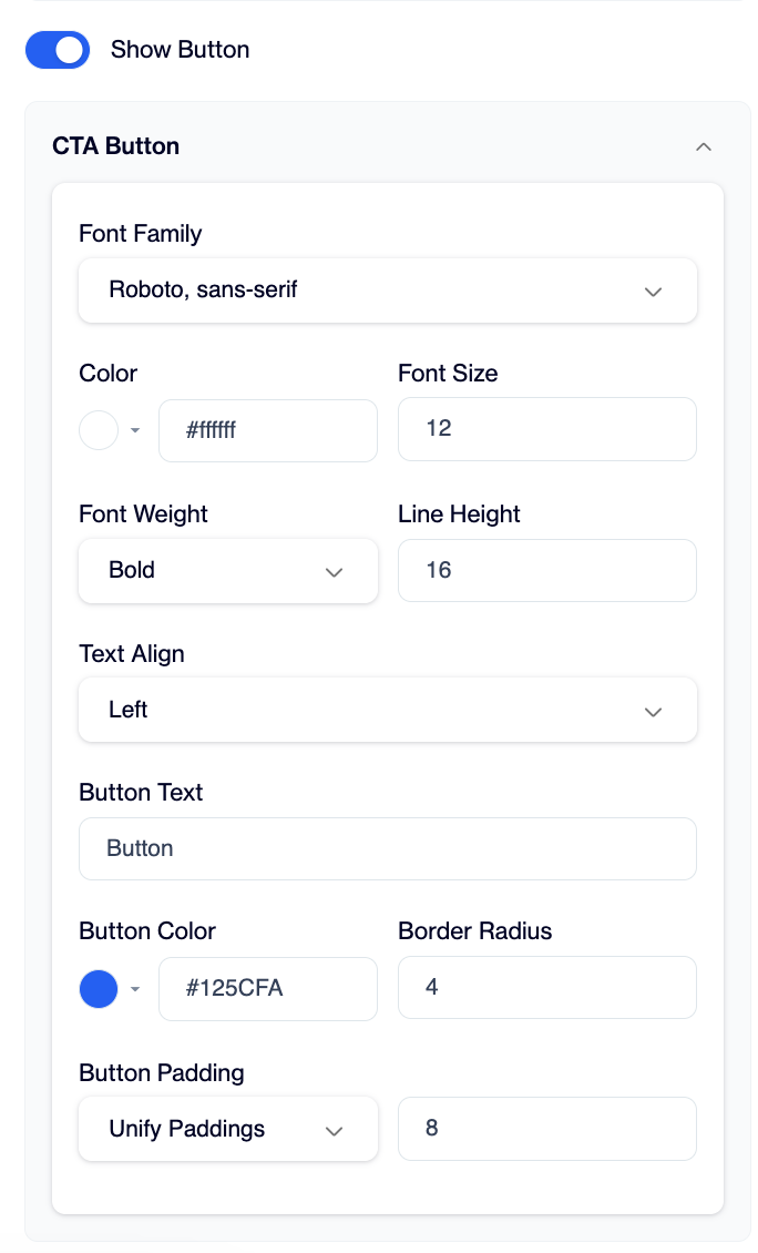
CTA Button
You can also control the button’s visual style by selecting a background color, adjusting the border radius for rounded corners, and managing spacing using button padding. If needed, enable Unify Paddings to apply the same value (e.g. 8) to all sides for a consistent look.
Once your widget is ready, click Save Draft to store your changes and Publish to make the template available for use in your onsite campaigns.
Recommendation Engine - Onsite Campaign
Creating a Recommendation Engine campaign follows the same process as creating an Inline Personalization campaign. When creating the campaign, select Inline Personalization as the campaign type and choose Recommendation as the content type. For detailed campaign creation steps, see Inline Personalization Campaign Creation.
Use Case
A fashion e-commerce brand uses the Recommendation Engine on its product detail pages to increase conversion. When a customer’s visitor views a product, the brand displays a recommendation widget showing Similar Items or Frequently Bought Together products based on that item.
This helps the brand guide its visitors toward relevant alternatives or complementary products without requiring additional search. As a result, the brand increases engagement, encourages higher basket size, and improves overall conversion rates.
Updated 3 months ago