
Creating Push Content
The Push Content section allows users to create push notifications in a straightforward way. Push notifications are created in a single format, ensuring simplicity and efficiency in the content creation process. Users can define the message content, apply filters for sorting and searching, and perform actions such as copying, moving, and deleting push notifications.
All created push content is stored in organized folders, making it easy to access and manage for future use.
How to Access
To begin creating a push notification:
- Navigate to Content > Marketing > Push.
- Click the New button to start creating a new push notification.
When you begin, you will be presented with a page containing two main sections: General and Content.
General
- This section allows you to provide a Content Name and select a Folder for organizing your push notification.
- Once a name is entered, the Content section will become available for editing.
Push Content
Content
- Add Languages
Choose between two options:
Copy from Content: Use content from an existing push notification.
Create Blank Content: Start with a blank push notification template and add content from scratch.
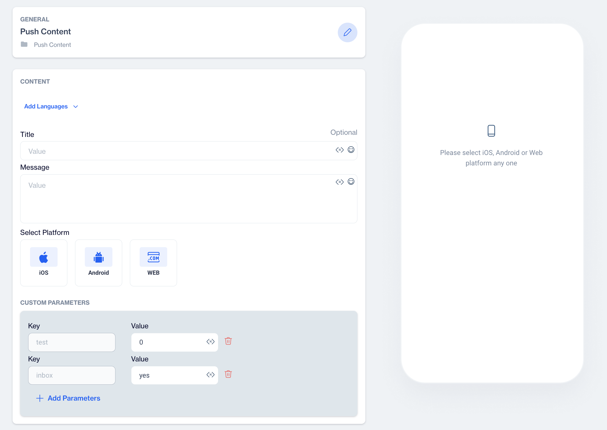
- Title: Enter the title of your push notification.
- Message: Enter the message content for your push notification.
Customization options:
You can use the Customization Selector to personalize your content by adding dynamic fields.
You can also insert emojis directly into the Title or Message to enhance engagement.
- Select Platform
In the same screen, you will need to select the platform for your push notification:
iOS
Android
Web
Once you select a platform, platform-specific options will appear.
Platform Settings
iOS Settings Overview
After selecting the iOS platform for your push notification, the customization options vary depending on the Notification Type you choose: Text, Rich, or Carousel. Each type offers specific settings to help you create tailored, engaging notifications for your users.
iOS Notification Settings: Text Type
When you choose "Text" as the notification type, the following settings will be available:
- Subtitle: Add a subtitle to provide more context or details below the notification title.
- Target URL: Input the URL where users will be directed when they click the notification. You can use the Customization Selector to personalize the URL based on user attributes.
- Sound: This is a resource file name that is embedded in your application. Your application developers can add new sound files.
- Badge: Set the number of notifications displayed on the app icon.
iOS Notification Settings: Rich Type
If you select "Rich" as the notification type, you’ll have all the above options, plus the ability to add Media and Action Buttons:
- Media: Enrich your notification with images. For the best experience, use media files smaller than 600KB and a 2:1 aspect ratio. You can add media in two ways:
- URL: Provide a link to an externally hosted image.
- Upload: Directly upload a file from your system.
- Action Buttons: Add interactive buttons to your notification, allowing users to take quick actions. You can choose from the following options:
- No Action Buttons: The notification won’t have action buttons.
- Yes/No: Adds two buttons labeled "Yes" and "No" for quick responses.
- Confirm/Decline: Adds buttons labeled "Confirm" and "Decline" for decision-making.
- Custom Buttons: Create personalized buttons by specifying a button ID, label text, and a target URL.
iOS Notification Settings: Carousel Type
When you select Carousel as the notification type, you’ll need to configure Carousel Customization. To add carousel content, click on "Add Carousel Content" and choose between the following options:
- Defined Pages: Create a carousel using predefined content.
- Get from Dynamic Content: Populate the carousel with dynamic content.
Android Settings Overview
After selecting the Android platform for your push notification, the customization options vary depending on the Notification Type you choose: Text, Rich, or Carousel. Each type offers specific settings to help you create tailored, engaging notifications for your users.
Android Notification Settings: Text Type
When you choose "Text" as the notification type, the following settings will be available:
- Subtext: Add a subtitle to provide more context or details below the notification title.
- Target URL: Input the URL where users will be directed when they click the notification. You can use the Customization Selector to personalize the URL based on user attributes.
- Sound: Select a sound to play when the notification is received. You can also customize the sound based on user preferences using the Customization Selector.
- Badge: Set the number of notifications displayed on the app icon. If you enable this setting, you’ll need to specify the Badge Count (e.g., 1, 2, 3, etc.).
Android Notification Settings: Rich Type
If you select "Rich" as the notification type, you’ll have all the above options for Text type, plus the ability to add Media and Action Buttons:
- Media: Enrich your notification with images. For the best experience, use media files smaller than 600KB and a 2:1 aspect ratio. You can add media in two ways:
- URL: Provide a link to an externally hosted image.
- Upload: Directly upload a file from your system.
- Action Buttons: Add interactive buttons to your notification, allowing users to take quick actions. You can choose from the following options:
- No Action Buttons: The notification won’t have action buttons.
- Yes/No: Adds two buttons labeled "Yes" and "No" for quick responses.
- Confirm/Decline: Adds buttons labeled "Confirm" and "Decline" for decision-making.
- Custom Buttons: Create personalized buttons by specifying a button ID, label text, and a target URL.
Android Notification Settings: Carousel Type
When you select Carousel as the notification type, you’ll have all the above options for Text type then you’ll need to configure Carousel Customization. To add carousel content, click on "Add Carousel Content" and choose between the following options:
- Defined Pages: Create a carousel using predefined content.
- Get from Dynamic Content: Populate the carousel with dynamic content.
Web Settings Overview
After selecting the Web platform for your push notification, the customization options vary depending on the Notification Type you choose: Text, Rich, or Carousel. Each type offers specific settings to help you create personalized and engaging notifications for your users.
Web Notification Settings: Text Type
When you choose "Text" as the notification type, the following settings will be available:
- Target URL: Input the URL where users will be directed when they click on the notification. The Customization Selector can be used to personalize the URL based on user data.
- Badge URL: Specify a URL to display a badge on the notification. Note that Badge URL is not supported in MacOS Safari.
- Icon: Upload an icon to display alongside your notification. Icons must be square, with a recommended size of up to 256x256 pixels. There are three options for the icon:
- No Icon: No icon will be shown.
- Default: Use the default system icon.
- Custom: Upload a custom icon.
Note: Media, Icon, and Badge URL are not supported in MacOS Safari.
Web Notification Settings: Rich Type
If you select "Rich" as the notification type, you’ll have all the settings available for Text notifications, plus additional options for Media and Action Buttons:
- Media: Enrich your notification with visuals. To ensure optimal performance, use media files smaller than 600KB and an aspect ratio of 2:1. You can add media in two ways:
- URL: Provide a link to an externally hosted image or video.
- Upload: Directly upload an image or media file from your system.
- Icon: Upload an icon to display alongside your notification. Icons must be square, with a recommended size of up to 256x256 pixels. There are three options for the icon:
- No Icon: No icon will be shown.
- Default: Icon url in the application definition.
- Custom: Upload a custom icon.
Note: Media, Icon, and Badge URL are not supported in MacOS Safari.
- Action Buttons: Add interactive buttons to your notification to allow users to take immediate action. You can choose from:
- No Action Buttons: The notification will not include any action buttons.
- Yes/No: Adds two buttons labeled "Yes" and "No" for quick responses.
- Confirm/Decline: Adds buttons labeled "Confirm" and "Decline" for user decisions.
- Custom Buttons: Create custom buttons by specifying a button ID, label text, and a target URL.
Custom Parameters
Custom parameters allow you to send additional data within a push notification. These parameters do not visually impact the notification itself but are transmitted to the application alongside the push message. Here's how they function and their purpose:
- No Visual Effect: Custom parameters do not appear on the notification received by the user. They are purely for backend use.
- Usage in Applications: These parameters can be utilized only if the application has specific code implemented to process them. Developers can write custom logic in the app to perform specific tasks based on the received parameters.
- Limited Use Case: Custom parameters are designed to address very specific requirements. They require collaboration with app developers to be functional and are not useful without such support.
With Custom Parameters, you can:
- Pass additional information (e.g., how to open a link).
- Customize how the push is displayed by handling it yourself in your app (instead of letting the SDK render it).
- Track specific events or attributes for analytics.
- Send design or functionality details (e.g., background color, image URL, button behavior) that your app can interpret.
The SDK only delivers these parameters. What happens next is completely decided by your app's development team.
How to Configure Custom Parameters
Step 1: Define Custom Parameters in Settings
- Go to Settings > Campaign Configurations > Push Custom Parameters.
- Click Add to define a parameter.
- Enter:
- Key → The name of the parameter.
- Default Value → A default value to appear when creating new pushes.
- Click Add to save, or Cancel to discard.
These parameters will then appear by default whenever you create a new push message.
Step 2: Add or Edit Custom Parameters in a Push
- When creating a new push (Content > Mobile/Web Push > New), go to the Custom Parameters section.
- You will see the predefined parameters (from settings) already listed.
- You can:
- Edit default values for this push.
- Add new parameters that are specific to this campaign.
- Remove parameters if not needed.
- You can:
Example Use Cases
Custom Rendering: If you don't want the SDK to show the push, you can handle it yourself. For example, define a parameter like:
- background_color = #FF0000
- image_url = https://example.com/banner.png
Then, your app will display the push with that background and image.
Button Behavior: Add a parameter like:
- open_type = browser (open in external browser)
- open_type = in_app (open inside the app)
Tracking: Pass custom event data that your app will log for analytics.
Custom Parameters are defined in Settings and appear automatically in new push campaigns. They allow you to send extra data with a push. Your app decides what to do with these parameters (custom rendering, analytics, logic, etc.). Default parameters can be predefined, and additional ones can be added or removed per campaign.
This feature gives flexibility to developers who want to customize the push notification experience beyond the standard SDK rendering.
Developer Assistance Needed
Implementing these parameters requires developer assistance to ensure the custom data is properly handled and triggers the intended actions.