
Full Image
The Full Image template displays a single, full-screen image to create a strong visual impact for users.
Creating a Full Image
Full Image
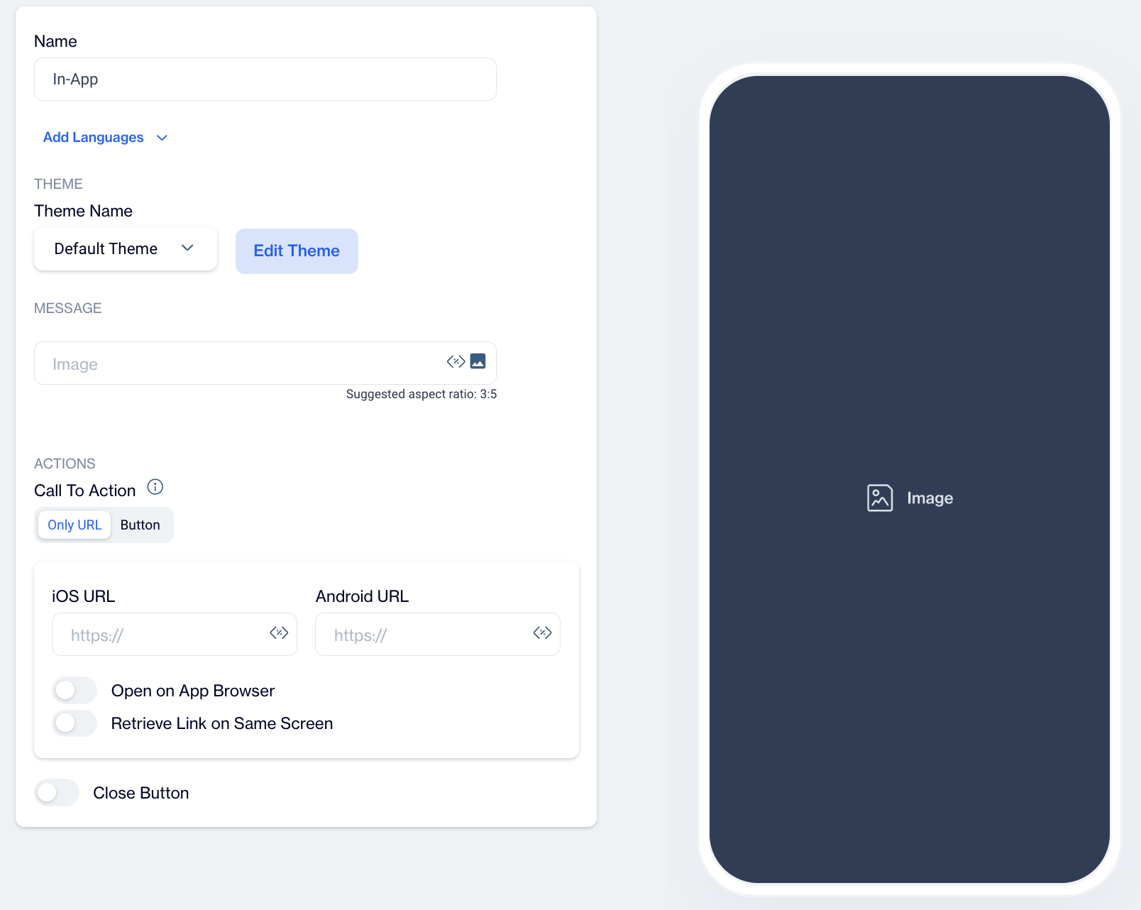
- Name: Enter a name for your Full Image to easily identify it in your list of templates.
- Preview on Mobile: Once the Full Image template is selected, preview how it will look on mobile devices on the right side of the screen.
- Add Languages: Expand your reach by adding multiple language versions of the Full Image template. You can:
- Copy from Content: Duplicate existing content for consistency across languages.
- Create Blank Content: Customize the image for each language independently.
THEME
Edit Theme: In the Edit Theme section, you can customize the appearance of your In-App Full Image by adjusting the following parameters:
General
- Font Family: Choose from options like Helvetica, or Roboto.
- Background Color: Set the background color.
- Card Radius: Adjust the radius of the survey card.
- Card Padding: Define the padding inside the card.
- Margin Top (px): Set the top margin.
- Margin Bottom (px): Set the bottom margin.
- Margin Right (%): Specify the right margin.
- Margin Left (%): Specify the left margin.
Message
- Message Color: Choose the text color for the message.
- Font Size: Set the font size for the message text.
- Text Align: Align the text (options include Left, Center, Right).
- Weight: Adjust the font weight (options include Normal, Bold).
Buttons
- Font Family: Choose a font for the buttons (options include Helvetica, Arial, sans-serif).
- Font Size: Set the font size for button text.
- Button Radius: Adjust the button’s border radius.
- Weight: Choose the font weight for button text (options include Normal, Bold).
- Fit Content: Option to set the button width to fit the text.
Primary&Secondary&Tetriary Button
- Background Color: Define the button's background color.
- Text Color: Set the text color for the button.
- Border Color: Choose the border color for the button.
- Border: Define the border thickness.
Close Button
- Icon Color: Set the color for the close button icon.
- Icon Size: Specify the size of the close button icon.
After clicking Save as New, a pop-up window will appear prompting you to name your new theme. Enter a unique name in the provided text field to identify your theme easily in the future. Once you’ve chosen a name, click OK to finalize your custom theme.
MESSAGE
Image
Select the primary image using the Image Selector and add customization if needed.
ACTIONS
Call to Action Options
- Only URL: Users are directed to a specified URL as soon as they click on the Full Image, ideal for quick navigation without buttons.
- Button
 Add an action button that directs users to a URL or performs another action.
- Button Action Type: Choose the action that occurs when users interact with the Full Image button:
- Open URL: Directs users to a specified URL.
- Dismiss: Closes the Full Image, suitable for informational images.
- Permission Prompt: Requests permissions if the image leads to a feature requiring notifications.
- Button Action Type: Choose the action that occurs when users interact with the Full Image button:
Toggles:
- Open on App Browser: Opens the link within the app’s browser, keeping users within the app while they view the content.
- Retrieve Link on Same Screen: Opens the URL on the same screen without navigating away, maintaining user focus on the current page.
Close Button: Adds a close (X) button to the full image, allowing users to dismiss it if they do not wish to engage with it.
After creating your Full Image content, you can save it as a draft or publish it for your in-app campaigns when ready.