
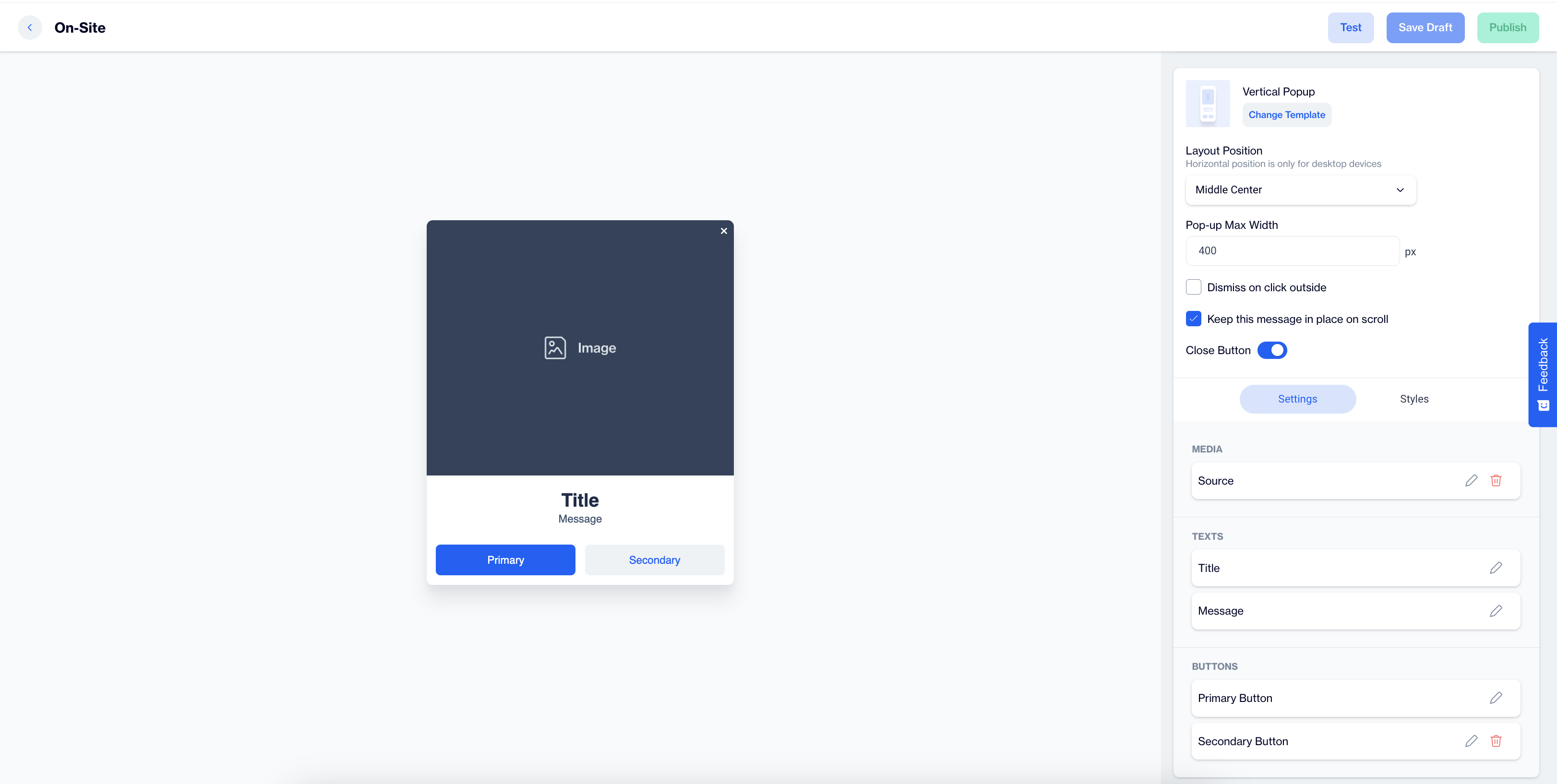
Vertical Popup
The Vertical Popup is an on-site element designed to display a combination of images, text, and buttons in a vertical layout, making it ideal for delivering engaging messages or calls to action.
Creating Vertical Popup
Vertical Popup
Preview on Desktop or Mobile:
After selecting the Vertical Popup template, users can preview how the popup will look on desktop and mobile devices on the left side of the screen.
General Section
As with other on-site elements, the General Section allows users to input the Name and Folder details to organize the popup for easy management.
Content Section
- Change Template:
Users can switch between different templates by clicking the Change Template button, allowing flexibility.
- Layout Position:
The Layout Position dropdown provides several placement options, including Middle Center, Bottom Center and others, for desktop devices. Horizontal position settings are available only for desktop users.
- Pop-up Max Width:
Users can set a maximum width for the popup to maintain its appearance within the page's design.
- Dismiss on Click Outside:
Enable this option to allow users to close the popup by clicking outside its borders.
- Keep This Message in Place on Scroll:
Toggle this on to ensure the popup remains visible as users scroll down the page.
Settings
Media:
- Media Type: Users can select between an image or video to display.
- Source: Below the media type selection, users provide the source for the media, with additional customization options available for images through the Customization Selector.
Texts:
In this section, users can click on the pencil icon next to the Title and Message to edit their text. The Customization Selector is available for adding dynamic content that personalizes the popup based on the user’s flow or real-time targeting.
Buttons:
- Primary Button: Customize the main call-to-action button. Users can edit the button's text and customize its appearance.
- Secondary Button: If applicable, a secondary button can be added, which is fully customizable with similar options to the primary button.
After clicking on the icon in the right corner, users need to click the Save & Back button to save their changes and return to the previous screen.
Styles
- General: In the General section, users can select a font family or input a custom Font URL. They can adjust the Card Radius for rounded corners and modify Card Padding to control spacing within the popup. Additionally, users can set the Background color, and customize the Close Button color and size to fit the overall design.
- Title: The Title section allows users to customize the Color, Font Size, and Text Alignment. The Font Weight can be set to Bold for a more prominent appearance, ensuring the title captures attention.
- Message: In the Message section, users can adjust the text’s Color, Font Size, Text Alignment, and Font Weight to create a clear, well-styled message that aligns with the overall design.
- Primary Button: The Primary Button section offers options to modify the button's Text, Text Alignment, Font Size, and Font Weight. Users can also change the Background, Border, and Border Radius to match their site’s style. The Fit Content option is also available to ensure the button fits seamlessly within the design.
- Secondary Button: Similar to the primary button, the Secondary Button section allows users to customize the Text, Text Alignment, Font Size, Font Weight, Background, and Border. The Fit Content option is also available to ensure the button fits seamlessly within the design.
After adding your content successfully, save it as a draft for future use or publish it to make it ready for your campaigns.
Updated 10 months ago