
NPS (Net Promoter Score)
This feature is designed to collect visitor feedback directly within the app, allowing insights through a single-question Net Promoter Score (NPS) format.
Creating a NPS
NPS
Name: Enter a name for your NPS to keep it easily identifiable and organized.
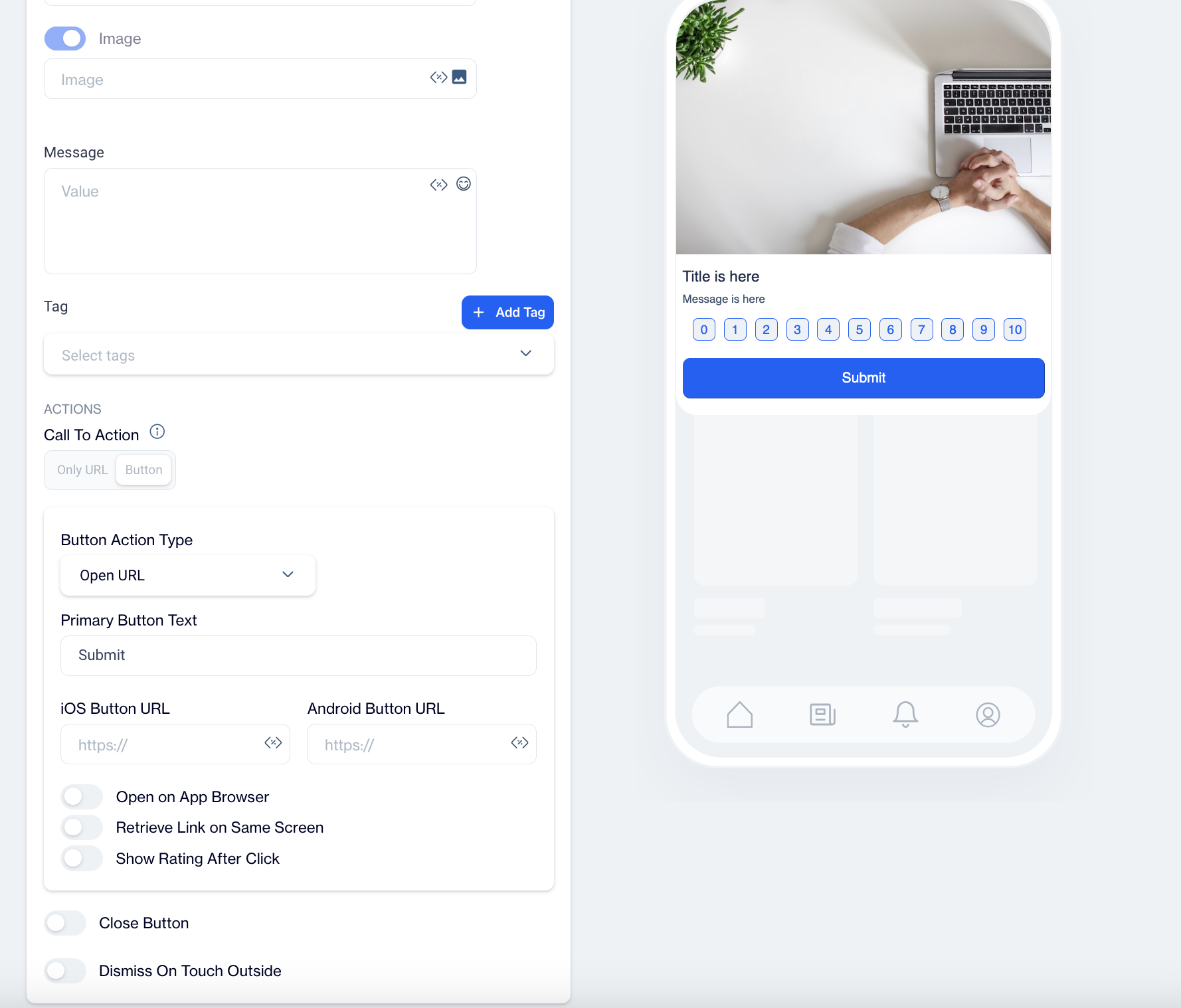
Preview on Mobile: After selecting the NPS template, preview the survey on the right side of the screen to see how it will look on mobile devices.
Add Languages: Add multiple language options for your NPS to engage a broader audience. When adding a new language, choose one of the following:
- Copy from Content: Duplicate the existing content for consistency across languages.
- Create Blank Content: Start with a blank template to create unique content for the selected language.
THEME
Edit Theme: In the Edit Theme section, you can customize the appearance of your In-App NPS by adjusting the following parameters:
General
- Font Family: Choose from options like Helvetica, or Roboto.
- Background Color: Set the background color.
- Card Radius: Adjust the radius of the survey card.
- Card Padding: Define the padding inside the card.
- Margin Top (px): Set the top margin.
- Margin Bottom (px): Set the bottom margin.
- Margin Right (%): Specify the right margin.
- Margin Left (%): Specify the left margin.
Message
- Message Color: Choose the text color for the message.
- Font Size: Set the font size for the message text.
- Text Align: Align the text (options include Left, Center, Right).
- Weight: Adjust the font weight (options include Normal, Bold).
Title
- Title Color: Set the color for the title text.
- Font Size: Define the font size for the title.
- Text Align: Align the title text (options include Left, Center, Right).
- Weight: Adjust the font weight for the title (options include Normal, Bold).
Buttons
- Font Family: Choose a font for the buttons (options include Helvetica, Arial, sans-serif).
- Font Size: Set the font size for button text.
- Button Radius: Adjust the button’s border radius.
- Weight: Choose the font weight for button text (options include Normal, Bold).
- Fit Content: Option to set the button width to fit the text.
Primary Button
- Background Color: Define the primary button's background color.
- Text Color: Set the text color for the primary button.
- Border Color: Choose the border color for the primary button.
- Border: Define the border thickness.
Close Button
- Icon Color: Set the color for the close button icon.
- Icon Size: Specify the size of the close button icon.
After clicking Save as New, a pop-up window will appear prompting you to name your new theme. Enter a unique name in the provided text field to identify your theme easily in the future. Once you’ve chosen a name, click OK to finalize your custom theme.
MESSAGE
Title: Enter the title for your NPS message, with options to add Customization and Emojis to boost engagement.
Image: Use the Image Selector to add an image, with an option for Customization.
Message: Input your NPS message, adding Customization and Emojis to personalize the experience.
Tag: Select a tag from the Dropdown Menu or click Add Tag to create a new one.
Create a Tag
To set up and configure tags, follow these steps:
- Tag Name
- Enter a unique name in the Tag Name field.
- This field is required, so be sure to provide a clear, identifiable name for the tag.
- Tag Type
- Tag Type is set to Key Value. This setting allows you to create a custom key-value pair to categorize or identify specific data points.
- Value Type
- Choose the Value Type for the tag data:
- TEXT – For values containing text, such as names or labels.
- INTEGER – For numeric values, such as scores or counters.
- Choose the Value Type for the tag data:
- Description
- Provide a Description to explain the purpose or usage of the tag.
- This helps others understand the context of the tag in your system.
- Audience Type
- Select the Audience Type for the tag, determining if it is Contact-Specific or Device-Specific:
- Contact Specific – Use this option for tags that target individual user profiles.
- Device Specific – Select this for tags associated with devices rather than specific users.
- Select the Audience Type for the tag, determining if it is Contact-Specific or Device-Specific:
ACTIONS
Button Action Type Select what the button will do when the user interacts with it:
- Open URL: Directs users to a specified URL. Use this if you want to lead users to a website or product page after they complete the NPS survey. Enter the URL to navigate users there.
- Dismiss: Closes the NPS survey. This is useful for collecting quick feedback without any further action.
- Permission Prompt: Requests specific permissions from the user. If your NPS survey relates to features that require notifications, select this option to prompt for permission.
Primary Text ButtonCustomize the button text (e.g., "Submit" or "Rate") to clarify its purpose and encourage interaction.
iOS Button URL & Android Button URLProvide platform-specific URLs if needed, directing iOS and Android users to different pages.
Toggles
- Open on App Browser: Opens the link within the app’s own browser, keeping users within the app to view the linked content.
- Retrieve Link on Same Screen: Opens the URL on the same screen, maintaining focus and minimizing screen transitions.
- Show Rating After Click: Enables a rating option immediately after users click the button, allowing for additional feedback. Use this to prompt users to rate their experience following the NPS survey.
- Close Button: Adds a visible close (X) button on the NPS survey, providing users with an easy option to exit the survey at any time.
- Dismiss on Touch Outside: Allows users to close the NPS survey by tapping outside of it.
After creating your NPS content, you can save it as a draft or publish it for your in-app campaigns when ready.