
Smart Search - Onsite
Smart Search enables you to provide personalized search and recommendation experiences within your channels. With this feature, users can search for products or content and receive relevant recommendations based on the configured search service.
Currently, Smart Search is available for Onsite channels, . It can also be used in mobile applications and other custom environments after the required service and API endpoint setup is completed. Once the search endpoint is provided by the development team, you can integrate it into your own custom interface and use your preferred designs and recommendation structures.
To use this feature, the Smart Search service must first be enabled and configured by the development team. This setup includes creating the required Search Container configuration in the backend. Since there is currently no user interface for managing Search Container settings, the required configuration must be completed by the development team before the feature can be used.
Smart Search helps improve product discovery, makes search experiences more relevant for users, and supports higher engagement by showing personalized recommendations.
Prerequisites
Before using Recommendations, ensure that:
- The SDK is integrated.
- Mobile SDK (iOS & Android): https://dev.dengage.com/reference/recommendation-ios-android-sdk
- Web SDK: https://dev.dengage.com/reference/recommendation-web-sdk
- Analytics Event Definition is enabled.
- Product integration is completed.
How to Access
To create and use a Smart Search:
- Navigate to Content > Marketing > Onsite.
- Click the New button.
- Select Visual Editor.
- Under the Recommendation section, choose the Search Widget template.
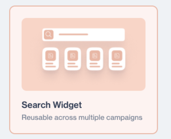
Search Widget
After selecting the template, you can configure and design your Smart Search experience.
How to Use
On the template screen, you will see a preview area for both desktop and mobile views so you can review how the Search Widget will appear on different devices.
Next to the preview area, there is a General section where you can enter the widget Name, Description, and select a Folder.
After completing these fields, click the Next button to continue with the Search Widget configuration.
Behavior Settings
In the Behavior section, you can configure how the Search Widget works on your website.
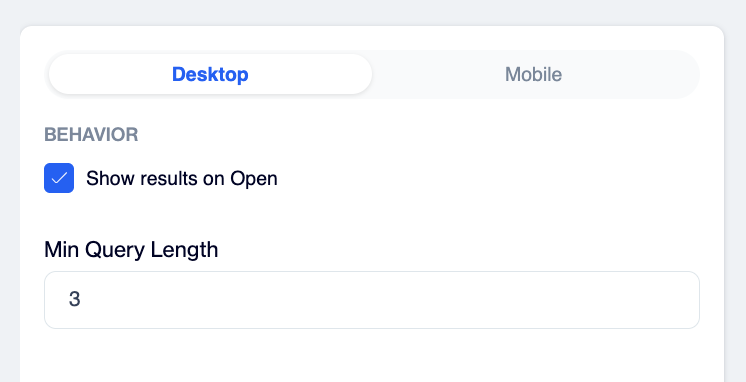
Behavior Settings
- Show Results on Open: Automatically opens and displays the Search Widget when website visitors click the search button.
- Min Query Length: Defines the minimum number of characters visitors must enter before search results are shown.
Example:3means visitors must type at least 3 characters to start searching.
Widget Sections
In the Products section, you can configure which products are displayed when the Search Widget is first opened and how products will appear inside the widget.
As users type in the search box, recommendations will appear.
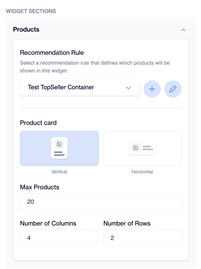
Widget Sections
Recommendation Rule: Select the recommendation rule that defines the products shown when the search box is opened before a visitor starts typing.This helps visitors discover products even before they start searching. For example, you can display Trending Products, Top Sellers, or other recommended product groups.
Here you can either create a new rule, edit an existing one, or select one that is already available. This allows you to fully control the initial product experience and tailor it to your business needs.
After visitors start typing in the search box, the product results are automatically updated based on the entered keyword.
You can also configure how the products are displayed inside the widget.
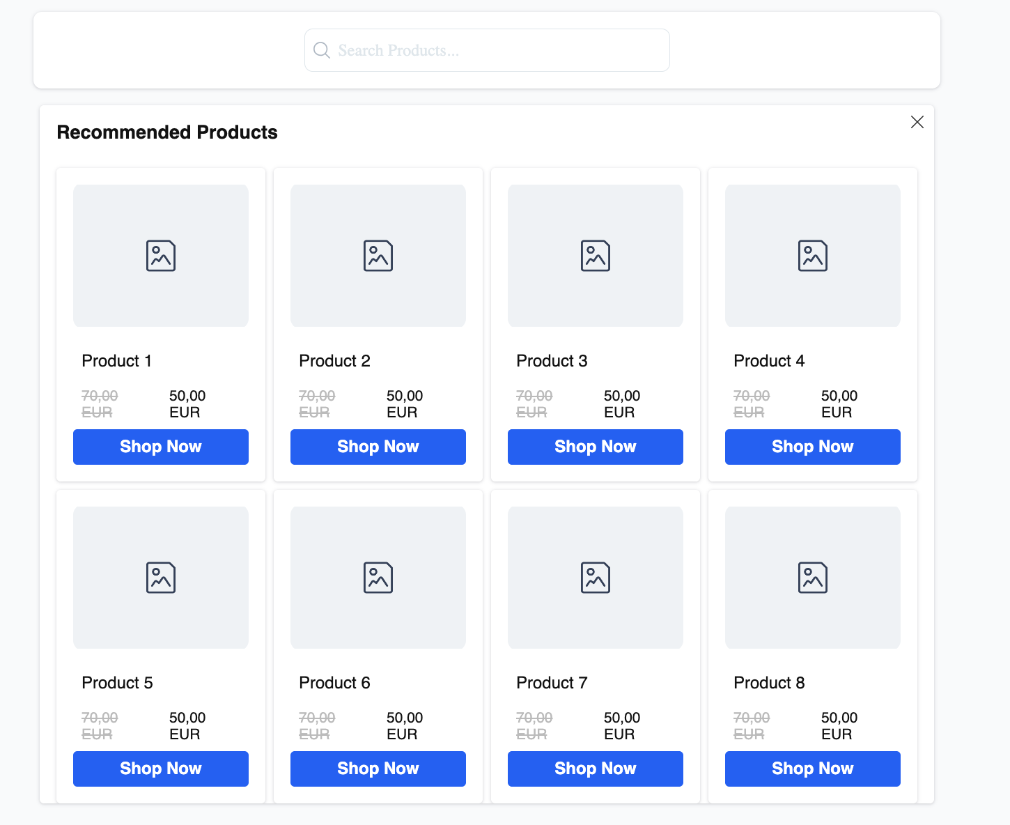
Search Products
The Product Card Layout setting defines the appearance of product cards:
- Vertical Layout displays products in a taller card format.
- Horizontal Layout displays products in a wider card format.
The display area can also be customized using the following settings:
- Max Products defines the maximum number of products displayed in the widget.
The maximum limit is 50 products. - The number of Columns defines how many products appear side by side in a row.
The maximum limit is 6 columns. - The number of Rows defines how many rows of products are displayed.
The maximum limit is 10 rows.
Control how the Search Widget looks and feels on your website. The goal is to match it with your brand design and make the product experience more visually consistent for your visitors.
Container
This section defines the general structure of the widget. Here you control the “frame” of the widget:
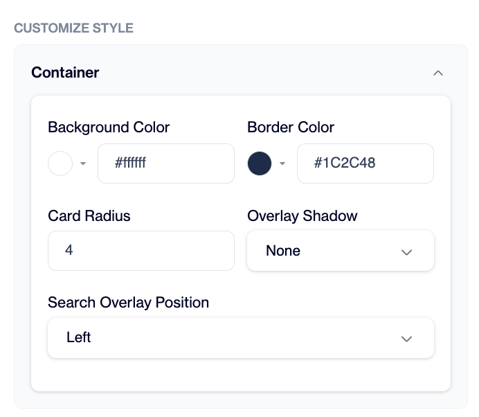
Container
- Background color sets the main widget background (for example white for a clean look).
- Border color defines the outer line of the widget to match your brand colors.
- Card radius controls how rounded the widget corners look (low values = sharp, higher values = more rounded).
- Overlay shadow adds depth and helps the widget stand out more clearly on the page. If no shadow is used, the widget appears with a cleaner and more minimal design.
- Search overlay position decides where the search panel appears inside the page.
Widget Title
The Widget Title section allows you to add a title to the Search Widget, such as “Recommended Products” or “Trending Items.” This helps visitors quickly understand what the widget is showing.
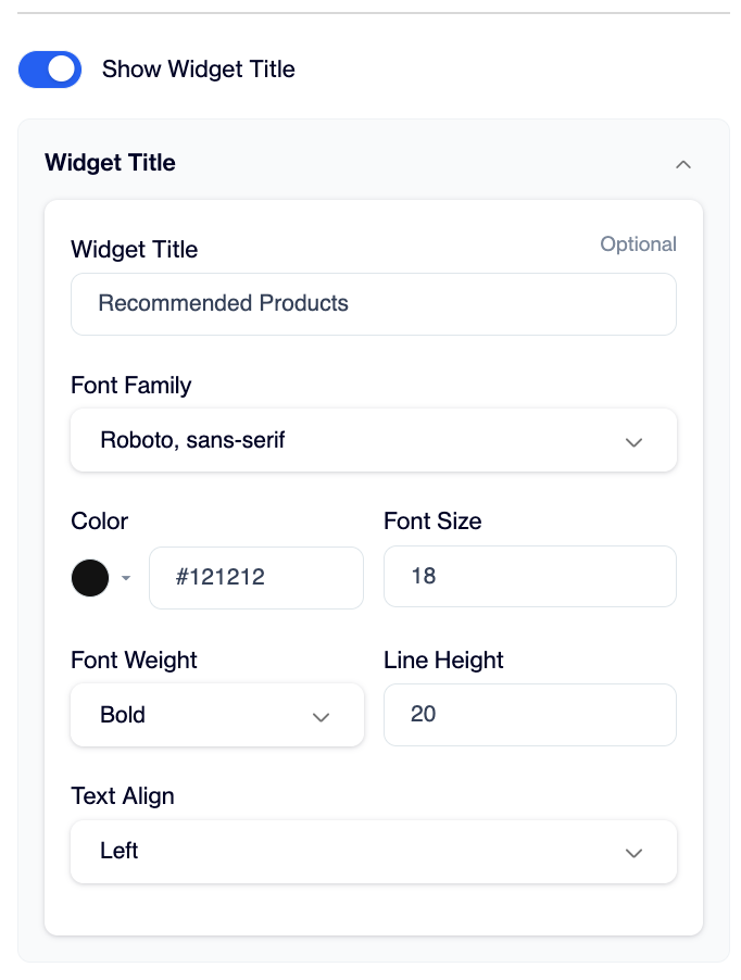
Widget Title
The title is optional and can be customized to match your website design.
You can adjust:
- Font Family to match your website typography
- Color to make the title more visible or align with your brand colors
- Font Size to make the title more prominent or compact
- Font Weight to display the title in a regular or bold style
- Line Height to improve readability and spacing
- Text Align to position the title to the left, center, or right
These settings help create a more consistent and branded search experience for visitors.
Product Card
This section controls how each product is shown inside the widget.
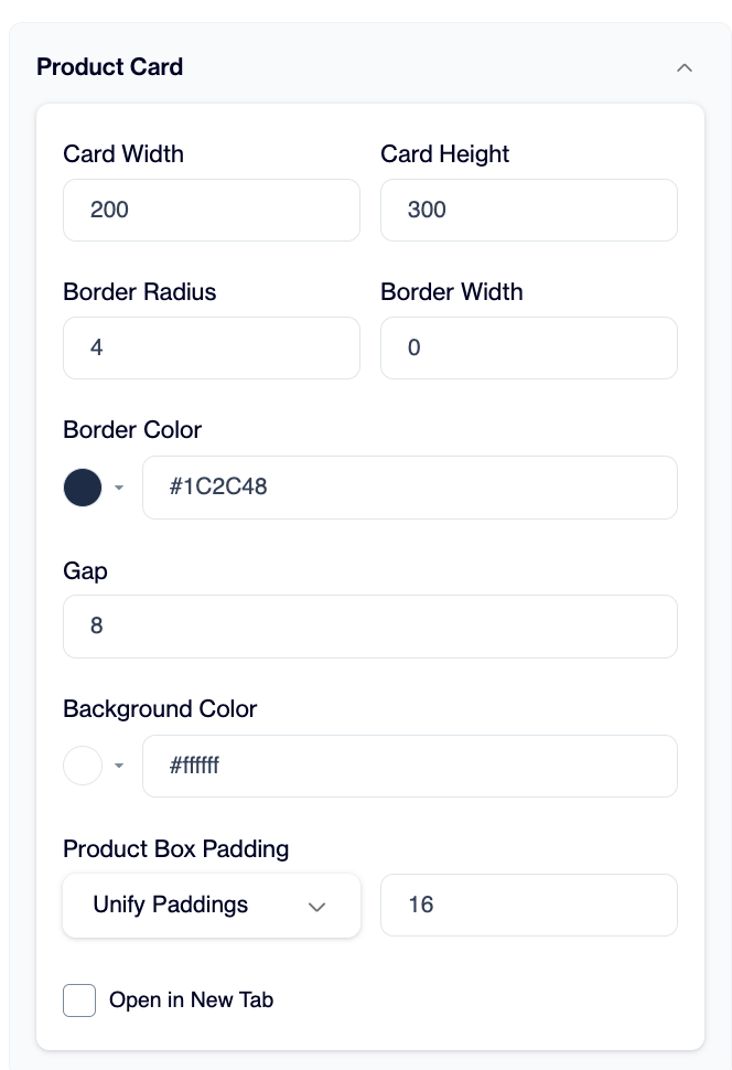
Product Card
You define:
- Card size (width and height) to decide how big each product looks
- Border and radius to match your UI style (modern, rounded, or sharp)
- Spacing between cards to control how dense or spacious the layout feels
- Background color for each product card
Product Box Padding (Unify Paddings) defines the internal spacing inside each product card. This controls how much space exists between the card border and its content (image, title, price, etc.). When padding is unified, all sides use the same spacing value, which helps maintain consistency across all product cards. Increasing padding makes the card feel more spacious and breathable, while reducing it allows more compact content presentation.
This section is important because it directly affects readability and how many products users can see at once. For example, smaller cards allow more products to fit on screen, while larger cards make each product more visible.
Product Image
This controls how product images are displayed.
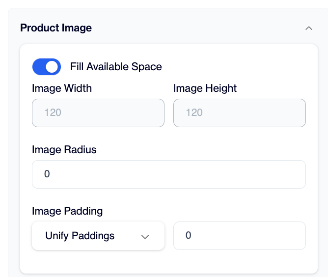
Product Image
You can decide:
- Whether images fill the available space (useful for consistent layouts)
- Image size (width and height) to keep visuals balanced
- Image radius for rounded or square image styles
- Padding around images for spacing control
This helps you maintain a consistent visual structure.
Product Title
This section controls how product names appear.
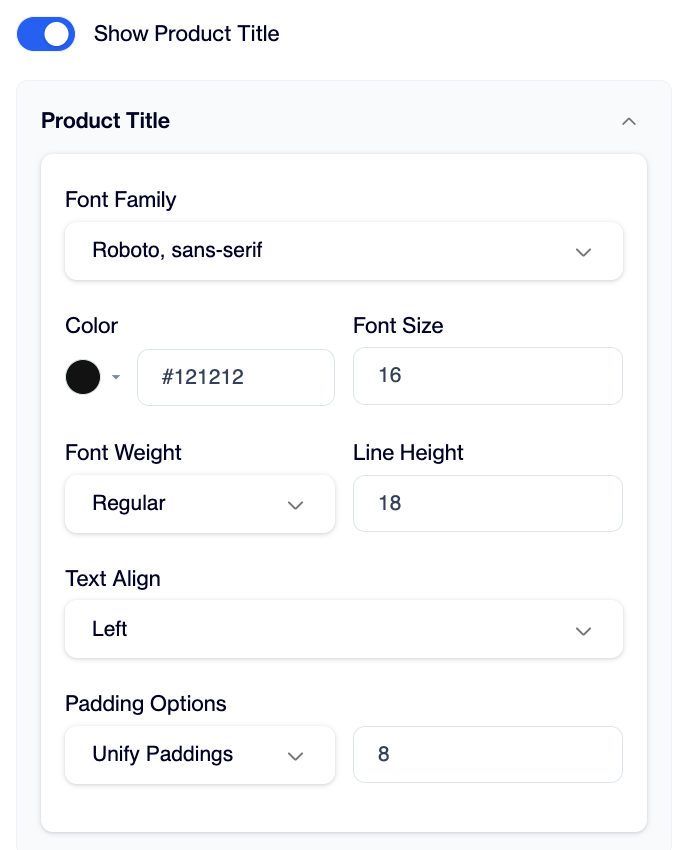
Product Title
You can adjust:
- Font style, size, and weight to match your branding
- Color for readability
- Alignment (left, center, right)
Show Product Title controls whether product names are shown on each product card and can be switched on or off.
A good practice is to keep titles readable and not too large, so users can scan products quickly.
Product Price
Here you define how the product price is shown.
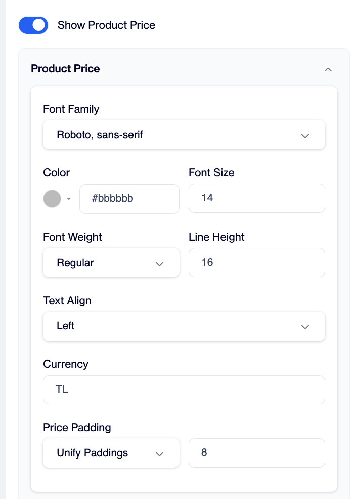
Product Price
You can customize:
- Currency (for example TL)
- Font size and color for visibility
- Alignment and spacing
Show Product Price controls whether the standard product price is displayed on product cards and can be switched on or off.
This is important for clarity, so users can quickly understand product value.
Discounted Price
If a product has a discount, this section controls how both original and discounted prices appear.
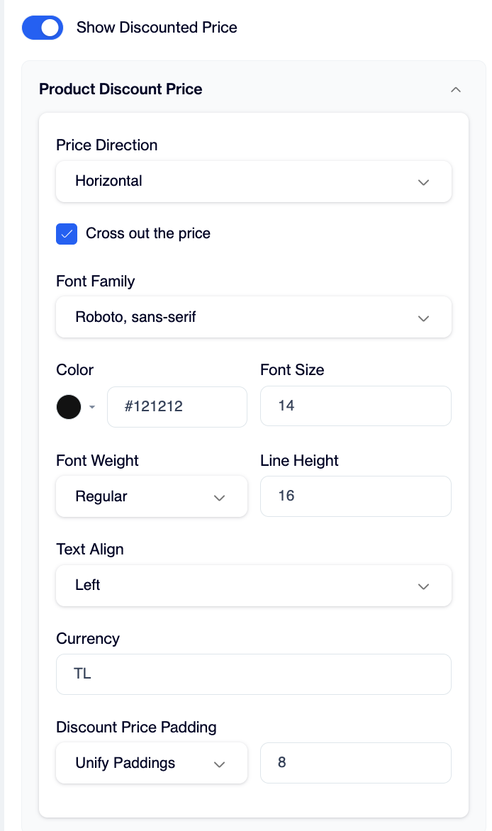
Discounted Product Price
You can:
- Show original price crossed out to highlight the discount
- Display discounted price more prominently
- Adjust layout direction (horizontal)
- Customize font and color to highlight promotions
Show Discounted Price controls whether discounted pricing is shown and can be switched on or off.
This helps users clearly see savings and improves conversion.
CTA Button
This is the button users click to interact with the product (for example “View Product”).
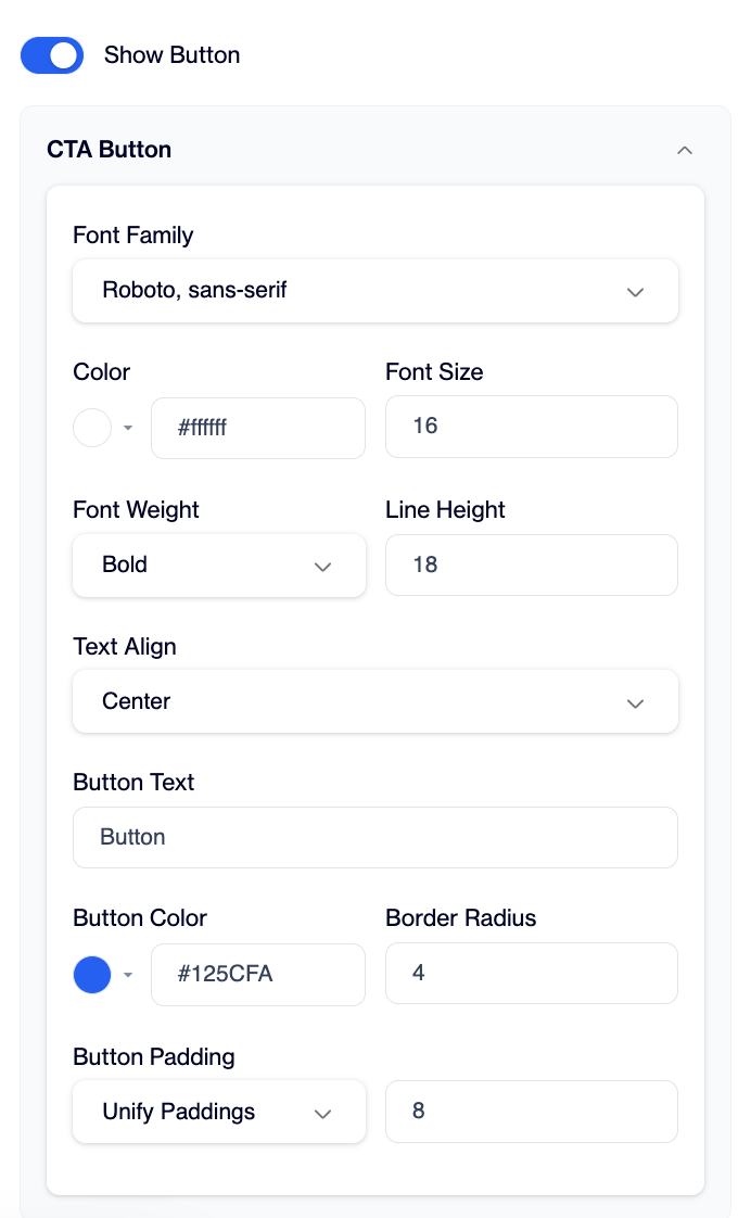
CTA Button
You can configure:
- Button text based on your action (View, Buy, Add to Cart)
- Button color to match your brand or highlight action
- Font style and size for readability
- Shape using border radius (rounded or sharp buttons)
Show Button controls whether the action button (such as “View Product”) is displayed on product cards and can be switched on or off.
A well-designed CTA button helps guide users toward interaction and improves engagement inside the widget.
Activation & Campaign Setup
After completing all configurations, click Save Draft and Publish to make the Search Widget ready for use.
To activate it on your website, go to Campaign > Targeting Campaigns > Onsite and click New. Select the campaign type as “Recommendation”.
In the campaign setup, first add the basic information such as the campaign name. For this use case, you do not need to define a start or end date, so the campaign will run continuously once it is activated.
Next, select the content you created earlier. You will also be able to see a preview of how it will look.
In the preview section, click “See on your website” and select your website from the modal. Then choose the target device and confirm the website selection.
Under the trigger settings, you can choose where the widget should appear. You can select all pages or specific pages depending on your strategy. In the target selector field, you need to paste the CSS selector of the search bar from your website. This connects the widget directly to your search input area.
For behavior, the default option is “On Page Load”, which means the widget loads automatically when the page is opened. If needed, you can also select a custom event instead.
In the Audience Selection section, it is recommended to select All Users. You can also use advanced filters if you want to target a specific audience segment.
Under Delivery Settings, choose Show without limits so the widget is not restricted by frequency caps. The Stop after engagement option should remain disabled to ensure continuous visibility.
Finally, set Campaign Priority to High so the Smart Search campaign is always prioritized correctly.
Once the campaign is activated, the Search Widget becomes live on your website and starts working immediately based on the configured settings.
Updated 3 months ago