
Onsite Builder
Onsite Drag and Drop Editor (Onsite Builder)
The Onsite Builder is a new feature that introduces a drag-and-drop interface for creating onsite content. It allows users to design banners, pop-ups, floating bars, and more using a visual editor—without the need for HTML or coding skills. With its intuitive interface, marketers and non-technical users can quickly build and launch high-quality onsite experiences.
How to Access
Navigation Path; Content > Marketing > Onsite
To access the Onsite Builder, go to the main navigation menu and select Content > Marketing > Onsite. This will take you to the listing page where all your onsite content is managed. The Onsite Builder is available as a new creation option when starting a new onsite campaign.
How to Use the Onsite Builder
- Start Creating with the New Onsite Builder; Begin by clicking the New button located at the top-right corner of the Onsite listing page. This will open the content type selection screen, where you’ll now see a new option labeled Onsite Builder, alongside any existing editor options. Select Onsite Builder to continue. This editor is specifically designed for users who prefer a no-code, visual design experience for onsite interactions.
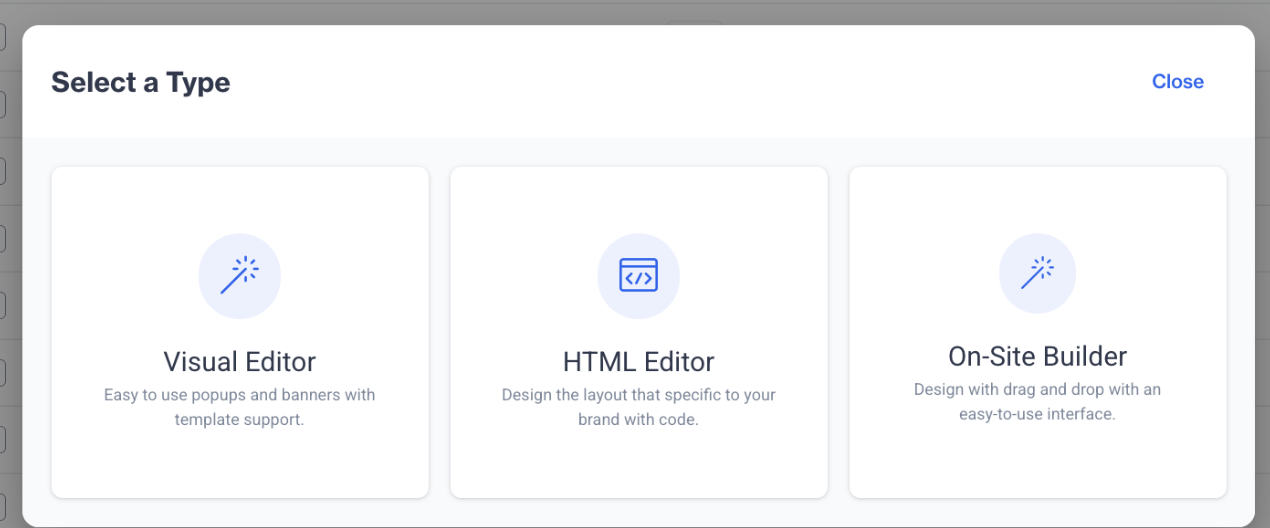
Onsite Builder
- Enter Basic Content Information; After selecting Onsite Builder, you’ll be prompted to define the core properties of your content. Enter a Name for your onsite content, choose a Folder to organize it, and optionally add a Description to provide internal notes or context. These fields help you maintain clarity and structure within your content library.
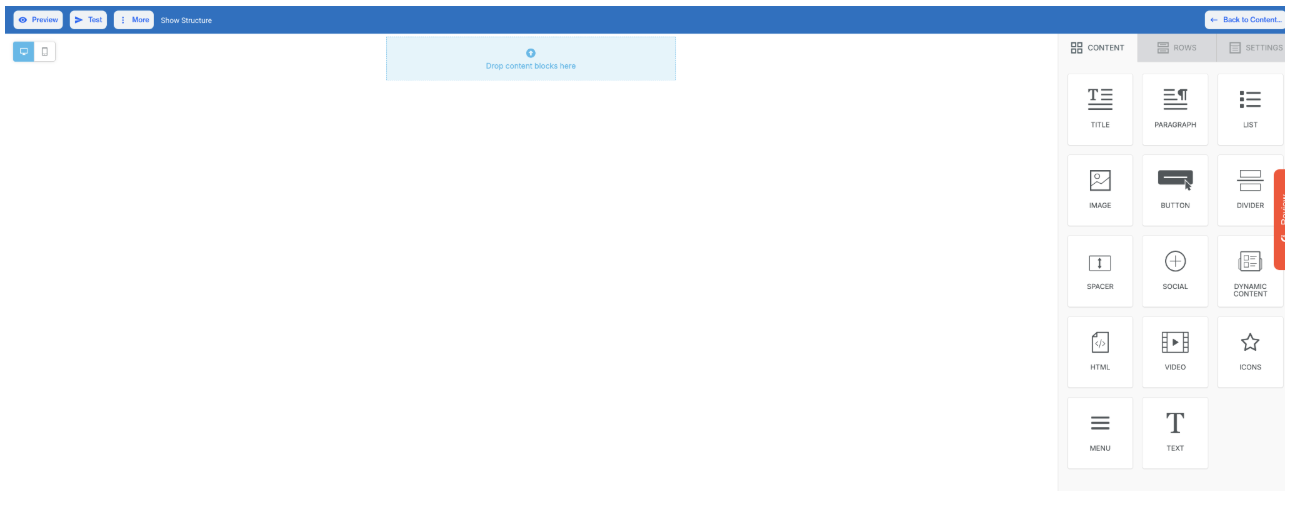
- Access the Drag-and-Drop Editor; Once the basic content setup is complete, click the Next button. You will now enter the Onsite Builder interface. This editor allows you to visually assemble your content by dragging and dropping blocks such as text, images, buttons, and layout containers directly onto the canvas. Each element can be customized using the built-in configuration panel, enabling full control over styling, spacing, actions, and visibility.
Onsite Builder
Onsite Drag & Drop Editor
Content
In the Content section of the On-Site Builder, you can build engaging and interactive on-site experiences using a variety of drag-and-drop elements. These components help you create pop-ups, banners, or embedded messages that align with your website's goals and design. Below is a breakdown of the key content blocks available:
- Title: Add prominent text headers to grab user attention. Customize font style, size, and color to match your website’s tone.
- Paragraph: Insert message text, announcements, or instructions. Supports full text formatting options for clarity and emphasis.
- List: Present items in bullet format for quick and clear communication, such as benefits or feature highlights.
- Image: Use the image block to upload or browse images that visually support your on-site campaign.
- Button: Create actionable buttons with full customization and define what happens on click:
- Action Types:
- Open Web Page: Redirects users to a specific URL.
- Send Email: Opens the user’s default email client with a pre-filled address.
- Make Call: Initiates a phone call (primarily for mobile devices).
- Send SMS: Opens the default messaging app for sending a predefined message.
- Special Links: Include unsubscribe options or attach files via the Link File feature.
- Button Options: Customize size, alignment, background, font, and padding.
- Block Options: Control padding, visibility settings (mobile/desktop), and HTML/AMP display preferences.
- Action Types:
- Divider: Insert a horizontal line to visually separate content sections.
- Spacer: Add vertical space between blocks for cleaner layout and visual hierarchy.
- Social: Add clickable icons linked to your social media profiles to drive engagement.
- Dynamic Content: Personalize content based on visitor attributes or segments (e.g., returning users, cart value).
- HTML: Insert custom HTML code to enable advanced design or embedded content not supported by standard blocks.
- Video: Embed videos from platforms like YouTube or Vimeo by pasting the video URL and adding a title.
- Icon: Choose from a collection of icons to visually enhance the design or indicate actions. Customize color and size.
- Menu: Add menu items with various link types and control how they open (same page/new page). Attach files if needed.
- Text: Insert flexible, stylized text with control over font size, color, line height, and other formatting options.
Rows
The Rows section allows you to define the layout structure for your on-site campaign. Each row can include multiple columns and support extensive styling options:
- Layout Settings: Adjust vertical alignment, mobile stacking behavior, and visibility settings per device.
Settings
The Settings panel lets you define overall styling for your on-site message:
- Content Area Width & Alignment: Control layout width and how the content aligns within the browser window.
- Background & Content Colors: Customize background colors for the full container or the main content area.
- Background Image: Upload or select a background image to enhance visual design.
- Default Font & Link Colors: Apply consistent text and hyperlink styles across the entire on-site experience
Editor Top Options
Located at the top of the On-Site Builder interface, these tools help manage and preview your content:
- Preview: View how your on-site message will appear in real time across device types.
- Test: Launch a test view to ensure design and actions perform as expected.
- More: Access additional features:
- Export Template: Save your on-site design for reuse.
- Upload Template: Import an existing template into the builder.
Updated 10 months ago