
In-App: Clickable Image Support
Clickable Image Support allows you to assign a click action directly to images in In-App templates. With this feature, images are no longer limited to being visual elements.
This capability gives you the flexibility to use both clickable images and buttons within the same In-App message, each with its own destination. As a result, you can design more engaging layouts, guide users through multiple actions, and create richer interaction experiences without changing your existing template structure.
How to Access
To use Clickable Image Support, navigate to the In-App creation from the content area.
Content > Marketing > In-App
Create New and select Visual Editor
Choose any template that includes an image or image + text templates.
Once the template is opened in the editor, scroll to the Action section. The Clickable Image toggle is located within this section.
How to Use
Enable Clickable Image
In the Action section, turn the Clickable Image toggle on. When the toggle is enabled, the image in the template becomes clickable and can trigger its own action independently from buttons.
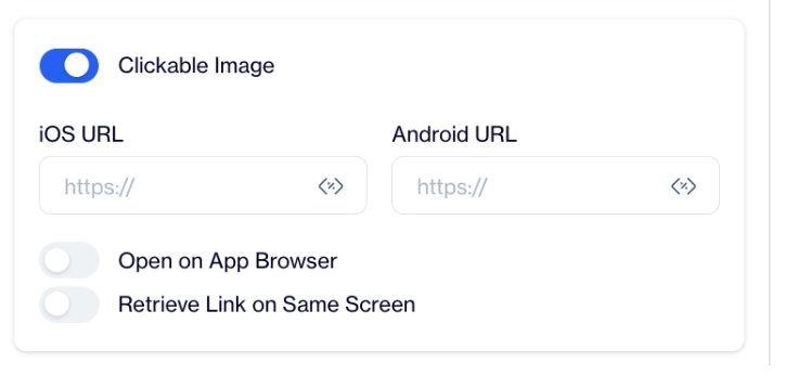
Clickable Image
If the toggle remains off, the image will stay non-clickable, and only buttons will trigger user actions.
Configure Image Click Actions
After enabling the Clickable Image toggle, additional configuration fields become visible. You can enter separate destination URLs for iOS and Android platforms. You can also choose whether the link opens in the app browser and whether the link should be retrieved on the same screen.
These settings apply only to the image and do not affect any button configurations in the template.
Configure Buttons Independently
Buttons in the same template can be configured as usual and remain completely independent from the image. You can assign different destinations to buttons, or you can choose to send users to the same destination as the image.
Both images and buttons support Web URLs, Deep Links, and Custom Actions.
Use Cases
Clickable Image Support enables a wide range of design and interaction scenarios. For example, you can direct users to a product detail page by clicking the image, while using a button to add the product to the cart. This helps shorten the path to purchase while still offering clear call-to-action buttons.
You can also use the image to open content such as an article or campaign landing page, while buttons allow users to save, share, or take secondary actions. In cases where you want to increase the clickable area, both the image and buttons can lead to the same destination, making the experience more accessible.
Clickable Image Support allows images and buttons to work together in the same In-App message. This feature gives you greater control over user journeys,and enables more flexible design choices.