
In-App Builder
The In-App Builder is a new feature that introduces a drag-and-drop interface for creating in-app content. It allows users to design banners, modals, and more using a simple visual editor, without the need for HTML or coding skills.
How to Access
Navigation Path:
Content > Marketing > In-App
To access the In-App Builder, go to the main navigation menu and select Content > Marketing > In-App. This will take you to the listing page where all your in-app content is managed. The In-App Builder is available as a new creation option when starting a new in-app message.
How to Use the In-App Builder
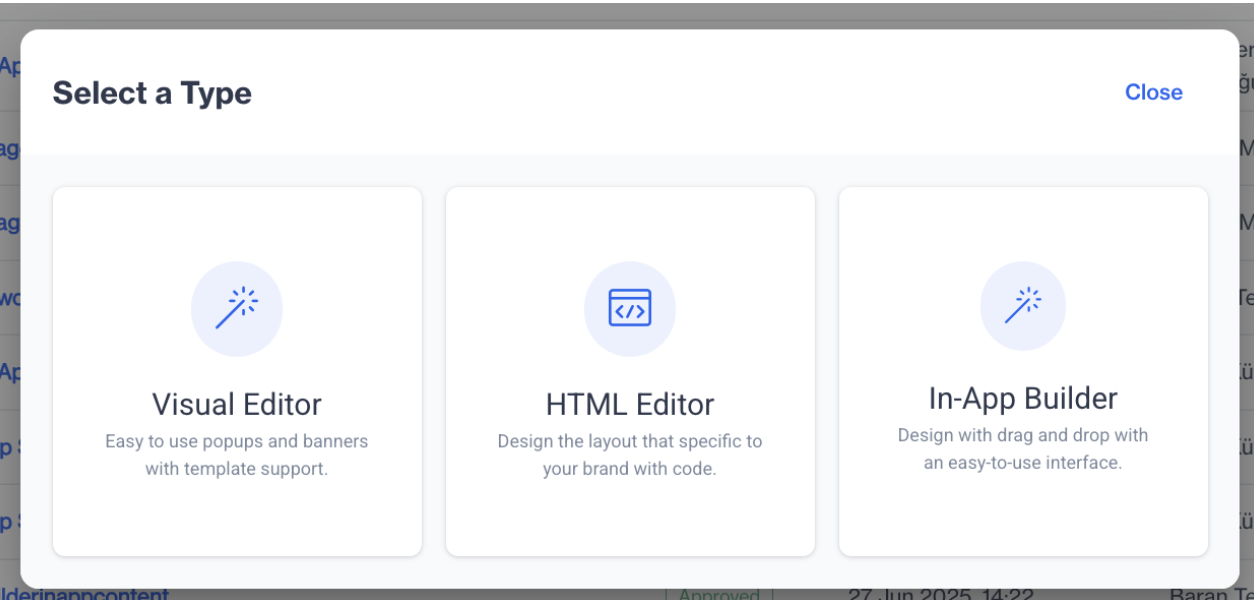
- Start Creating with the New In-App Builder
Begin by clicking the New button located at the top-right corner of the In-App listing page. This opens the content type selection screen where you’ll now see a new third option labeled In-App Builder, in addition to the existing Visual Editor and HTML Editor. Select In-App Builder to continue. This option is specifically designed for users who prefer a no-code, visual design experience.
In-App Builder
- Enter Basic Content Information
Once you've selected In-App Builder, you’ll be prompted to define the basic properties of your content. Enter a Name for your in-app content, choose a Folder to store and organize it, and optionally provide a Description for internal notes or context. These details help maintain structure and clarity across your in-app campaigns.
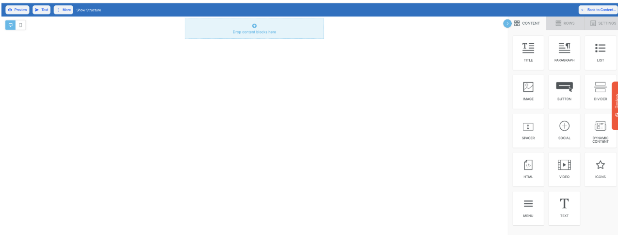
- Access the Drag-and-Drop Editor
After filling in the required information, click the Next button. You will now enter the In-App Builder interface. This editor allows you to drag and drop content blocks such as text, images, buttons, and containers directly onto your layout. You can visually structure and style each element using the built-in configuration panels—no coding required. The intuitive design experience allows marketers and non-technical users to build professional-looking in-app messages quickly and easily.
In-App Builder
In-App Builder
Content
In the Content section of the In-App Builder, you’ll find a range of components you can drag and drop to design your in-app messages with flexibility and ease. Below is a breakdown of the key elements available:
- Title: Add headings or prominent text to capture user attention. Text can be customized using formatting tools.
- Paragraph: Insert descriptive or informational text blocks with customizable styling options.
- List: Use this to create unordered (bullet) lists to highlight key points within your message.
- Image: Drag and drop an image block or upload an image directly from your file manager to visually enhance your content.
- Button: Configure interactive buttons using the following options:
- Action: Define what happens when the button is clicked. Available link types include:
- Open Web Page: Redirects users to a specified URL.
- Send Email: Opens the default email client with a pre-filled email address.
- Make Call: Initiates a phone call (ideal for mobile users).
- Send SMS: Opens the default messaging app to send a predefined text.
- Internal Links: Include options like Unsubscribe, Brand Unsubscribe, or Link File to attach documents or redirect to system-generated links.
- Button Options: Customize font size, colors, alignment, and padding to match your message style.
- Action: Define what happens when the button is clicked. Available link types include:
- Divider: Add a horizontal line to separate different content sections.
- Spacer: Insert vertical spacing for better content structure and readability.
- Social: Add clickable social media icons linked to your brand's profiles.
- Dynamic Content: Display personalized content based on user attributes or behaviors.
- HTML: Insert custom HTML code for advanced formatting or interactive elements.
- Video: Embed videos from YouTube or Vimeo by entering the video URL and setting a title.
- Icon: Choose from a variety of icons, adjust size and color, and place them in your content to visually communicate actions or ideas.
- Menu: Add a navigational menu with custom link types like Open Web Page, Send Email, Make Call, or Send SMS, with additional options for setting targets and file attachments.
- Text: Add flexible, stylable text blocks. Modify fonts, colors, line height, and more.
Rows
The Rows section lets you control layout structure and design elements:
- Layout: Manage vertical alignment, mobile stacking, and visibility settings.
- Column Structure: Customize each column’s background, padding, and alignment.
Settings
In the Settings panel, you can configure the overall design of your in-app message:
- Content Area Width & Alignment: Adjust layout dimensions and alignment.
- Background & Content Area Colors: Set background colors for different parts of the message.
- Background Image: Add an image background to elevate visual engagement.
- Default Font & Link Color: Define default styles for text and hyperlinks to maintain design consistency.
Editor Top Options
At the top of the In-App Builder, you’ll find several options to streamline your work:
- Preview: See a real-time version of your message before publishing.
- Test: Trigger a test message to validate design and functionality.
- Manage Saved Rows: Access and reuse previously saved row templates.
- More: Includes:
- Export Template: Save your current design for future reuse.
- Upload Template: Import an existing template to edit or send.
Updated 9 months ago