
NPS (Net Promoter Score)
The NPS is an on-site element designed to capture user feedback through a brief survey that measures user loyalty and satisfaction.
Creating an NPS
NPS
Preview on Desktop or Mobile:
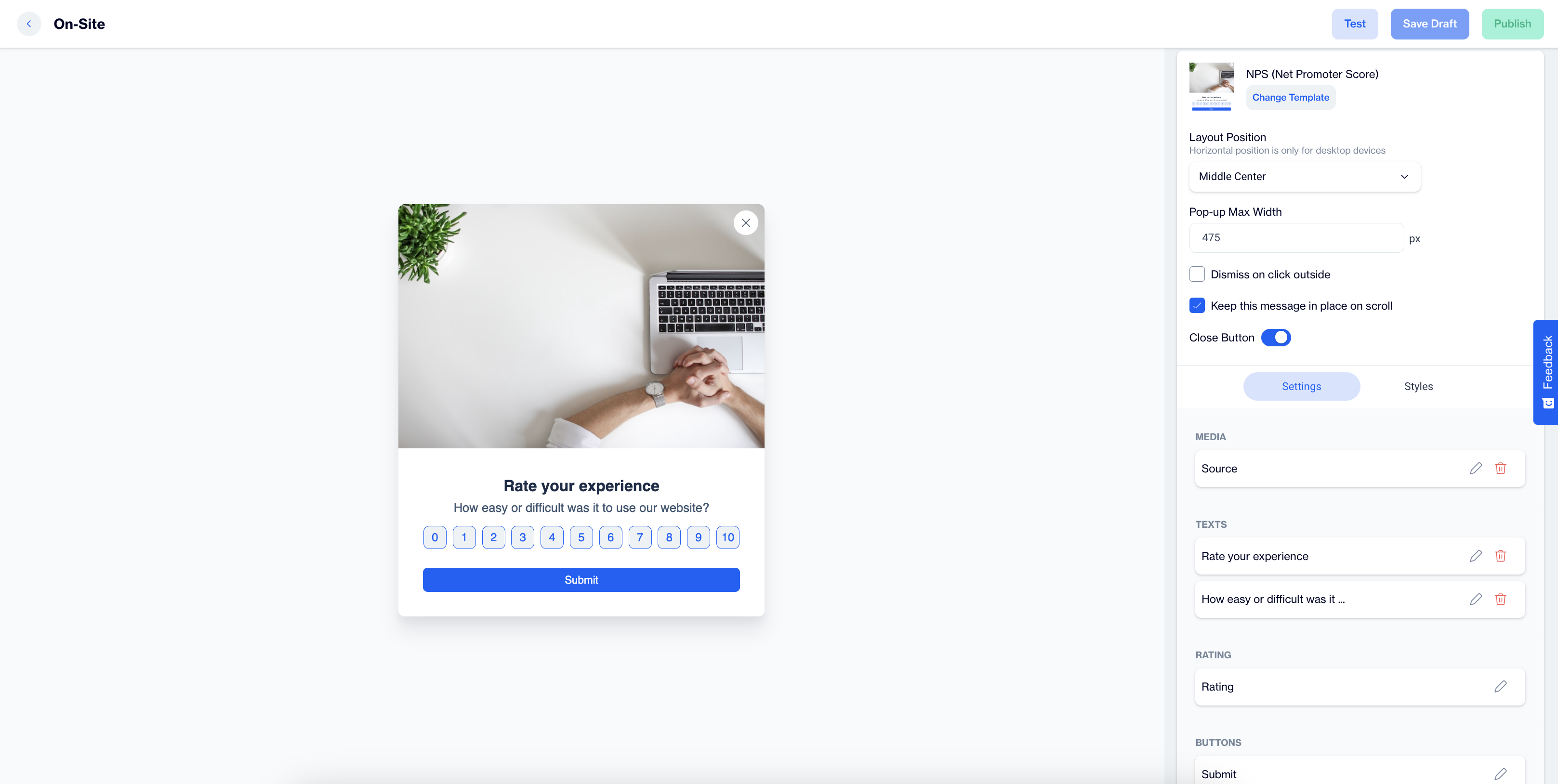
After selecting the NPS template, users will see a preview on the left side of the screen, displaying how the popup will appear on both desktop and mobile devices.
General Section
As with other on-site elements, the General Section is where users input the Name and Folder details to ensure the NPS content is well-organized and easy to manage.
Content Section
- Change Template:
Users can switch between different templates by clicking the Change Template button, allowing flexibility.
- Layout Position:
In the Layout Position dropdown, users can choose from various placement options, such as middle center, top right, and others, depending on the desired positioning on the page.
- Pop-up Max Width:
Set the desired width of the popup to ensure it fits seamlessly within the page’s design.
- Dismiss on Click Outside:
Enable this option to allow users to close the popup by clicking anywhere outside of it.
- Keep This Message in Place on Scroll:
Toggle this option on to ensure the NPS remains visible as users scroll down the page.
Settings
Media:
- Position: Users can choose the position of the media within the form, such as left, top, or right of the content.
- Media Type: Users can select the type of media to display, either an image or video.
- Source: Users need to provide the media source, with customization available using the Customization Selector for dynamic and personalized content.
Texts:
- Title: The title text, such as "Rate you experience" can be edited by clicking the pencil icon.
- Message: Users can edit the message, like "How easy or difficult was it to use our website?" The Customization Selector allows for personalized content.
Rating
- Size; Select the size of the rating element to fit your design preferences.
- Primary (Color); Choose the primary color for the rating element to align with your brand or design theme.
- Secondary (Color); Set the secondary color for the rating element for contrast and visual appeal.
- Tag; Select a tag to save the rating. Tags help categorize or identify users based on their rating behavior.
- Add Tag:
- Tag Name: Enter a name for the tag.
- Tag Type (Key Value): Define the tag type based on a key-value structure, where the tag identifies the key, and its value provides further details.
- Value Type: Choose the Value Type as either TEXT or INTEGER, depending on whether the value needs to be treated as a text or a numeric value.
- Description: Provide a description to clarify the tag's role or usage.
- Audience Type: Specify if the tag applies to Contact Specific (individual user profiles) or Device Specific (applied to a specific device).
- Input Validation Language: Users can choose the language for validation messages that appear when subscribers interact with the form. The available language options are: Turkish or English
- Add Tag:
Button:
- Text; Users can edit the Submit Button text to align with their campaign, such as "Submit Feedback" or any other action-oriented text that fits the context of the survey or form.
- Customization; Apply dynamic content using the Customization Selector to personalize the button text.
After making changes, users must click the Save & Back button to return to the previous screen.
Styles:
General:
Users can select a font family, input a Font URL, and adjust the card's radius and padding for optimal spacing. Background and close button color customization options are available to ensure a cohesive design.
Title:
Customize the title's color, font size, alignment, and font weight to make the text eye-catching and engaging.
Message:
Adjust the message's color, font size, alignment, and font weight to ensure clarity and readability.
Submit Button:
Users can modify the submit button's text, alignment, font size, background color, and border radius to create a modern and interactive design.
After adding your content successfully, save it as a draft for future use or publish it to make it ready for your campaigns.
Rating
The Rating is an onsite element designed to capture user feedback by allowing them to rate their experience or interaction. It helps measure user satisfaction and engagement.
Creating a Rating
Preview on Desktop or Mobile: After selecting the Rating template, users will see a preview on the left side of the screen, showing how the rating component will appear on both desktop and mobile devices.
General Section:
As with other onsite elements, the General Section is where users input the Name and Folder details to organize the Rating element effectively.
Content Section:
- Change Template: Users can switch between different templates by clicking the Change Template button, allowing flexibility.
- Layout Position: In the Layout Position dropdown, users can choose from various placement options, such as middle center, bottom left, or other positions that align with the page layout.
- Pop-up Max Width: Set the desired maximum width of the rating element to ensure it fits seamlessly within the page’s design.
- Dismiss on Click Outside: Enable this option to allow users to close the rating element by clicking anywhere outside of it.
- Keep This Message in Place on Scroll:
Toggle this option on to ensure the rating remains visible as users scroll down the page.
- Dismiss on Click Outside: Enable this option to allow users to close the rating element by clicking anywhere outside of it.
- Close Button: Include a close button in the pop-up for users to easily dismiss the rating element.
Settings:
- Media:
- Position: Users can select where the media (image or video) will be displayed relative to the rating content, such as left, top, or right.
- Media Type: Choose between displaying an image or video in the Rating.
- Source: Specify the media source, with the option to customize the content dynamically using the Customization Selector.
- Texts:
- Title: Edit the title text (e.g., "Rate your experience") by clicking the pencil icon.
- Message: Customize the message, such as "How would you rate your interaction with our app?" Use the Customization Selector for personalized content.
- Rating
- Size: Select the size of the rating element (e.g., stars) to fit your app’s design preferences.
- Primary Color: Choose the primary color for the rating component to align with your branding.
- Secondary Color: Select a secondary color for contrast and visual appeal, enhancing the overall aesthetic of the rating element.
- Tag: Select a tag to save the user’s rating, helping to categorize or identify users based on their rating behavior.
- Add Tag:
- Tag Name: Enter the name for the tag to organize ratings effectively.
- Tag Type (Key Value): Define the tag type based on a key-value structure, identifying the key while providing further details through its value.
- Value Type: Choose the Value Type as either TEXT or INTEGER, depending on whether the value is treated as text or a numeric value.
- Description: Provide a description to clarify the tag's purpose or usage.
- Audience Type: Specify if the tag applies to Contact Specific (individual user profiles) or Device Specific(specific to a device).
- Input Validation Language: Users can choose the language for validation messages that appear when users interact with the rating form. The available options are English or Turkish.
- Button
- Text: Edit the text on the submit button (e.g., "Submit" or "Rate Now") to align with the action users are expected to take.
- Customization: Use the Customization Selector to personalize the button text for each user.
After making changes, users must click the Save & Back button to return to the previous screen.
Styles:
- General: Choose a font family, input a Font URL, and adjust the card’s radius and padding for a sleek, responsive design. Customize the background and close button colors to align with your app’s overall theme.
- Title: Adjust the title’s color, font size, alignment, and font weight to ensure it captures the user’s attention.
- Message: Customize the message’s color, font size, alignment, and font weight for clarity and consistency with your app's style.
- Submit Button: Modify the submit button’s text, alignment, font size, background color, and border radius to create a modern and engaging design.
After adding your content successfully, save it as a draft for future use or publish it to make it ready for your campaigns.
Updated 11 days ago