
Inline
The Inline element allows you to customize the website to suit your visitors' preferences and needs, offering a seamless user experience.
Creating Inline
Inline
Preview on Desktop or Mobile: After selecting the Inline template and adding elements, users will see a preview on the left side of the screen, showing how the inline content will appear on both desktop and mobile devices.
General Section
As with other onsite elements, the General Section is where users input the Name and Folder details to organize the Inline element effectively.
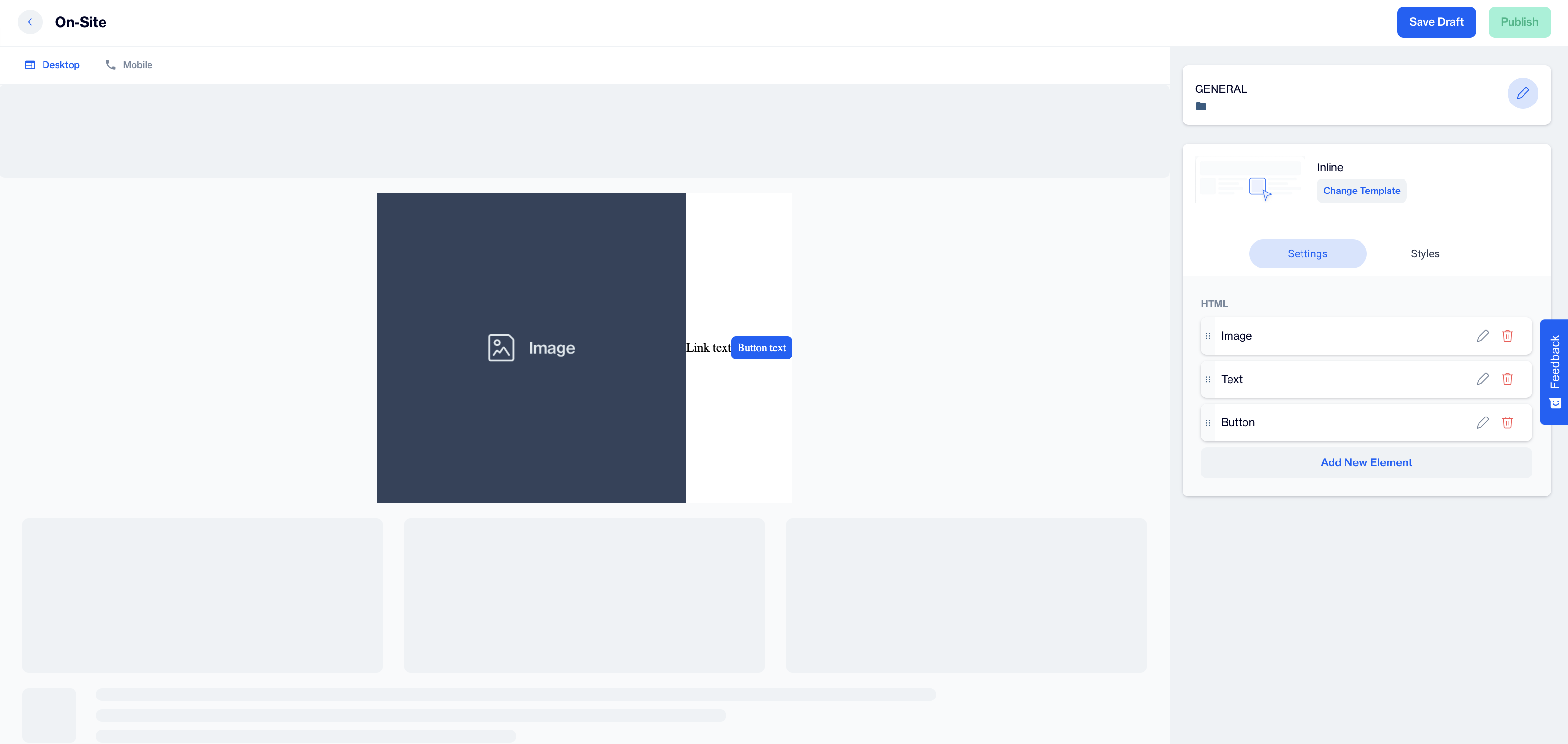
Content Section
- Change Template: Users can switch between different templates by clicking the Change Template button, allowing flexibility.
Settings
- HTML; Under the Settings tab, users can enhance the inline element by clicking on the Add New Element button. Three options are available when adding a new element:
- Image
- Text
- Button
1.Image
When users select the Image option and click on the pencil button, a new page appears where they can configure various attributes and styles for the image.
Attributes:
- Source: Users can either select an image using the Image Selector or customize the source by clicking the Add Customization option.
- Alternate Text: This field allows users to provide alternative text for the image, ensuring accessibility.
- Link URL: Users can add a URL to make the image clickable. The Add Customization option and emojis are also available.
- Open Link In: Users can choose whether the link opens in a New Tab or the Current Tab when clicked.
- Width and Height: Users can adjust the dimensions of the image by setting the Width and Height using units such as px or % .
Style:
- Margin: To adjust the margins around the image, users need to click the Add button to customize the spacing.
- Padding: Similarly, for padding adjustments, users can click the Add button to make changes to the padding inside the image container.
2.Text
When users select the Text option and click on the pencil button, they can configure both the display text and attributes for the text element, along with customizing its style.
Display Text:
- Display Text: Users can edit the main display text, adding dynamic content using the Customization option or inserting emojis for a more personalized touch.
Attributes:
- Link URL: Users can add a clickable link to the text. The Add Customization option and emojis are also available for personalization.
- Open Link In: Users can select whether the link opens in a New Tab or the Current Tab when clicked.
Style:
- Select to Add Value: Users can click the Select to Add Value button to reveal a list of style properties. After choosing the desired property, they can click Add to customize the appearance of the text. These properties include Cursor, Height, Width, Border Radius, Border Width, Border Color, Background Color, Color, Padding, Margin, Line Height, Text Align,Font Height, Font Size and Text Decoration. After selecting a property, they need to click the Add button to apply and modify the selected style.
3.Button
When users select the Button option and click on the pencil button, they can configure both the display text and attributes for the button element, along with customizing its style.
Display Text:
Users can edit the main button text, adding dynamic content through the Customization option or inserting emojis for a more engaging and personalized button label.
Attributes:
- Link URL: Users can add a clickable link to the button, with the Add Customization option and emojis available to personalize the link further.
- Open Link In: Users can choose whether the link opens in a New Tab or the Current Tab when clicked.
Style:
- In the Style section, users can click the Select to Add Value button to access a list of style properties. After selecting the desired property, they can click Add to apply customizations to the button’s appearance. The available style properties include Font Size, Font Weight, Text Align, Text Decoration, Color, Background Color, Border Color, Border Width, Border Radius, Padding, and Cursor. After selecting the property, users must click Add to modify the button’s style.
After making changes, users must click the Save & Back button to return to the previous screen.
Styles
In the Styles section, users can adjust general design settings to align with the website's aesthetics.
Font Family: Select a font family or apply the website's default font for consistency.
Card Radius: Adjust the corner radius to create either sharp or rounded edges.
Card Padding: Set the inner padding to control spacing.
Direction: Align content horizontally along the X-axis and vertically along the Y-axis for precise layout control.
Justify Content: Determine horizontal alignment of content, such as left, center, or right.
Align Items: Vertically align elements, such as center or top alignment.
Background: Select a background color that matches your website's design theme.
After adding your content successfully, save it as a draft for future use or publish it to make it ready for your campaigns.
Updated 22 days ago