
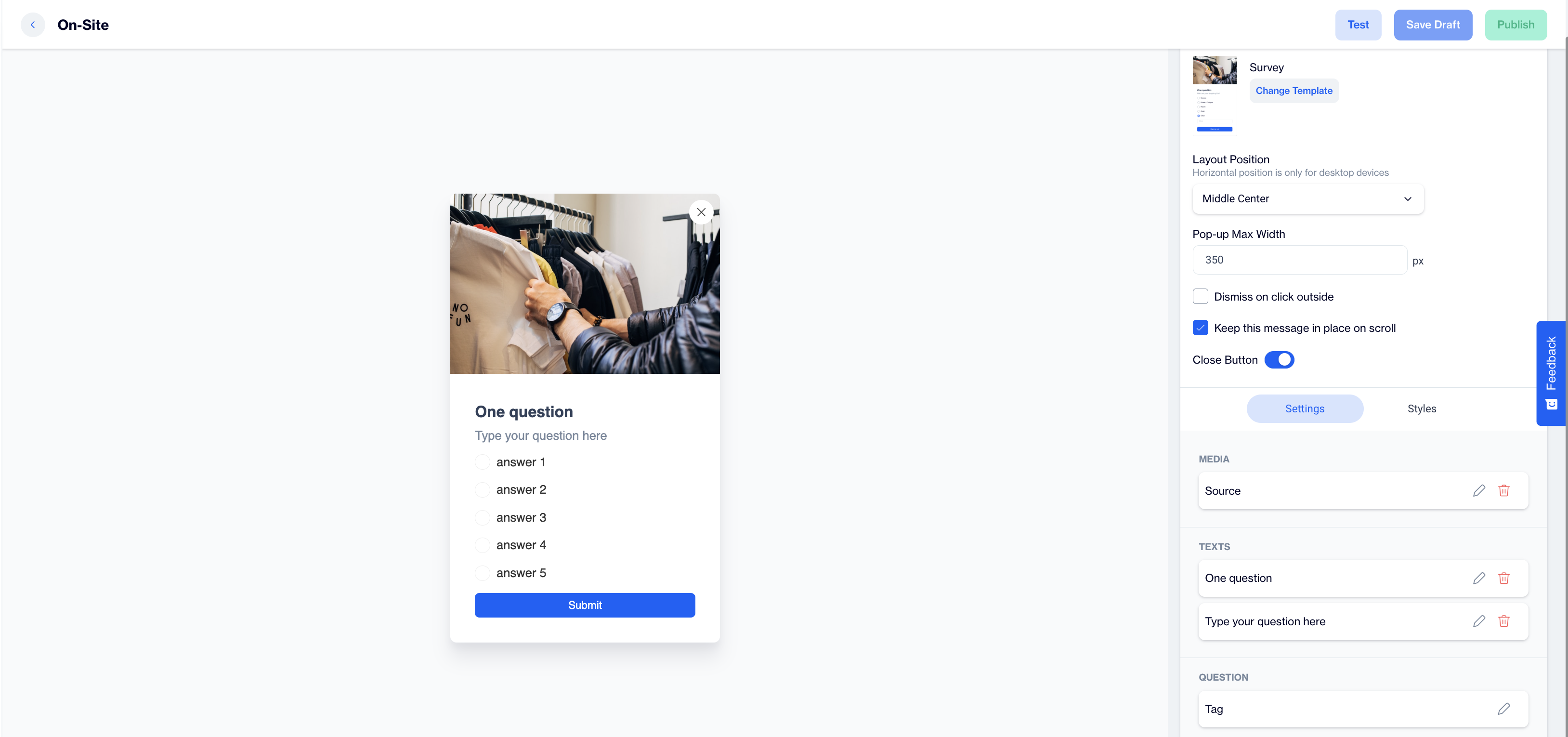
Survey
The Survey is an on-site element designed to gather visitor feedback through a single question. This popup is ideal for quickly engaging visitors and collecting valuable insights based on their responses.
Creating Survey
Survey
Preview on Desktop or Mobile:
After selecting the Survey template, users will see a preview on the left side of the screen, showing how the popup will appear on both desktop and mobile devices.
General Section
As with other on-site elements, the General Section is where users input the Name and Folder details to ensure the Survey content is well-organized and easy to manage.
Content Section
- Change Template:
Users can switch between different templates by clicking the Change Template button, allowing flexibility. - Layout Position:
In the Layout Position dropdown, users can select various placement options (e.g., middle center, top right) based on where they want the survey popup to appear on the page. - Pop-up Max Width:
Set the desired width of the popup to ensure it fits seamlessly within the page’s design. - Dismiss on Click Outside:
Enable this option to allow users to close the popup by clicking outside of it. - Keep This Message in Place on Scroll:
Toggle this option on to ensure the Survey popup remains visible as users scroll down the page. - Close Button: Toggle on the Close Button option to allow users to dismiss the survey.
Settings
Media:
- Position: Users can choose the position of the media within the form, such as left, top, or right of the content.
- Media Type: Users can select the type of media to display, either an image or video.
- Source: Users need to provide the media source, with customization available using the Customization Selector for dynamic and personalized content.
Text:
- Title: Displays a default prompt, "One Question," which can be edited to suit the purpose of the survey.
- Message: Shows a placeholder text, "Type your question here," where users can input their specific question for the survey.
Question:
- Tag: Allows users to tag the response for easy categorization.
- Add Tag: Users can add tags, such as CONTACT or specific tags to label the collected responses.
- Answers:
- Users can add predefined answer options. By default, the following placeholders are provided:
- Answer 1
- Answer 2
- Answer 3
- Answer 4
- Answer 5
- Users can add predefined answer options. By default, the following placeholders are provided:
- Has Other Option: Provides an option for users to add an "Other" response for open-ended answers.
- Other Label: Customize the label for the "Other" option.
- Other Placeholder: Set the placeholder text for the open-ended answer field.
- Input Validation Language: Users can choose the language for input validation messages.
Button:
- Text: Customize the text on the action button, such as "Submit Feedback”.
- Customization: Users can apply dynamic content to the button text using the Customization Selector.
After making changes, users must click the Save & Back button to return to the previous screen.
Styles
- General:
Users can select a font family, input a Font URL, and adjust the card’s radius and padding for optimal spacing. Customization options for background and close button colors are available for a cohesive design. - Title:
Customize the title’s color, font size, alignment, and font weight to ensure it's engaging. - Message:
Adjust the message’s color, font size, alignment, and font weight for clarity. - Checkboxes:
Style the checkbox, tick mark, background, font size, and borders for better clarity. - Submit Button:
Customize the submit button’s text, alignment, font size, background color, and border radius for a modern design.
After adding your content successfully, save it as a draft for future use or publish it to make it ready for your campaigns.
Updated 20 days ago