
Crafting On-Site Content with Visual Editor
Welcome to the On-Site Contents section, where you will learn how to create and manage various on-site marketing contents to enhance user engagement on your platform. This section provides comprehensive instructions on developing a range of interactive elements, including pop-ups (such as modals and dialog boxes), sticky bars, subscription and feedback modals, stories, and inline personalizations. Each of these content is designed to capture your audience's attention effectively and deliver targeted messages in an engaging manner. Whether you're looking to increase subscriptions, gather feedback, or simply enhance the user experience, this section will guide you through the process of creating impactful on-site content tailored to your specific needs.
List of On-Site Contents
When you dropped in the On-Site Contents Main Page you will see list of on-site contents having enabled actions alongside with foldering and filtering options . Let's dive into those section together.
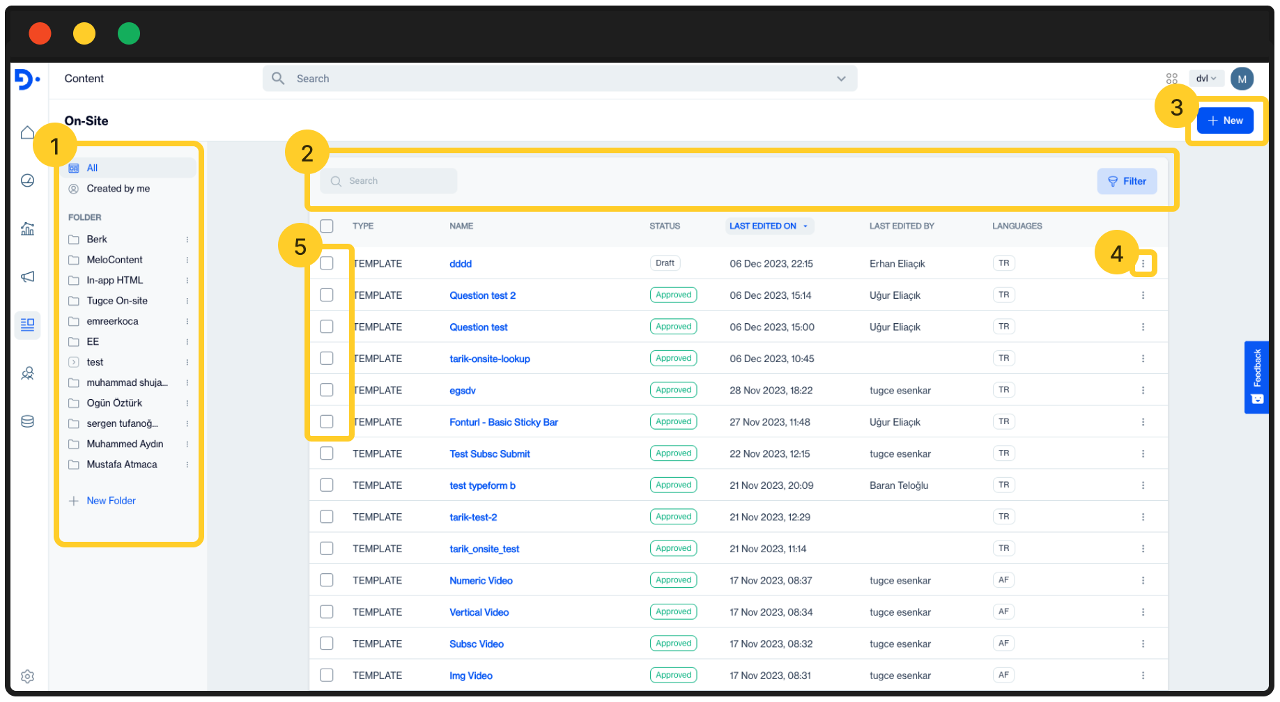
1️⃣ Folder Pane: This field allows you manage created on-site campaigns based on foldering structure .
- Created By Me: Allows you to quick filter the list of on-site campaigns that have been created by your user.
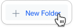
- New Folder : Click on New Folder button to add a new folder on your structure.
2️⃣ Search and Filter
- Search Box: Search box allows you to instantly search created On-Site content by given names.
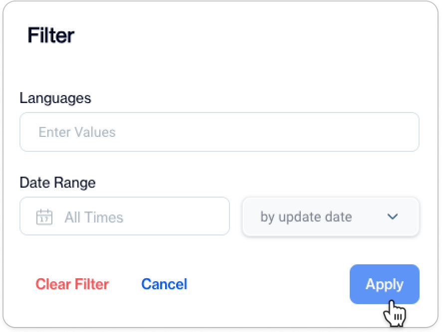
- Filter: Filter allows you to filter the list of On-Site Contents by following parameters:
- Languages: Allows you to filter data grid by selected languages.
- Date Range: Allows you to filter the list by given time period. ⚠️ This time period applies on selected Date Type.
3️⃣ New: Allows you to start creating new On-Site content.
4️⃣ Actions:
- Edit: Allows you to edit selected On-Site Content Details . Alternatively Click on the Name of the content to start editing.

- Duplicate: Duplicates the selected On-Site Content. This can be useful if you need to create similar On-Site Content with a couple of changes.
- Move: Allows you to move selected On-Site Content to another folder.
- Copy Public Id: Public Id is for using REST API updates for the selected On-site content. This public Id will be use to updating On-Site content details via REST API.
- Delete: Removes selected on-site content.
5️⃣Bulk Actions:
- Move Selected: Allows you to move selected On-Site Contents to another folder.
- Delete Selected: Allows you to Removes selected contents at once.
Creating On-Site Contents with Visual Editor
Explore the dynamic capabilities of On-Site Visual Editor, a pivotal section of our user guide that introduces you to the world of WYSIWYG (What You See Is What You Get) editing for crafting your on-site content.
The Visual Editor is an intuitive tool designed to simplify the creation of various on-site elements, including pop-ups, sticky bars, subscription and feedback modals, stories, and inline personalizations.
This section will guide you through using the editor's user-friendly interface, enhanced by a selection of prebuilt layouts that serve as helpful starting points for designing your pop-up content. Whether you're aiming to captivate your audience with eye-catching modals or seeking to streamline user experiences with neatly integrated personalizations, the Visual Editor equips you with the tools necessary for creating effective and engaging on-site content.
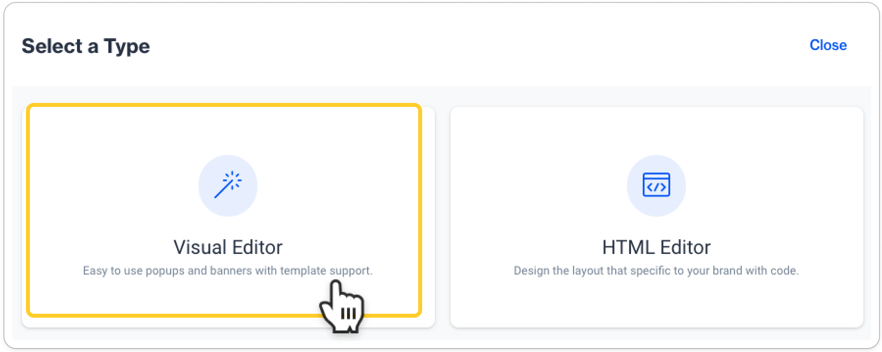
Upon accessing the Visual Editor, you will be presented with two primary sections as follows:
- Template Gallery:
This section showcases all available on-site content types. Browse through the gallery, select a template, and start building your on-site content.
ℹ️ Detailed descriptions of each content type will be provided in later sections for your reference. -
This area stores all your saved contents. If you've saved any content as a template, you can find, edit, and reuse it from here.Saved Gallery:
Actions Available in the Saved GalleryFiltering Options :
- Filter to view only contents created by yourself.
- Alternatively, filter to view contents saved as templates by any creator.
Search: Quickly locate a template by searching for its name among the saved templates.
Sort: Organize the display of your templates alphabetically from A-Z for easier navigation.
Blank Layout
Blank layouts are available as start-from-scratch options, each tailored for specific purposes in your On-Site campaigns. These layouts serve as foundational structures for pop-ups designed to capture attention and spark your creative ideas. Choose from a variety of blank layouts, each equipped with image, text, and button components, to best suit your communication design. Once selected, you can fully customize and modify these layouts to align with your vision before publishing.
Mastering Horizontal Pop-Up LayoutsIn the following section, we will guide you through the process of creating content using horizontal pop-up of blank layouts. By following these instructions closely, you'll gain the skills and understanding necessary to craft your on-site content using any other blank layout item available in our platform.
Creating Content with Horizontal Popup
When creating On-Site content, the process is divided into two distinct layers, each playing a crucial role in the development and delivery of your content:
- General: This is the initial phase of your On-Site content creation
- Content: This is where the actual creation and customization of your content takes place. In this layer, you'll bring your content to life, adding and fine-tuning the elements that will engage your audience.
detailed information on each of these layers is provided in the subtopics below.
General
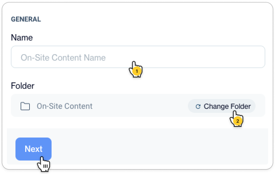
- Name Your Content: Assign a unique and descriptive name to your content for easy identification.
- Select a Save Folder: Optionally, change the default folder where your content will be saved if needed.
- Proceed to Content Creation: Once the above steps are completed, click 'Next' to move forward to the content creation phase.
Content
Pop-up Layout and Behavior Settings
Control how your pop-up behaves and where it appears
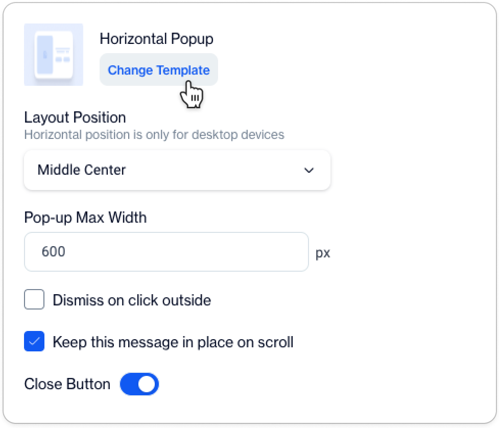
- Horizontal Pop-up Template: Change the template if needed to better fit your design.
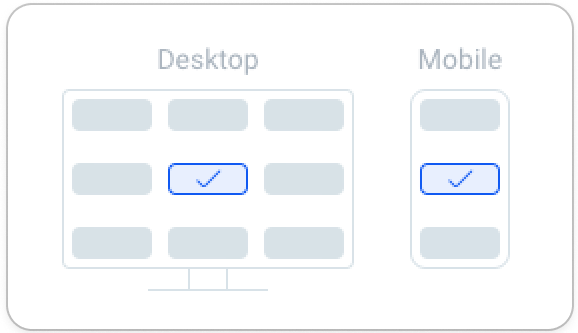
- Layout Position: Choose the position of your pop-up on the screen to best capture user attention. See blow for the options 👇
- Pop-up Max Width: Set the maximum width for your pop-up to ensure optimal viewing on different devices.
- Dismissal Settings: Decide if the pop-up can be dismissed by clicking outside or if it should remain fixed during scrolling.
- Close Button: Activate this option to incorporate a close button into your pop-up.
Content Configuration Tab
This tab is your starting point for on-site content creation.
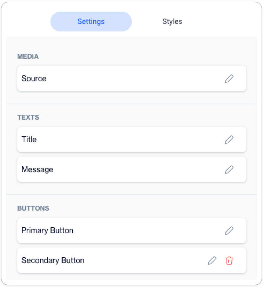
Here you can:
- Media: Specify the source of the media you wish to include in your on-site content.
- Texts: Enter the title and message that will be displayed in your pop-up or inline content.
- Buttons: Configure the text for primary and secondary buttons, including their actions and styles.
Configuring Components
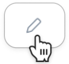
ℹ️ Every component within a section can be configured by clicking on the accompanying pencil icon.
Media
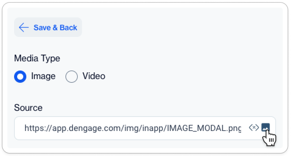
- Media Type: The type of media to be included, which can be either Image or Video.
Important Note on Embedding VideosTo enrich your content with videos, you will need to embed them using external URLs. Please note that our Image Assets File Directory system currently does not support direct video uploads. Ensure you use reliable and accessible URLs from external sources to seamlessly integrate videos into your content.
- Source: The source URL where the image or video is hosted. Users can either input a URL directly or select from existing media. 👉 ℹ️ Selecting a media thumbnail will prompt a dialog box where you can choose an image from the hosted files. 💡 Alternatively, if you need a fresh visual, this dialog box also provides the option to upload a new image directly to the media library.
Texts
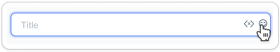
- Title and Message: Input the desired title and body message for your content. 👉 ℹ️ To add a touch of personality, click on the emoji icon to insert emojis into both your title and message.
Buttons
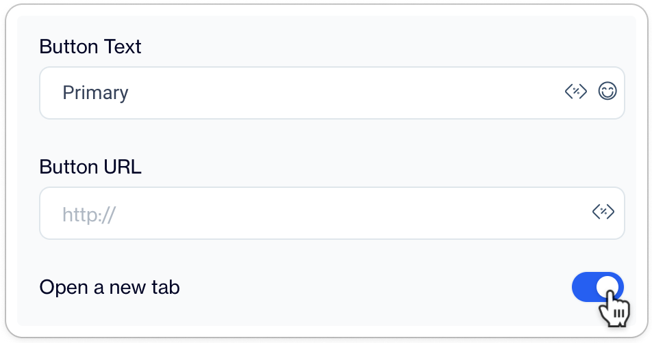
- Button Text: This field allows you to define the text displayed on the button. You can personalize it with a clear call-to-action like "Sign Up" or "Learn More."
- Button URL: Enter the destination URL where users will be directed upon clicking the button. Ensure the URL begins with
http://orhttps://to make it a valid hyperlink. - Open a New Tab Toggle: Slide this switch to the 'on' position if you want the link to open in a new browser tab, keeping your website open in the original tab. This is particularly useful for external links or resources you want your users to view without navigating away from your page.
Customization Selector
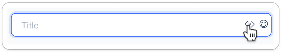
Enhance the personalization of your on-site content by using customization tags for media, texts, and buttons.
- To access the customization selector, click on the
<x>icon located at the end of the input field.
There are two types of customization selector
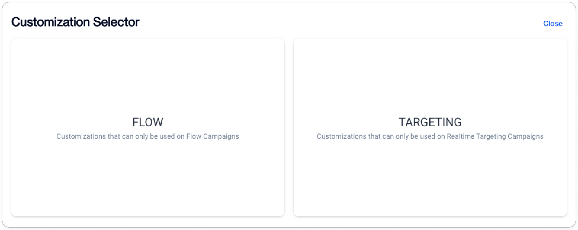
- Flow Customization Selector: Designed specifically for journey flows.
- Targeting Customization Selector: In contrast, the Targeting Customization Selector is utilized exclusively for real-time on-site campaigns.
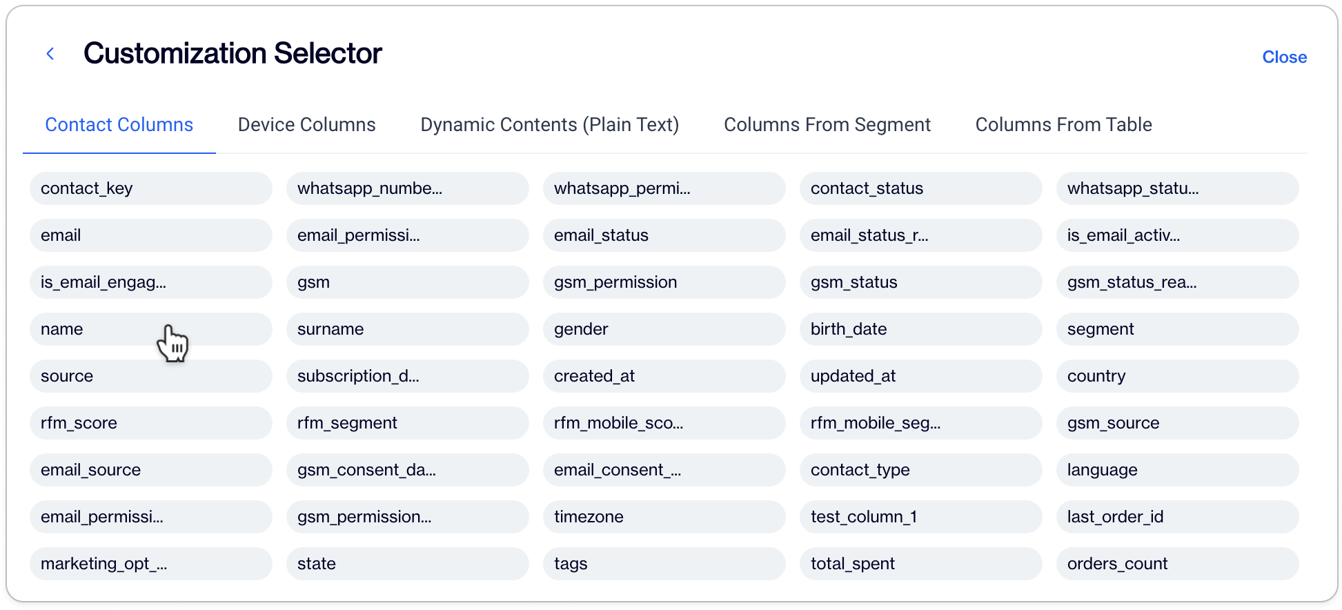
- Contact and Device Columns: These are the database columns or data fields from which users can select to customize their campaign content. Fields like "contact key," "email," "name," and device fields are likely populated.
- Dynamic Contents (From Table): This refers to dynamic content that can be personalized for each user, pulled from a specific table.
- Columns From Segment: These are likely fields that are specific to segmented user data, which can be used to further personalize the campaign for different user groups.
- Columns From Table: This is another selection of data fields that can be sourced from a particular table, which might include detailed user information or interaction history.
Important Note on Customization ParametersWhile there is no upper limit to the number of customization parameters you can add, it is crucial to proceed with caution. Ensure that all fields are correctly filled out on your database. Incomplete fields will result in the display of empty fields in your customized content, which could affect the overall user experience.
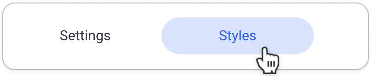
Styling Customization Options
- Click on Styles tab to access customization options
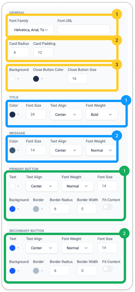
🟨 General Settings
1️⃣ Font Settings
- Font Family: Choose from a dropdown list to apply a specific font that matches your brand or desired look for the content.
- Font URL: If the desired font is not in the list, provide the URL where the custom font can be loaded from.
2️⃣ Card Appearance
- Card Radius: Adjusts the corner roundness of your modal or pop-up card, giving it a more rounded or sharp appearance depending on the value set.
- Card Padding: Controls the spacing between the content and the edges of the card, allowing for more or less white space as needed.
3️⃣ Close Button Customization
- Background: Choose a color for your modal’s background to match your campaign’s theme or to contrast with the content for readability.
- Close Button Color: Decide the color of the close button to ensure it is visible against the background but not distracting.
- Close Button Size: Set how large the close button appears, making sure it is easily clickable without dominating the design.
🟦 Text Styling
1️⃣ Title Customization
- Color: Select the color of your title text to stand out or blend with your overall design.
- Font Size: Determine the size of the title text to ensure it captures attention appropriately.
- Text Align: Align your title text to the left, center, or right of the modal.
- Font Weight: Choose the thickness of the title font, from light to bold, to emphasize the title text.
2️⃣ Message Customization
- Similar options as the title, allowing for consistency or contrast between the title and message body text as desired.
🟩 Button Styling
1️⃣ Primary Button
- Style the main call-to-action button with text alignment, font weight, font size, and background color. Border settings, including radius and width, can further define the button's look.
2️⃣ Secondary Button
- The secondary button is styled similarly to the primary, allowing for a secondary option or action within the modal.
Ready to publish your contentBefore you publish any On-Site content, make sure to save your work as a draft. This precaution ensures that all your changes are preserved and can be reviewed one final time. Once you're satisfied with the content and have verified all details, you can confidently publish it for use within your journey flows and targeting campaigns.
Creating Inline Personalization Content with Visual Builder
Note on Inline Personalization Feature ActivationThe Inline Personalization feature, an advanced tool for enhancing user experience through tailored content, needs to be activated for use. This feature is available as an additional option. For activation and to explore its full potential, please contact your account manager or our technical support team.
Note on General SettingThe process for configuring General Settings is consistent with the procedures outlined in an earlier topic. Please refer back to the General section for detailed guidance.
Guidance on Implementing CustomizationFor the inclusion and adjustment of text and other customizable components, please consult the Customization Selector section. This resource provides detailed instructions on how to effectively utilize the available customization parameters to tailor the content to your specific requirements.
Building Content with HTML Elements
Click on Add New Element button to start building your inline personalization content
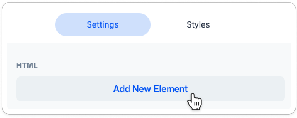
You can add new elements like Image, Text, or Button to your inline content, customizing each to fit your design and message.
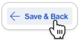
Important Note for WYSIWYG EditorPlease note that the modifications you apply to the HTML elements will only be reflected in the preview area once you click the 'Save & Back' button.
Image
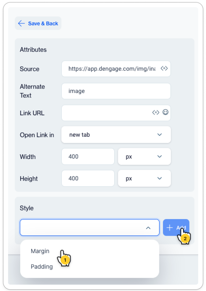
Attributes
- Source: Provide the URL of the image you want to display.
- Alternate Text: Add descriptive text for the image, which is helpful for SEO and accessibility.
- Link URL: If the image should link to another page, insert the URL here.
- Open Link in: Decide whether the linked page opens in the current tab or a new one.
- Dimensions:Set the width and height of the image in pixels to fit your layout precisely.
Style
Modify the image's margin and padding to ensure it is positioned correctly within your content.
- Margin: Set the outer space around the image, controlling how it aligns with other page elements.
- Padding: This setting adjusts the space between the content of the image and its border.
Notes for PaddingIncreasing the padding value will move the image inward, creating a wider border area, which can help your image stand out or create a more pronounced frame effect. Decreasing the padding will make the image content larger relative to its container. Modify this value in pixels to achieve the desired spacing and visual impact for your image within the content layout.
Button
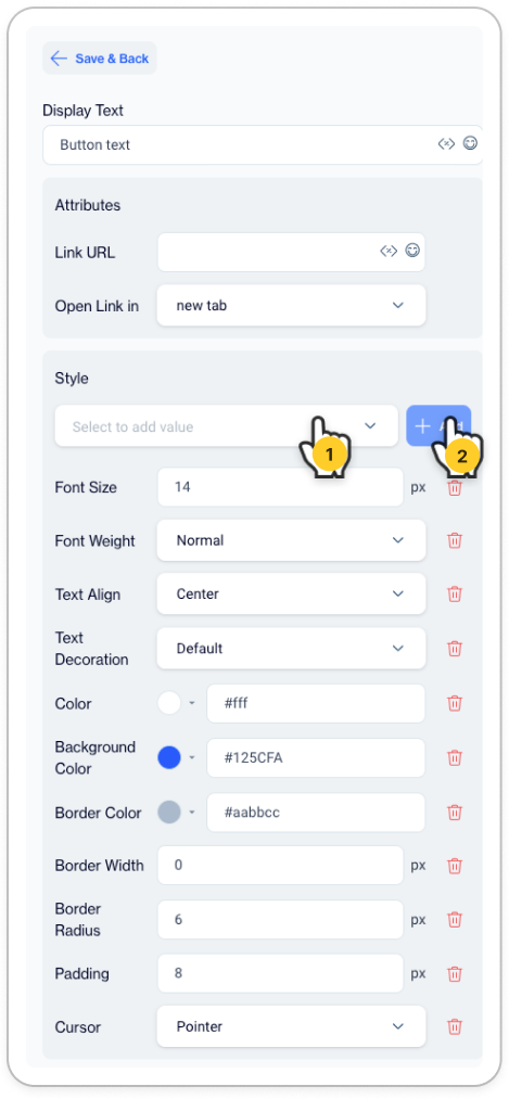
- Display Text: Enter the text that will appear on the button, such as "Click Here" or "Learn More."
Attributes
- Link URL: Specify the web address where the user will be directed upon clicking the button.
- Open Link in: Choose whether the link opens in the current window or a new tab, enhancing the user experience according to your preference.
Style
This section allows you to customize the visual appearance of the button, including font size, weight, alignment, color, and more. Additional styling for the button's border and cursor can also be adjusted here to ensure it aligns with your brand’s design guidelines.
Additional Styling CustomizationAlternatively, for additional styling customization, use the dropdown selector to include extra settings for:
- Line Height: Adjust the spacing between lines of text to improve readability and aesthetic appeal.
- Margin: Set the space around the element, defining its positioning relative to other elements on the page.
- Width: Specify the element's width to ensure it aligns with your design layout.
- Height: Determine the element's height, which can be crucial for maintaining a consistent user interface.
Style Customization
- Background Color: Sets the button's background color using a color picker or hex code.
- Border Color: Choose the color of the button's border to differentiate it from the background.
- Border Width: Define the thickness of the button's border in pixels.
- Border Radius: Adjust the roundness of the button's corners.
- Padding: Control the space inside the button, between the text and the button's border.
- Cursor: Decide the type of cursor that will appear when a user hovers over the button, such as a pointer to indicate it's clickable.
Creating Story Content with Visual Builder
Note on Story Feature ActivationOur dynamic Story Feature, designed to engage audiences with interactive story sets, is an additional, separately available tool that requires activation. To bring this compelling content feature to your platform, reach out to your account manager or our technical support team for assistance.
Note on General SettingThe process for configuring General Settings is consistent with the procedures outlined in an earlier topic. Please refer back to the General section for detailed guidance.
Guidance on Implementing CustomizationFor the inclusion and adjustment of text and other customizable components, please consult the Customization Selector section. This resource provides detailed instructions on how to effectively utilize the available customization parameters to tailor the content to your specific requirements.
Understanding Story and Story Set
A Story Set acts as a comprehensive campaign, encompassing a series of Stories that together weave a complete narrative designed to engage and guide the audience through a curated journey.
👉 Each Story Set represents the overarching theme or message of the campaign, serving as a container that holds multiple Stories, akin to chapters in a book. The Story Set provides the structure and context within which individual Stories can be understood.
Within each Story Set lies the individual Story, which is a single, self-contained unit of content.
👉 Each Story offers a specific piece of the larger narrative, complete with its own imagery, text, and a unique call to action that prompts customer interaction. These Stories are the fundamental elements that captivate the audience's attention, delivering bite-sized, impactful messages that contribute to the overarching goals of the Story Set.
💪 Together, the Story Set and its constituent Stories form a powerful tool for storytelling and customer engagement on websites.
An On-Site Story feature can encompass numerous story sets, allowing for a layered and rich storytelling experience. Each set can act as a distinct chapter within the broader narrative, offering diverse and engaging content to visitors.
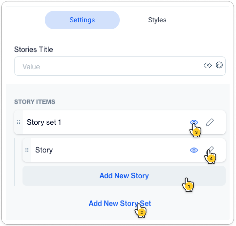
- Stories Title: Assign a title to your collection of Stories. This name will serve as the identifying label for your narrative series.
- Add New Story: A button that suggests adding an individual story to the set.
- Add New Story Set: A button for creating a new group of stories.
- Preview Your Content: Click the eye icon to view your content in the WYSIWYG editor.
- Modify Content: To begin creating or revising your content, click the pencil icon.
Creating Your Story Set
Critical Reminder: Previewing Your Edited ContentTo effectively preview your edits in the WYSIWYG editor, it's essential to click the "Save & Back" buttononce you have completed your changes. Always ensure to save your work before leaving the page, to avoid losing any modifications.
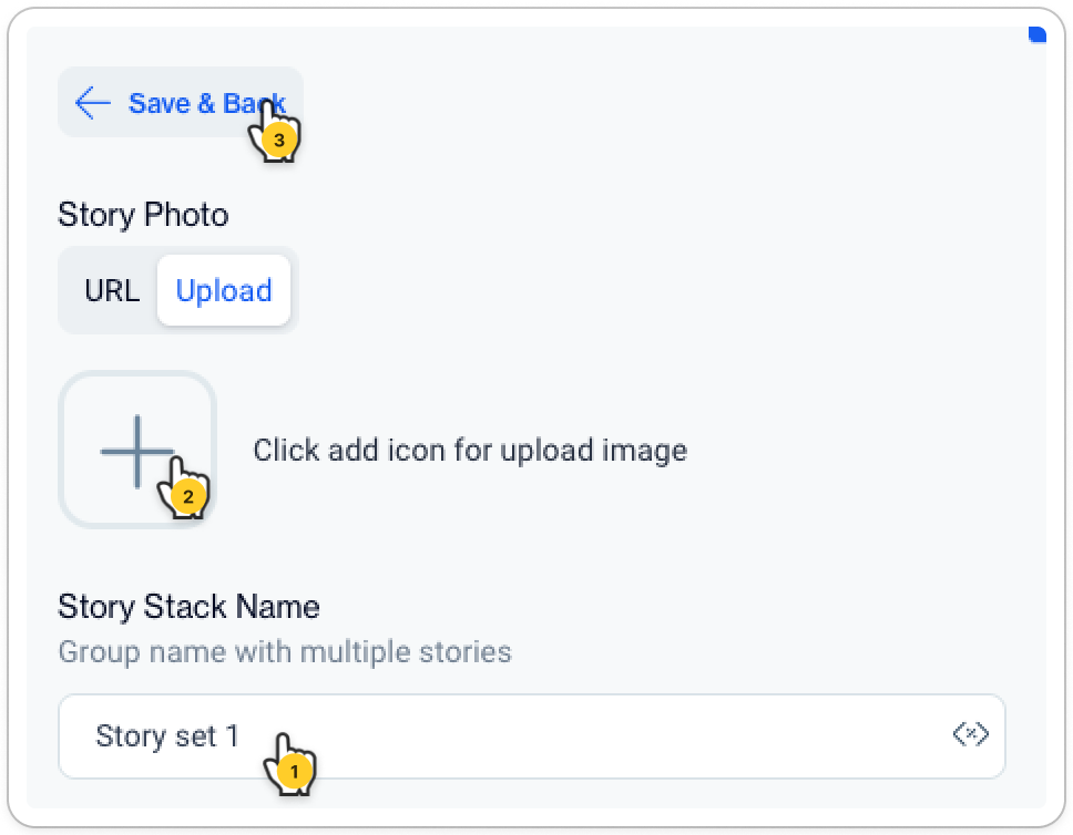
- Story Set Name Field: Enter the name for your group of stories in this field. Story set 1 is displayed as an example. This name helps identify the set among other story collections.
- Story Photo Section:
- Upload Tab: Click the plus icon within the grey box to upload an image from your computer.
- URL Tab: Use this if you prefer to link to an image hosted online. Simply paste the image's URL here.
- Save & Back Button: This button allows you to save your current progress and go back to the previous page.
Configuring Your Individual Story
Critical Reminder: Previewing Your Edited ContentTo effectively preview your edits in the WYSIWYG editor, it's essential to click the "Save & Back" buttononce you have completed your changes. Always ensure to save your work before leaving the page, to avoid losing any modifications.
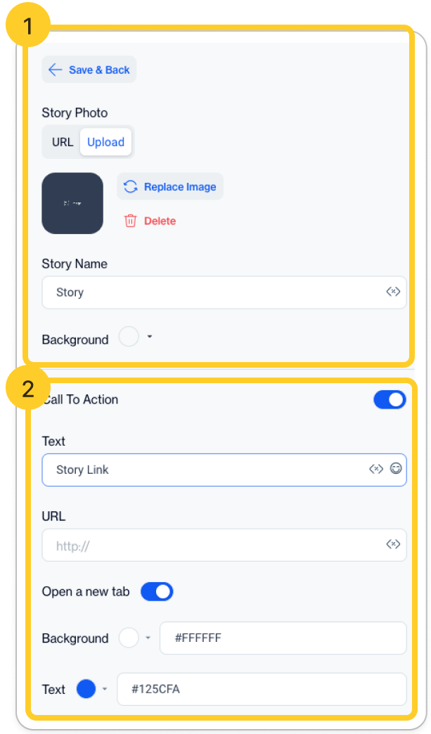
1️⃣ Story Image Settings
Replacing or Deleting the Image
- Replace Image: Click here to change the current image. The photo is shown as a thumbnail for reference.
- Delete: This option allows you to remove the existing image.
Story Name and Background
- Story Name Field: Enter the title for this specific story here, which helps in identifying it within your set.
- Background Setting: Select a background color or setting from the dropdown menu to establish the desired tone and ambiance.
2️⃣ Call To Action (CTA) Settings
- Toggle Switch: Turn this on to activate the CTA section.
- CTA Text and URL: Fill in the fields with the CTA text and the corresponding URL. This is where you direct your audience's next action.
- Open in a New Tab Toggle: Use this to decide if the CTA link should open in the current window or a new tab.
- Color Customization: Customize the background (default #FFFFFF) and text (default #125CFA) colors for the CTA using the color pickers.
Customizing Styles
- To customize the appearance of your content, please navigate to the Styles tab.
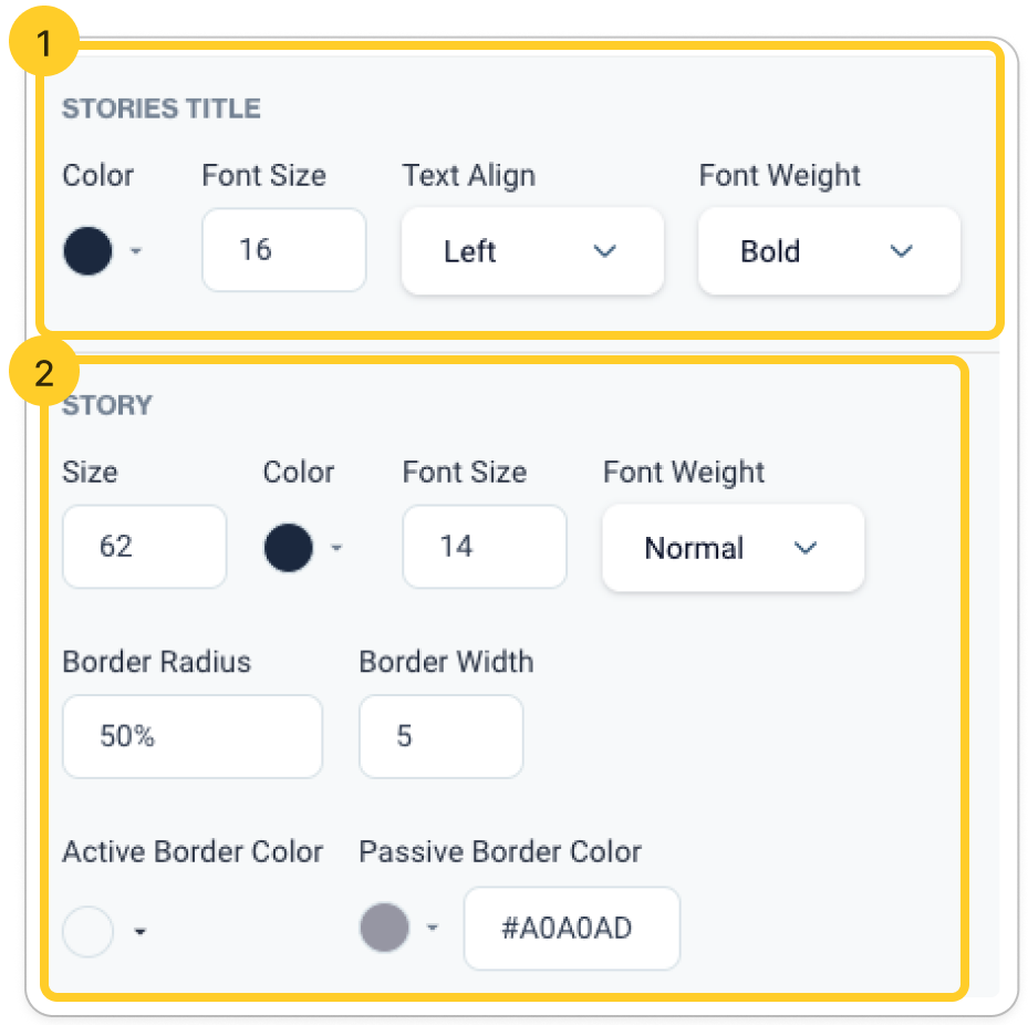
1️⃣ Customizing the Stories Title
- Color: Use the color picker to select a color for your story titles.
- Font Size: Choose the size of your font from the dropdown menu (default set to '16').
- Text Align: Select the text alignment (left, center, right) from the dropdown (default set to 'Left').
- Font Weight: Choose the font weight (e.g., normal, bold) from the dropdown (default set to 'Bold').
2️⃣ Customizing Individual Story Elements
- Size: Enter a value to set the size of the story element (default set to '62').
- Color: Adjust the color of the story element using the color picker.
- Font Size: Select the font size for your story text from the dropdown (default set to '14').
- Font Weight: Choose the weight of your story's font from the dropdown (default set to 'Normal').
- Border Radius: Set the border radius of your story element in percentage (default set to '50%').
- Border Width: Define the width of the border in pixels (default set to '5').
- Active Border Color: Use the color picker to choose a border color for when the story is active.
- Passive Border Color: Select a color for the border when the story is inactive (default set to '#A0A0AD').